Graphic Design 2000s
Although there were leaps and bounds of progress in the ’70s, ’80s, and ’90s, those improvements do not compare to the expansion and revolution of graphic design in the 2000s. Print methods were relatively similar, and the technology, although improving, was never truly breaking the barrier of what was possible. That progression became exponential very, very quickly in the 2000s with the rapid improvement of technology. All of a sudden, people weren’t designing simply for print or digital media. Designers had to make sure their work looked good on something as large as a billboard and as small as a screen that fits in a pocket. New software allowed designers to easily create three-dimensional objects and manipulate typography like never before. On top of all this development, some of the most iconic designs in human history were created during this decade, including Shepard Fairey’s Obama Hope poster (which opened a whole other door into the legality of certain design practices, a rabbit hole that we won’t go down today) and Apple’s single-colored iPod ads. Whether it was the artists who were learning to use new tools or the new tools themselves that allowed the creation of new and exciting artwork, the possibilities of graphic design were expanding more and more by the day.
Here you can see the original 3Points Communications logo — 3Points was founded in early 2010, so this logo is more a reflection of the 2000s than the 2010s. [Also worth noting: unlike the preceding designs, which were created for this exercise, this was our actual logo, which means it is less exaggerated to reflect its decade.] Much like some of the most popular new logos of the 2000s (AT&T, Wikipedia, and Microsoft, to name a few), it features three-dimensional shapes, which were then a must-have for a brand hoping to keep up with the times. Although most brands chose to use either the effect of a gradient or a drop shadow to achieve a 3D feel, both are used here. On top of this, we can now see 3Points sporting a sleek and thin font. Thick fonts were very popular in the ’90s; however, the look considered modern in the 2000s was sleek and minimalistic.
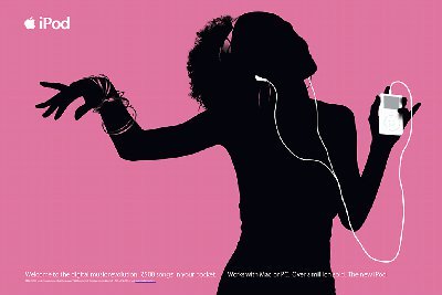
Apple debuted the iPod in 2001 – this print ad is from 2003.
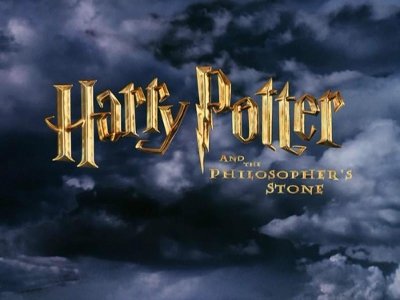
 The first movie in the Harry Potter series – with its lightning-bolt font – was released in 2001.
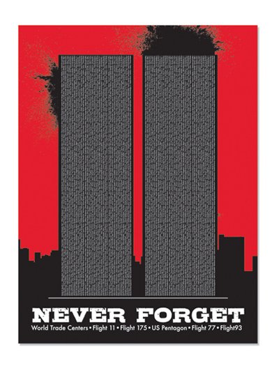
“Never forget” was everywhere following the Sept. 11, 2001, attacks.
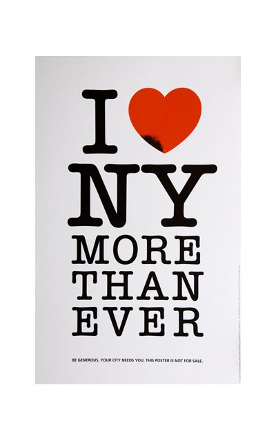
Milton Glaser modified his iconic design after 9/11.
Facebook launched in 2004, and workplace productivity was never the same again.

“Lost” crashed into TV households in 2004 along with its simple yet mystifying title sequence.

Co-founded in 2006 by U2’s Bono, Product Red raises funds to eliminate AIDS in Africa.

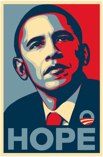
Street artist Shepard Fairey designed and printed this poster of Barack Obama during the 2008 presidential campaign. Fairey and the Associated Press just settled a lawsuit regarding the original photograph’s copyright.
The 2006 Super Bowl’s XL Roman numerals made for an extra-large logo.

Blizzard Entertainment’s “World of Warcraft” was released in 2004, and even nongamers became familiar with terms like MMORPG.

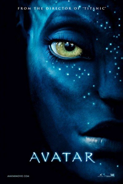
“Avatar,” released in 2009, got so much praise for its special effects yet so much flak for the use of Papyrus in its title font and subtitles.
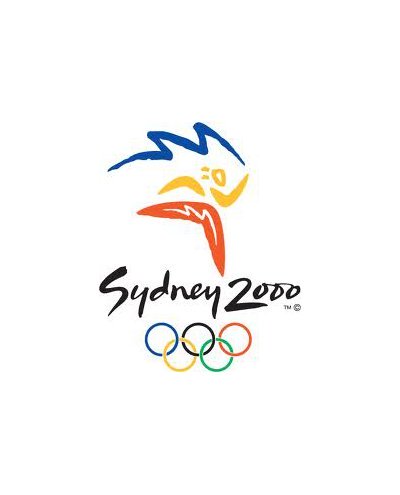
The bid logo for the 2000 Summer Olympics featured a stylized image of the Sydney Opera House.
The television show “24” first aired in 2001, and the logo resembling a digital clock went alongside the split screen with the time running down during each episode.

Wikipedia, launched in 2001, has gone through a handful of logo changes. The puzzle ball version came about in 2003.

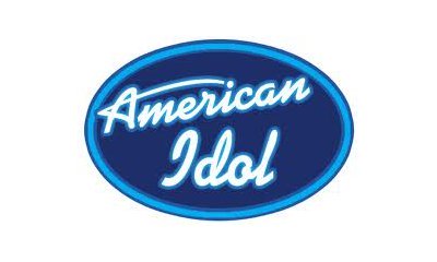
The televised talent show “American Idol” debuted in 2002, changing the way viewers interact with their TV shows.
The 2000s began an entirely new frontier for graphic designers. In addition to tools becoming even more powerful, people were suddenly designing on portable devices, such as smartphones. On top of that, designers began to realize the importance of designing in a way that looked good across all device types.
Movement became more of a focus, with designers looking for ways to make even static logos look like they’re in motion.
The AT&T logo was redesigned in 2005 but still features a version of Saul Bass’ globe introduced in ’84.

One example of a logo that appears to almost be in motion is the AT&T logo of a globe. Because of the mix of blue and white along with the angles of the logo, one can imagine that the image is spinning slowly just as the earth does. They debuted the logo in 2005.