Month: January 2020
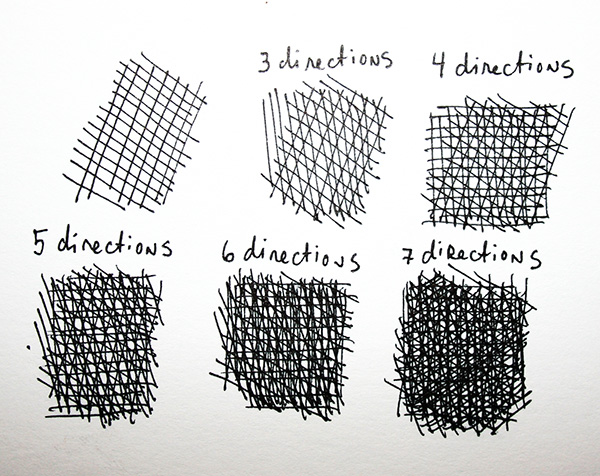
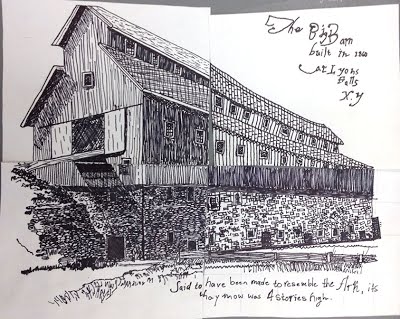

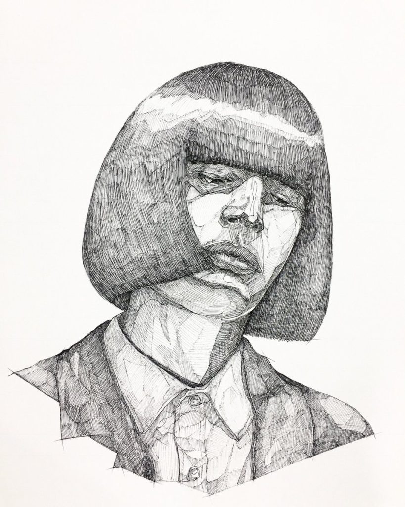
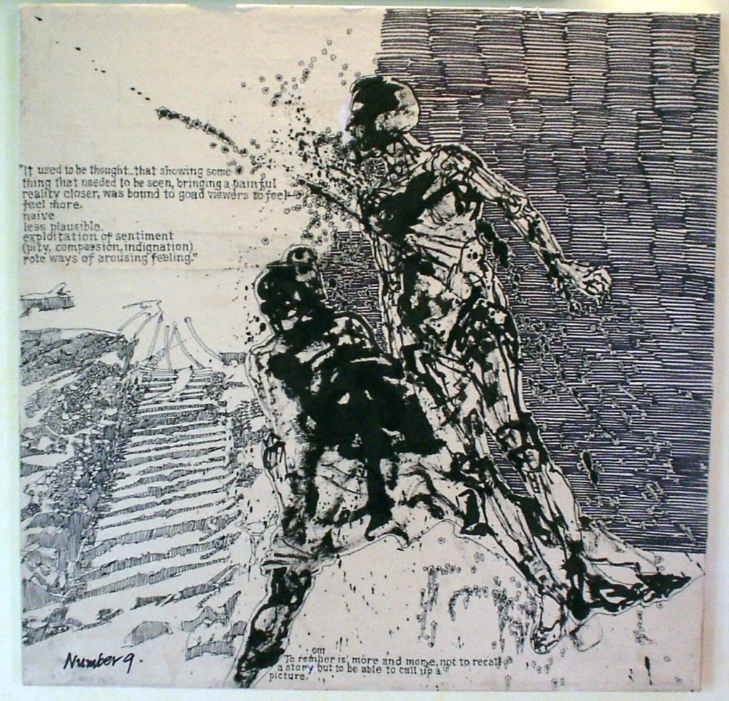
Above: Barron Storey
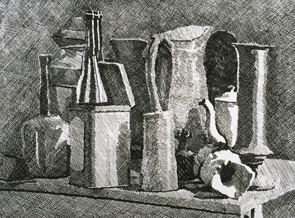
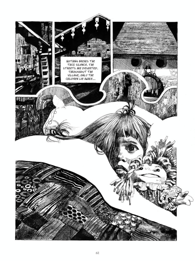
Below: Sergio Toppi
Graphic Design and Typography
Leslie set up a graphic arts salon that leaders of the industry including Ladislav Sutnar, Alvin Lustig and Herbert Bayer could discuss design and talk shop.
In the 1950s, he was instrumental in the creation of the High School of Industrial Arts (later renamed the High School of Art and Design) in New York City.He also founded a paper mill and artist colony in Beer Sheva, Israel, in the old Turkish railway station.
Illustration
Comics
Animation
Alakazam the Great wikipedia article
Dudley Do-Right wikipedia article
The Alvin Show wikipedia article
The Fabulous Baron Munchausen wikipedia article
The Sword in the Stone wikipedia article
Marry Poppins wikipedia article
Thunderbirds wikipedia article
A Charlie Brown Christmas wikipedia article
Do Not Adjust Your Set wikipedia article
Yellow Submarine wikipedia articleinterview material trailer for re-release
Scooby Doo Where Are You? wikipedia article
Monty Python wikipedia article
Sesame Street wikipedia article
Film
Directors
J. Lee Thompson – Guns of Navarone – wikipedia article
David Lean – Lawrence of Arabia – wikipedia article – Dr Zhivago – wiki
Terence Young – James Bond – Dr No–wiki article
Alfred Hitchcock – The Birds – wiki
Morton DaCosta – The Music Man – wiki
George Cukor My Fair Lady – follow up –wiki
Robert Aldrich – The Flight of the Phoenix – wiki
Robert Wise – The Sound of Music – wiki
Mike Nichols The Graduate wiki article
Personalities
Film Score
Leonard Bernstein(West Side Story) wikipedia article
Elmer Bernstein (To Kill a Mockingbird) wikipedia article
Jerry Goldsmith (The Sand Pebbles) wikipedia article
Popular Entertainment
Absent Minded Professor wikipedia article
Special Effects
Color Fred A Young Lawrence of Arabia wikipedia article
Cinematography
Jean Bourgoin – The Longest Day – wikipedia article – more info
Screenwriting
Robert Bolt (Dr Zhivago, A Man for All Seasons) More info
Advertising
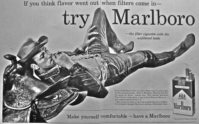
Marlboro Man
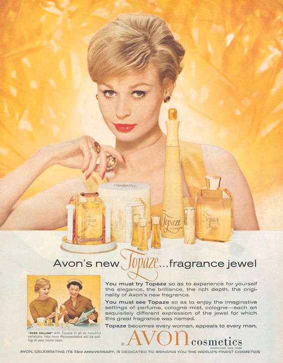
Avon
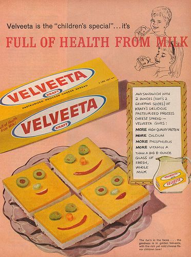
Velveeta
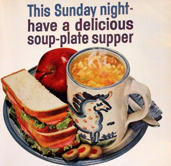
Campbells
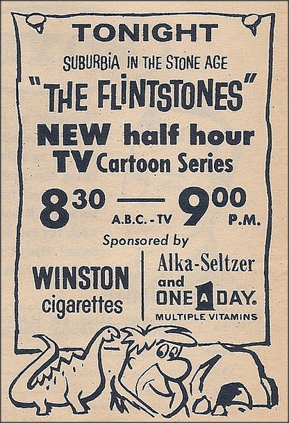
TV – Flintstones
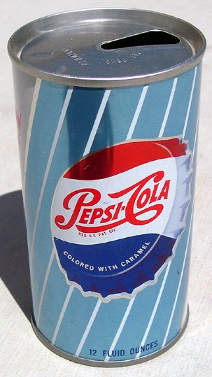
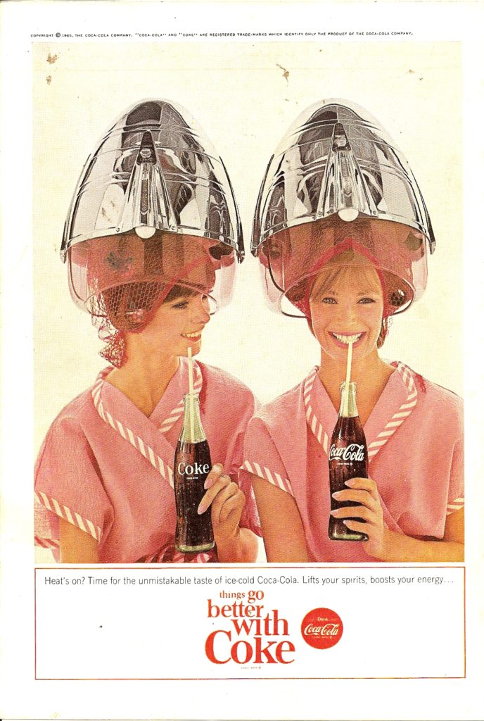
Pepsi and Coke
Television
Hertz “Let Hertz put you in the driver’s seat” Norman, Craig & Kummel
Avis “We Try Harder” Doyle Dane Bernbach
Pepsi “The Pepsi Generation” Batton, Barton, Durstine & Osborn
The Pepsi generation starts around 4:30
Charmin “Please don’t squeeze the Charmin” Benton & Bowles
Wisk detergent “Ring around the collar” BBDO
It is impossible to discuss all aspects of image treatment in publications. Like most media today, the ideas and expectations are shifting regularly. That having been said, here are a few ideas:
All publications use photos, illustrations, infographics, and iconography. As of 2020 the standard resolution for printable imagery is 300 dpi (dots per inch) or ppi (pixels per inch). Most professionals create their images for publication at a minimum of twice the expected image resolution. So if the intended output is a fourth page ad in an 8.5″X11″ magazine, one would make the original file 8.5″X2.75″ at 600 dpi, then account for bleed, printable area and margins.

Remember, the margin may be different on either side to account for the spine of the publication and how malleable the inner gutter unfolds. If it is a large publication the inner margin may be as much as an inch, while the outer margin is only a half an inch. These are decisions the book designer needs to make in order to insure that the book comes out looking polished and legible.
Remember that when it comes to images, you can reduce them in scale, but you cannot make raster graphics larger without suffering quality problems. I have seen many disappointed designers who built things for websites, then wanted to convert those materials to books, and were extremely disappointed to discover that all their images had to be re-created to account for the demands of print publishing rather than web/digital publishing. The gap between these two worlds is shrinking, but the standard screen resolution is still 72 ppi, which is much lower than 300 dpi. Current retina screens are 144 ppi (72X2), but that is still less than half the stand resolution for print.
Kinds of Images Used in Different Publications
Again, this is impossible to foresee with the shifting media landscape, but generally newspapers need images that convey something immediate, while magazines can afford to use images that convey less immediate information. Newspapers and news websites are in the business of conveying information as it unfolds, in as simple and articulate a way as possible. Magazines are in the business of slowing down and focusing on a topic at length.
Photographs
Photographs can be acquired in a few different ways.
- You can take them yourself. Actually, there are a number of news organizations that are essentially training their reporters to collect photos and video for publication using smart phones. There is an “old guard” who hate this and decry it as the end of professional journalism, but it does not change the fact that newspapers and news websites are having a harder time making ends meet financially. If they want to continue staying competitive it makes sense that they would find a way to get the materials they need in as inexpensive a way as possible. However, I agree that switching to a smart phone instead of a camera with “good glass” is not going to give you the same quality. Some reporters are learning to shoot with DSLRs, and I hope that trend continues. If you are in this class, you have the training or are getting the training to use a camera. This gives you a small leg up compared with much of the competition.
- You can hire a photographer/commission a photographer. This is pretty easy. There are a ton of photographers looking for work. I’ve seen many “2 person teams” work at this sort of thing very successfully, where one does the “ideation” and writing for an article and the other collects the materials and completes the design. Here’s another idea: some editors will purposefully not tell a photographer the point of the story, maybe just the subject, then see what the photographer comes up with. Sometimes this can lead to an interesting juxtaposition of ideas. Also, remember that the photo you have commissioned can be edited through image manipulation software, like photoshop, if you need the image to convey something slightly different from what you received. Often the role of photo editing is a whole discipline unto itself. Sometimes photo editing is as simple as cropping so you are only publishing the part of the image one needs to see.
- You can purchase photos from a website like “gettyimages” or “shutterstocK”. They will supply high resolution versions of the image you want/need.
Illustration
At one point in time all images in publications were illustrations because the printers needed very specific parameters in order to reproduce images effectively. With current print technology illustrations are in far less demand, though most publishers still use illustration for icons and branding. Some publishers use illustration helps a publication by expressing an idea more abstractly, or figuratively. If a reader sees a photograph that is what it is. If they see an illustration they intuitively understand the illustration is an approximation.
The Senate Subcommittee Hearings on Juvenile Delinquency took place between April 21-22, 1954.
American Psychologist Fredrick Wortham had been going around speaking about the problem of comics as he saw it since 1948. Two days before the hearings he published a book that compiled his ideas from these talks. The book was called “Seduction of the Innocent”. It claimed comic books, and specifically, horror, sci-fi, crime, and romance comics were to blame for the troubles American parents had raising misbehaving children. The term used for this was “juvenile delinquency”. Super Heroes were not totally innocent either. There are sections of the book devoted to proving Batman and Robin were in a homosexual relationship, as well as a section devoted to explaining that due to her power Wonder Woman must be a lesbian. At the time homosexuality was viewed as a mental disorder. His book also claimed Superman was un-American and fascist. More than this, it claimed that these comic books functioned as an instruction manual to teach children how to commit crimes.
There was a news program that built up tension about the comic book industry. I couldn’t find it, but I did find a piece someone put together that has excerpts from that program:
When the senate subcommittee hearings actually took place they called on Wortham, Walt Kelly, Milton Caniff, and The final witness of the day was Bill Gaines, from EC Comics. His testimony did not go well.
As a response to the hearings, the comic book industry tried to police itself by creating the comics code authority.
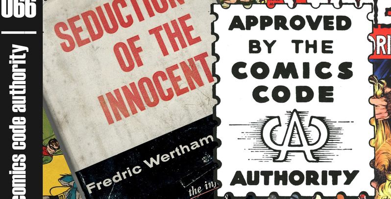
There is a good article at CBR detailing the rules the authority laid out.
EC Comics had a tough time with the rules. They were designed by all the publishers who were both envious of EC’S success, but also fearful there would get shut down by the government if they didn’t do something. This was the age of McCarthyism.
To make matters worse an editorial appeared in the Chicago Daily News called “A National Disgrace” written by Sterling North. It was reprinted all over America.
There was an outbreak of anti-comic hysteria.
By the 1960s only 6 of the twenty comic publishers survived.
Dell Comics (went out of business in 1974)
DC Comics
Archie Comics
Timely aka Atlas aka Marvel Comics
Harvey Comics (went out of business in 1994)
Charlton Comics (went out of business in 1986)
Gaines’ last attempt to comply with the code was a story called “Judgment Day”
After that story failed to pass code, Gaines discontinued all comics publishing. He converted Mad to a “Magazine” to make it clear it was not intended for children, and going forth that was how he approached most everything.
EC Comics
EC comics (First “Educational Comics” then later “Entertaining Comics”) was the biggest publisher of comics between 1950-1955. They published comics in genres like horror, war, romance, fantasy, funny animal, and satire. Max Gaines, who was a co-publisher of All Star Comics in the 40s, founded EC comics in 1944 when that company merged with DC comics. After his death in 1947, his son, Bill Gaines took over. Bill transformed the company into a pioneer of horror, science fiction, and satire comics. While you may not have heard of “EC Comics”, you probably have heard of “Tales from the Crypt“, “Weird Science“, and “Mad Magazine“, for example.
When Max started the company he began by producing a line of Picture Stories from the Bible.
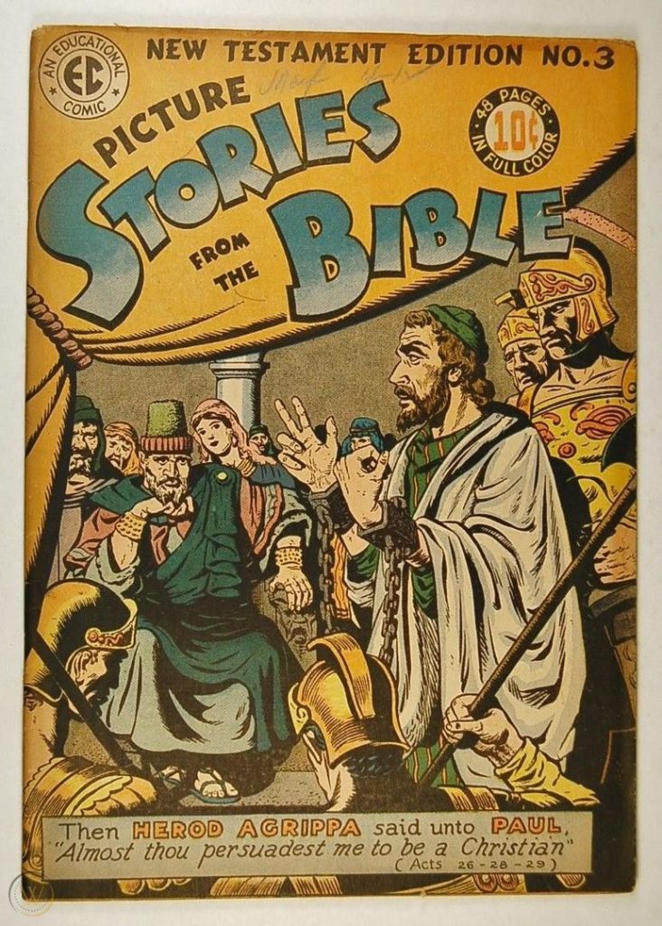
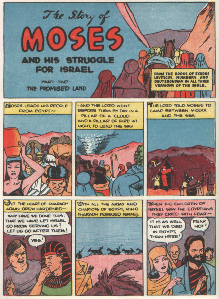
He also published Picture Stories from Science
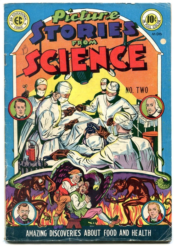
…and Picture Stories from American History/
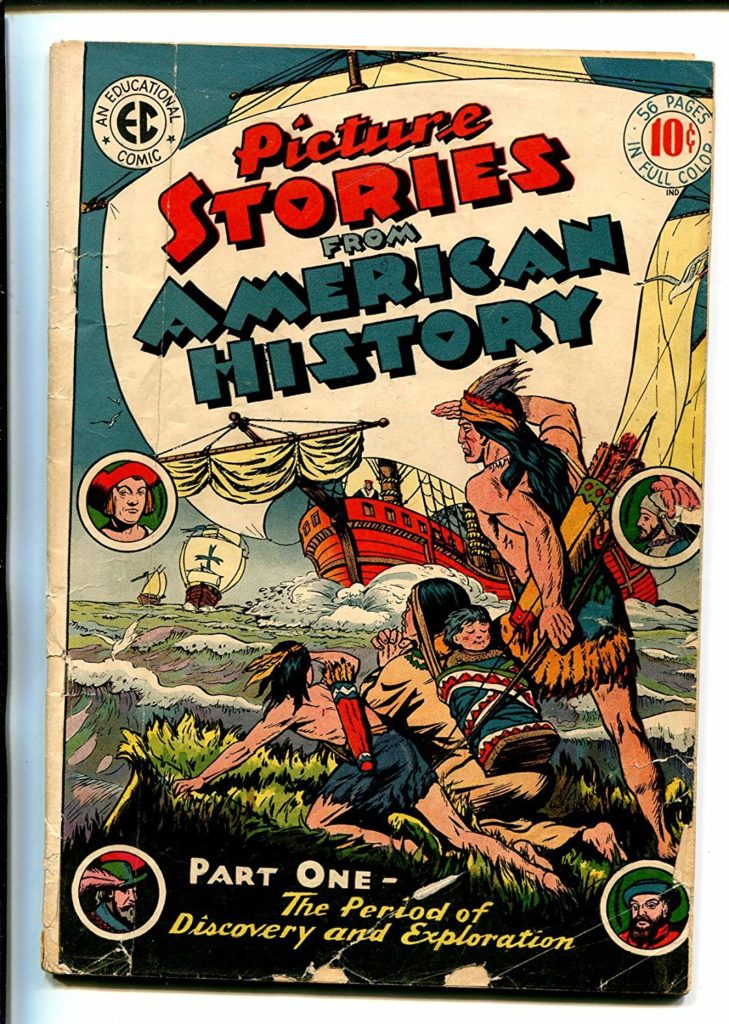
Which are all exactly what you think they are.
The company was approximately $100,000 in debt when he died in a boating accident.
His son, Bill Gaines, a chemistry student and aspiring teacher, was left in charge of the company.
Bill changed the name from Educational Comics to Entertaining Comics and decided to try and capitalize of the popular genres of the day. His first publications were character driven like the comics that preceded EC in the 40s.
In 1950, Al Feldstein became the editor of the company. He and Gaines decided to take the books in a completely new direction.
Most of their books were anthology comics, meaning, they did not feature a main character, but rather, sought to tell a variety of stories in the genre specified by each magazine’s genre. These stories would often be 4-8 pages long. The reason many comics are presented in 4 page units (you will often hear about 4 page, 8 page, 12, page, 16 page, 20 page, 24 page, etc comics is because when comic magazines are printed they are printed in 4 page signatures.
We will begin by discussing their main contributors:
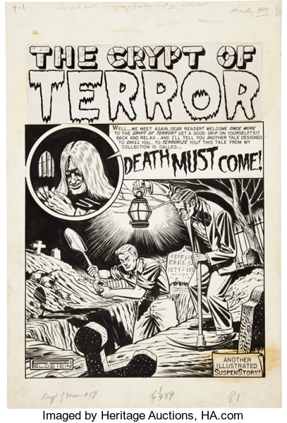
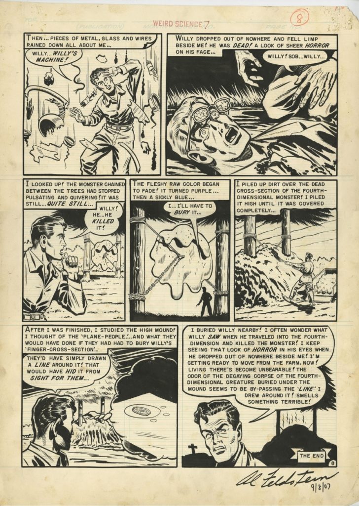
Al Feldstein
Al was an illustrator, but began writing comics at EC. He eventually stopped drawing interiors to focus on writing and cover art. He would often write a 4-8 page story for 7 magazines in the EC line every month.
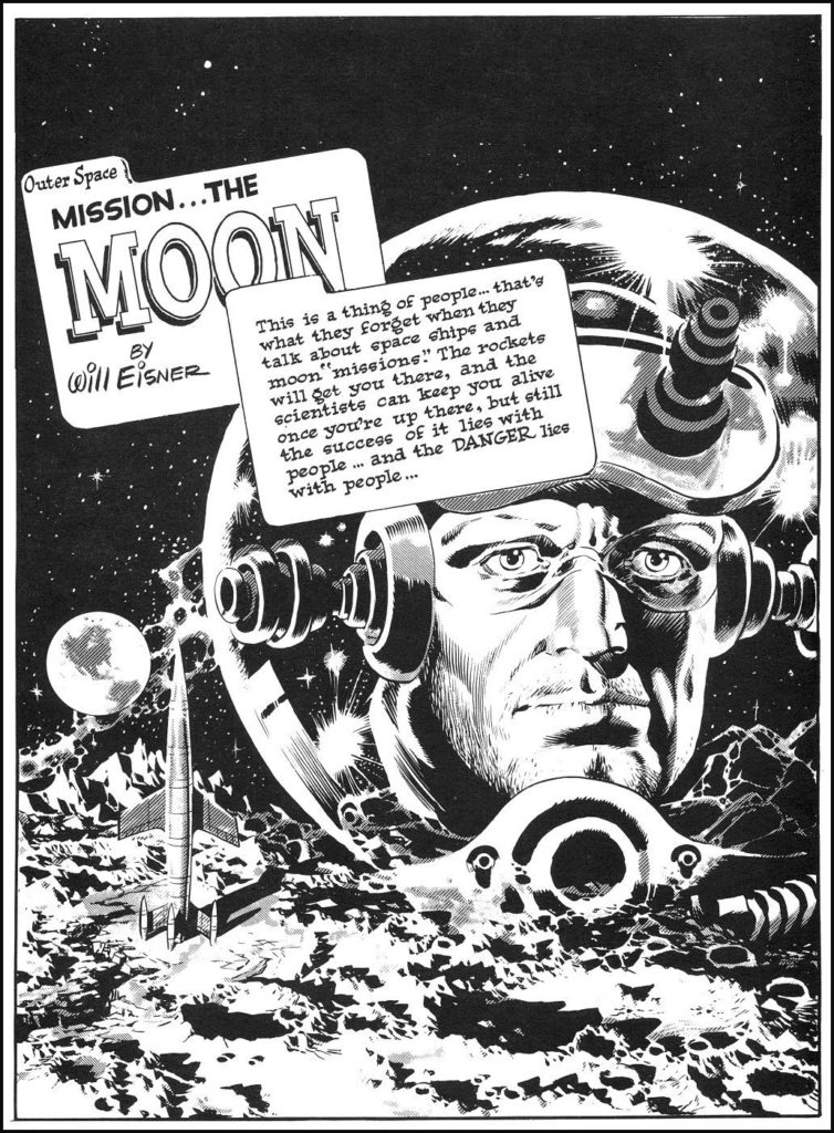
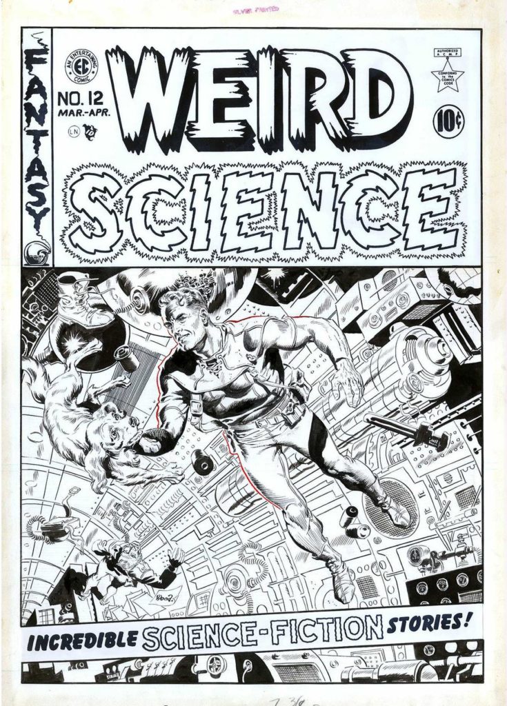
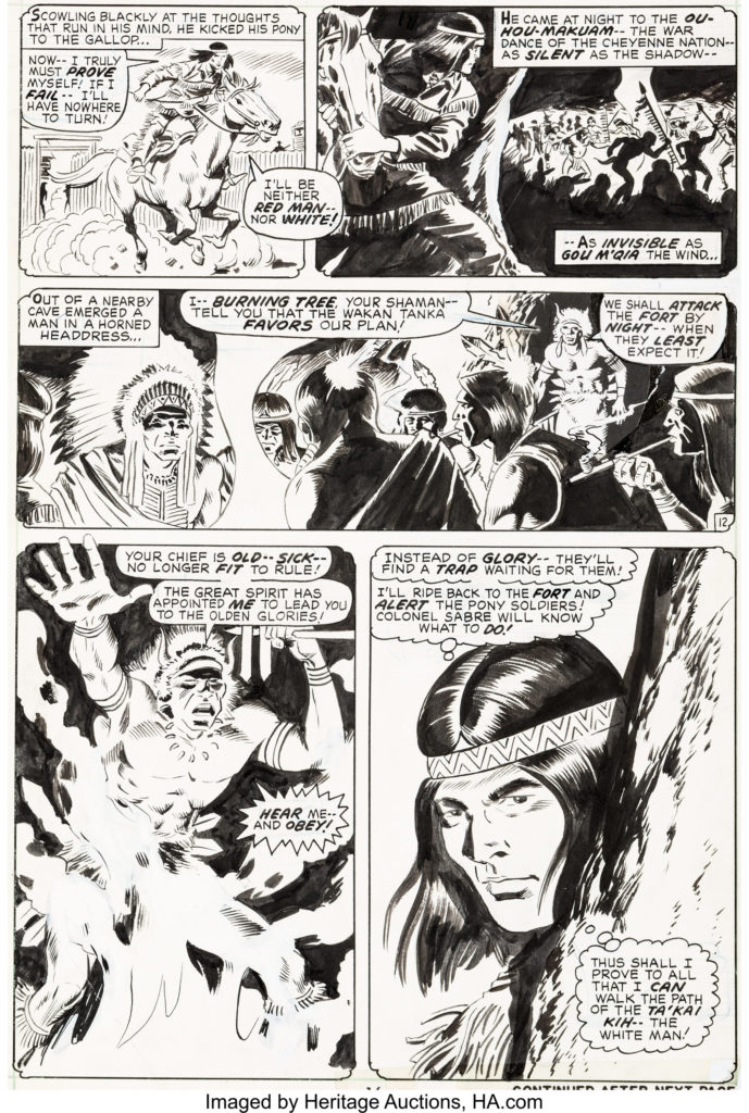
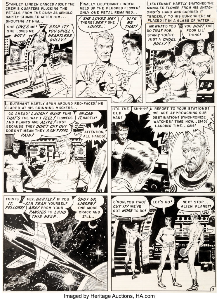
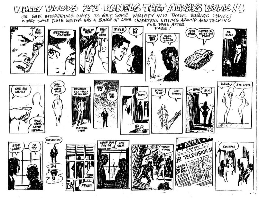
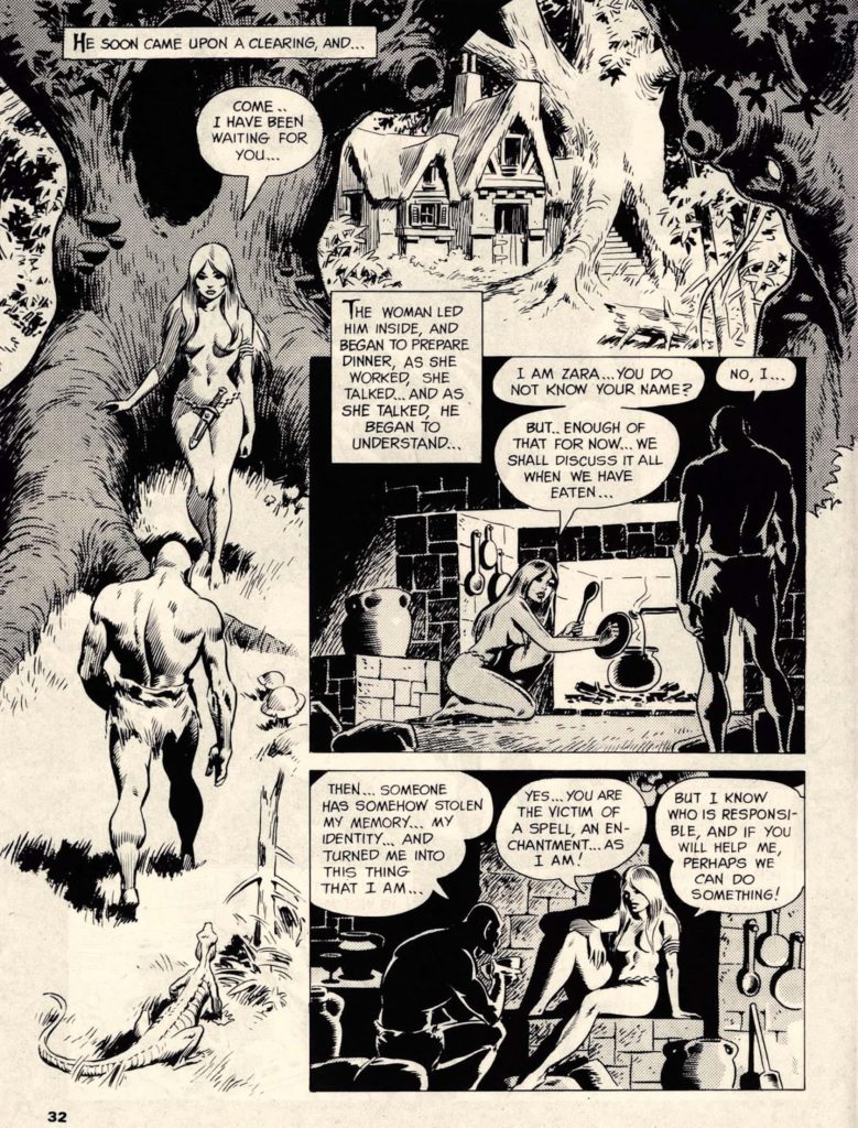
Wally Wood
was the super star artist of the EC line. He became primarily known for his Sci-Fi comics, but the real secret behind the success for the EC line was the fact that he and Feldstein weren’t scared to get a little smutty with their depictions of romantic relationships.
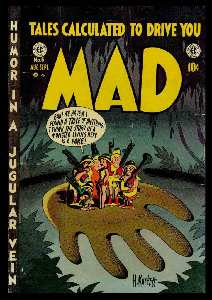
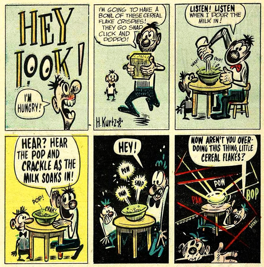
Harvey Kurtzman
He wrote and edited theTwo-Fisted Tales and Frontline Combat war comic books, where he also drew many of the carefully researched stories, before he created his most-remembered comic book, Mad, in 1952 which was a humor and satire book.
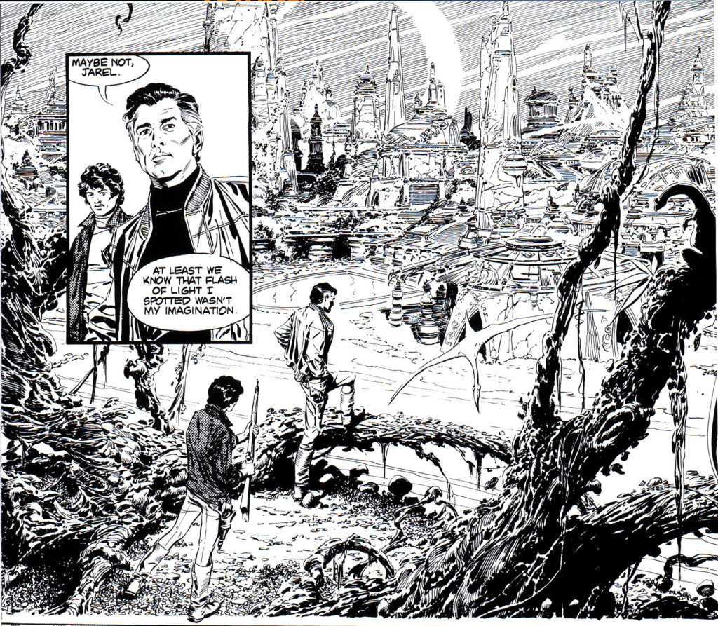
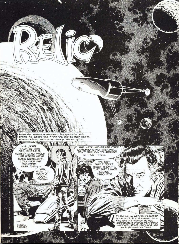
Al Williamson
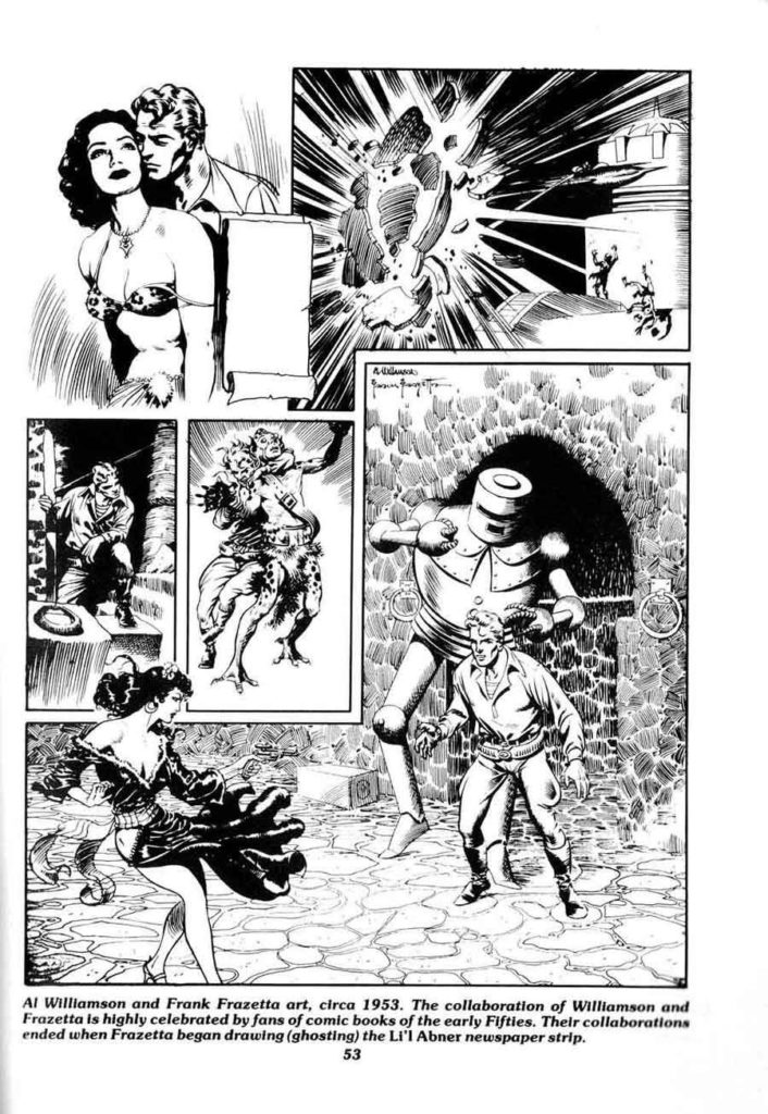
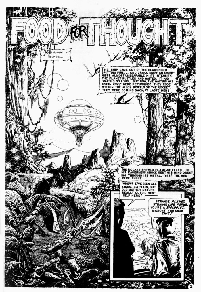
He took art classes at Burne Hogarth‘s Cartoonists and Illustrators School, there befriending future cartoonists Wally Wood and Roy Krenkel, who introduced him to the work of illustrators who had influenced adventure strips. Before long, he was working professionally in the comics industry. His most notable works include his science-fiction/heroic-fantasy art for EC Comics in the 1950s, on titles including Weird Science and Weird Fantasy.
Reed Crandall
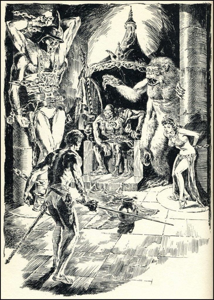
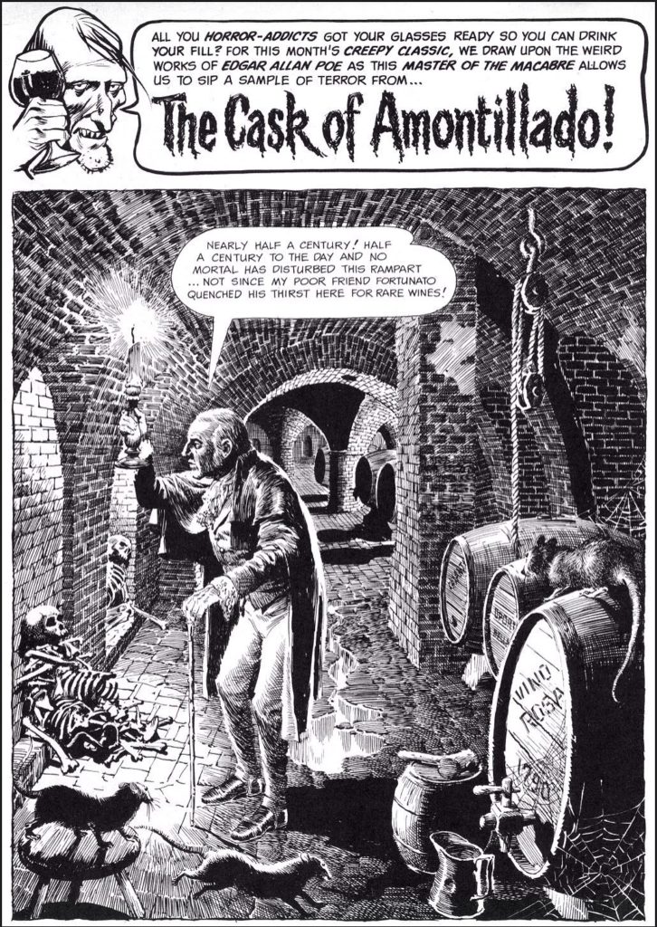
Crandall drew for comic books from 1939 until 1973. His first work appears in comics from publisher Quality Comics, for which he drew stories starring such superheroes as the Ray (in Smash Comics, beginning in 1941 and initially under the playful pseudonym E. Lectron)[12] and Doll Man (first in Feature Comics in 1941, then in the character’s own solo title). His earliest confirmed cover art is for Fiction House‘s Fight Comics #12 (April 1941) at the Grand Comics Database.[13] Other early work includes inking the pencil art of future industry legend Jack Kirby on two of the earliest Captain America stories, “The Ageless Orientals That Wouldn’t Die”, in Captain America Comics #2 (April 1941),[14] and “The Queer Case of the Murdering Butterfly and the Ancient Mummies” in #3 (May 1941).[15]
With S.M. “Jerry” Iger credited as writer, Crandall co-created the superhero the Firebrand in Quality’s Police Comics #1 (Aug. 1941) and began his long run as artist of his signature series, the World War II aviator-team strip “Blackhawk“, in Military Comics #12-22 (Oct. 1942 – Sept. 1943) and, after his WWII service in the Army Air Force,[8] in Blackhawk and in Modern Comics. During this time he also drew the adventures of Captain Triumph in Quality’s Crack Comics. His final “Blackhawk” work was a seven-page story, plus the cover, for Blackhawk #67 (Aug. 1953).
Crandall went on to become a mainstay of EC Comics, whose line of hit horror and science fiction titles would become as influential to future generations of comics creators as they were controversial in their own time due to their often graphic nature and mature themes. Joining a group that included artists Johnny Craig, Jack Davis, Will Elder, Frank Frazetta, Graham Ingels, Jack Kamen, Bernard Krigstein and Wally Wood, Crandall made his debut there with the six-page story “Bloody Sure”, written by Al Feldstein, in The Haunt of Fear #20 (August 1953).
He drew dozens of stories across a variety of genres for the EC anthologies Crime SuspenStories, Shock SuspenStories, Tales from the Crypt, Two-Fisted Tales, The Vault of Horror, Extra!, Impact, Piracy, and Weird Fantasy and its sequel series, Weird Science-Fantasy.
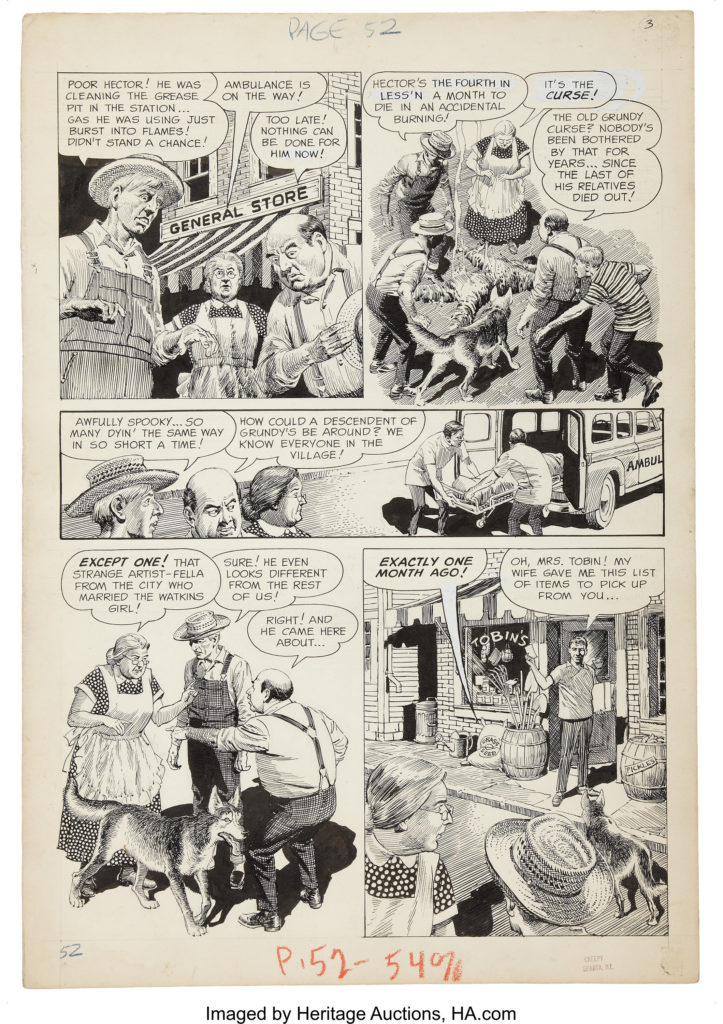
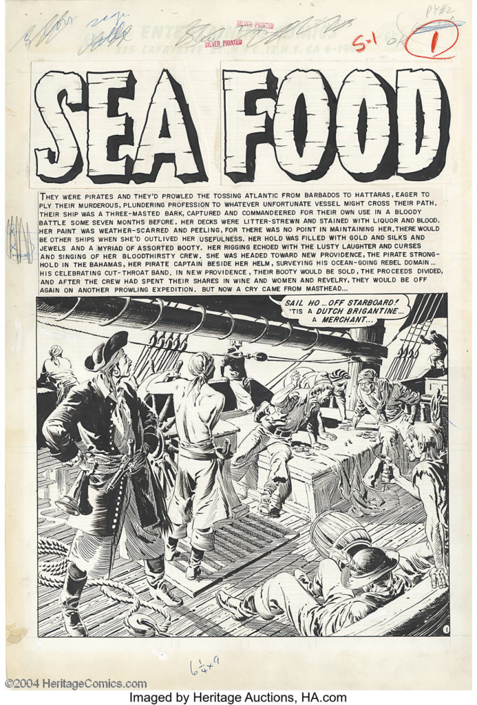
Severin was working on Wall Streetwhen her brother John, then an artist for EC Comics, needed a colorist for his work there. Marie Severin’s earliest recorded comic-book work is coloring EC Comics’ A Moon, a Girl … Romance #9 (Oct. 1949). In a 2001 interview, she recalled she broke in as a colorist… for all the war books at EC with [Harvey] Kurtzman. I went on to color all their books, they were happy with it, and I learned a lot about production color and how everything worked. … I believe the color chart for the printed pages had a range of up to 48 colors. I had the full range; I would mix colors — golds, greens, blues, and so on — and you would intensify them so that the separators could see the difference. … What they liked is that I really studied which colors looked best and sharper next to one another, the subtleties of it. I would also proofread the colors.She would contribute coloring across the company’s line, including itswar comic and its celebrated but notoriously graphic horrorcomics, and also worked on the comics’ production end, as well as “doing little touch ups and stuff” on the art.
The First Comic Book Magazines
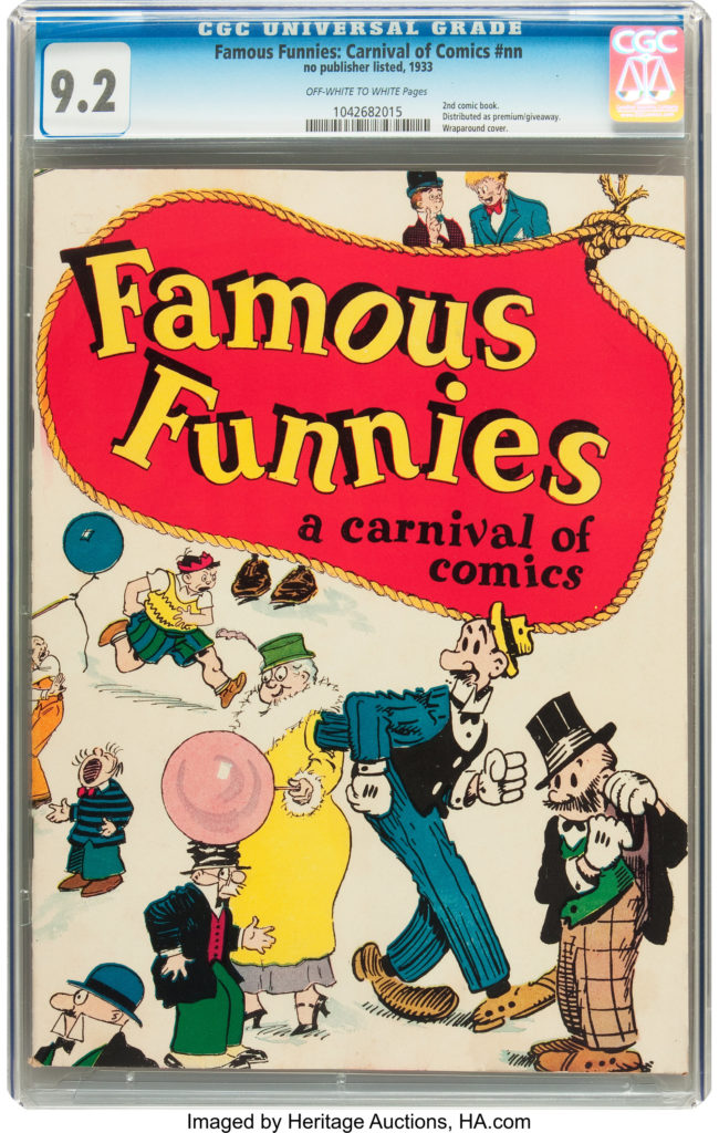
The first comic book appeared in 1933
Famous Funnies was a collection of comic strips printed together in one magazine.
 However, the first comic magazine to feature all original material was published by DC comics in 1935.
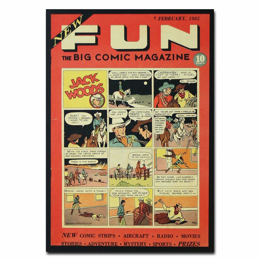 It was an anthology comic.
Detective Comics No 1 appeared in 1937. It is the longest running comic book title (still being published today), and we’ll come back to discuss it many times. DC comics derives their name from this book.
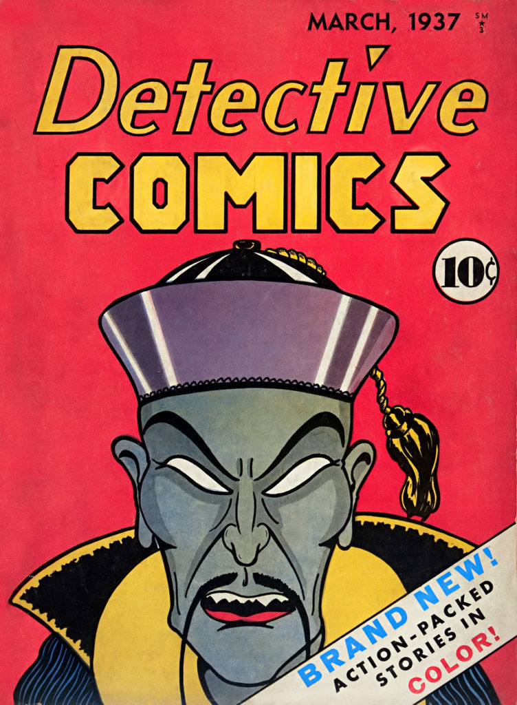
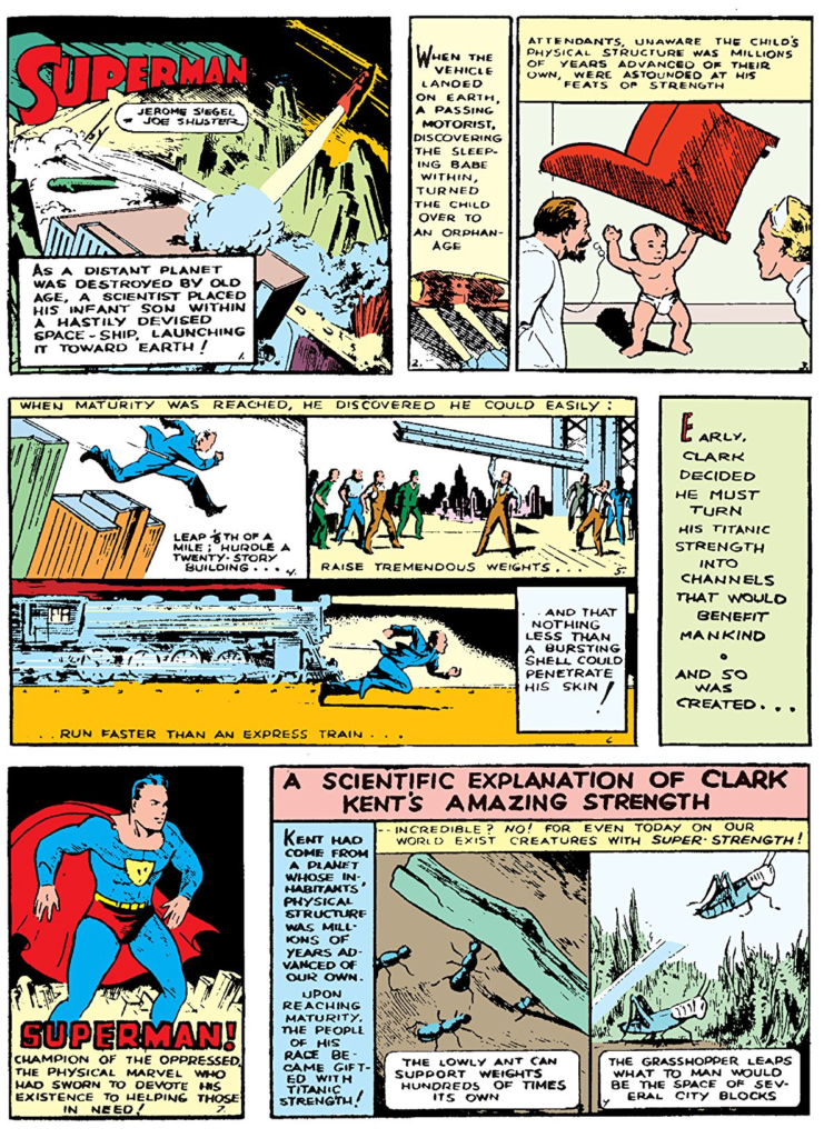
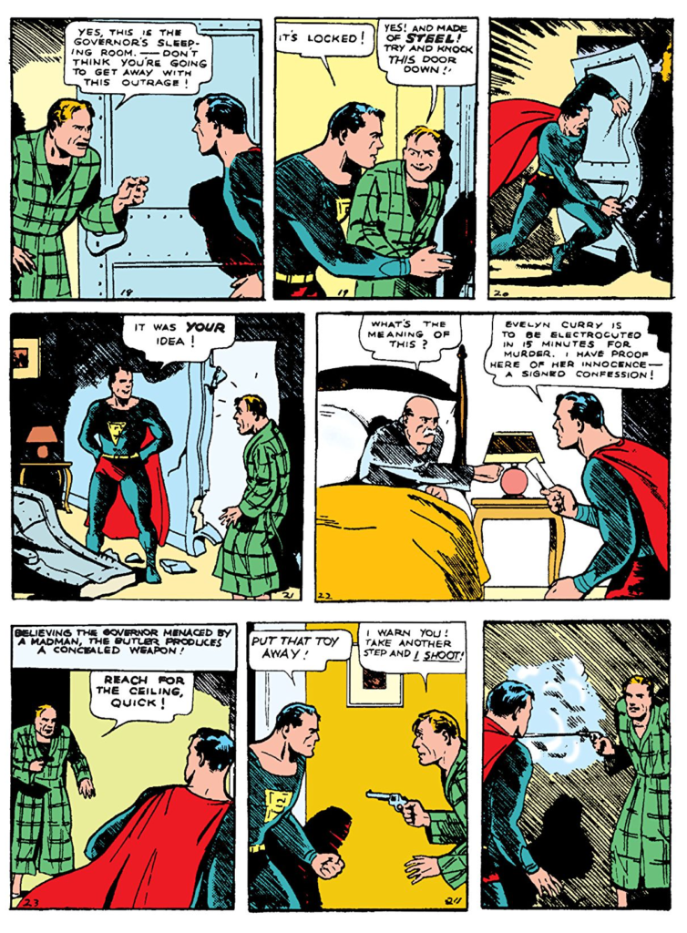
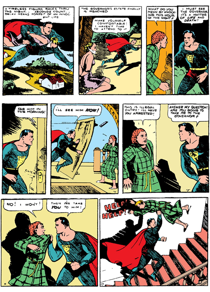
Superman
The “Golden Age” of Comics officially begins with Action Comics no 1 also published by DC.
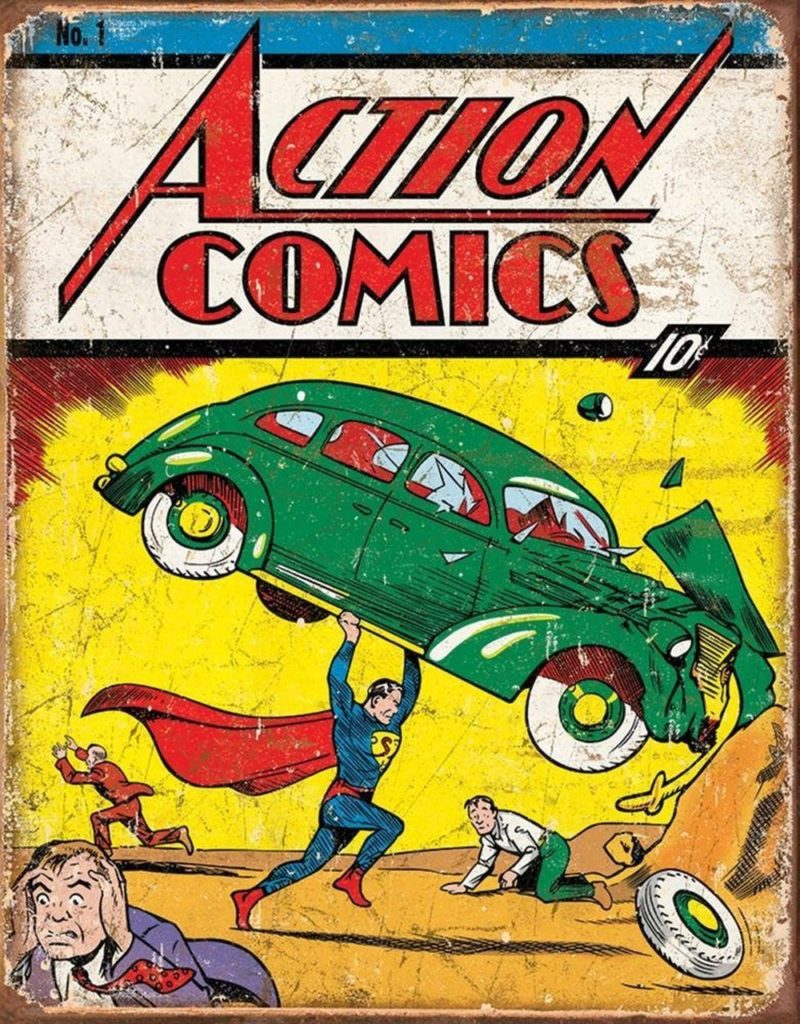
There is a lot to say about Superman. Much of it has already been said. Here are what I believe to be the key points:
- Superman is essentially a “Moses Myth” created by a couple Jewish kids from Cleveland. One of whom lost his father in a burglary. We can imagine why he imagined a bullet proof hero.
- At the time the pulps and the adventure comic strips were very popular. It isn’t hard to understand why this would have caught on with young male readers.
- Superman was originally envisioned as a villain, but the design for that version eventually became the basis of design for Lex Luthor.
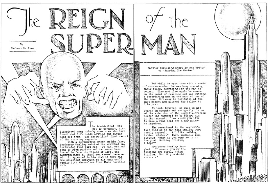
- “A couple of months after I published this story, it occurred to me that a Superman as a hero rather than a villain might make a great comic strip character in the vein of Tarzan, only more super and sensational than that great character. Joe and I drew it up as a comic book – this was in early 1933. We interested a publisher in putting it out, but then he changed his mind, and that was the end of that particular version of Superman – called The Superman. Practically all of it was torn up, by the way. Joe got very upset and tore up and threw away most of it.” – Jerry Siegel
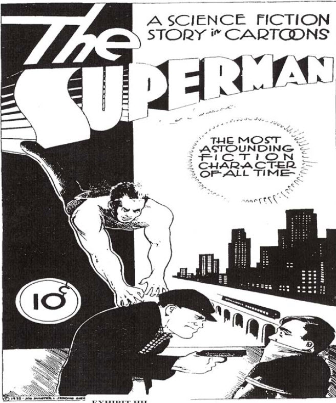
- “We saved the cover. The rest of the drawings were a crude version of Superman. It wasn’t really Superman: that was before he evolved into a costumed figure. He was simply wearing a T-shirt and pants; he was more like Slam Bradley than anything else – just a man of action. But we called him The Superman. That was the second time we used the name, but the first time it was used for a character of goodwill. I’m a perfectionist, and I think the fact that the drawings had been turned down made me want to tear them up. I simply destroyed them. I said, ‘If we ever do it again, I’m going to redo it properly.’ It was a very low period for us.” – Joe Shuster
- “Siegel and Shuster earned fairly high salaries writing and illustrating Superman comics. But they received no royalties. They signed away all rights to their character for $130. “Our company has very little to gain in a monetary sense from the syndication of this material,” DC Comics’ publisher disingenuously told Siegel in 1938 in response to one of his many requests for more cash. “Also bear in mind … that we can at any time replace you.” Siegel and Shuster were then fired in 1947 after filing a lawsuit against DC. A financially struggling Siegel returned to the company in 1959, accepting standard pay and no byline. He left again in 1965 and lodged a second, equally unsuccessful suit that dragged on for years. When a Superman movie began production in the 1970s, Siegel put a curse on it as part of a public relations campaign. The shaming strategy worked, as DC’s parent company agreed to give him and Shuster pensions of $20,000 a year, a sum that later went up. Furthermore, DC once more began crediting them as Superman’s creators. Following their deaths in the 1990s, Siegel’s and Shuster’s heirs brought additional copyright litigation that remains ongoing.” – JESSE GREENSPAN
- Jesse Greenspan brings up an interesting point here, but he neglects to mention the large role several artists had in helping Siegle and Shuster with their case in the 1970s, most notably: Neil Adams, who we’ll discuss later.
Batman
A few months after Action Comics No 1 Detective Comics No 27 was published featuring the first appearance of Batman
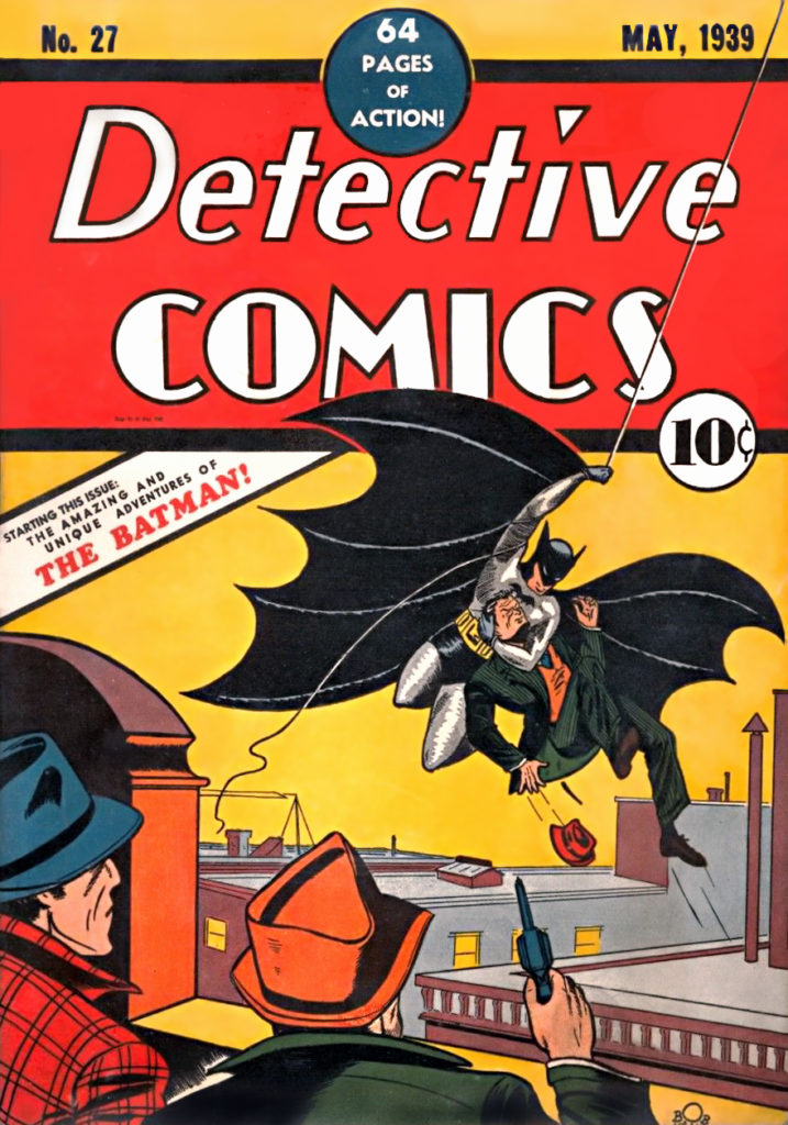
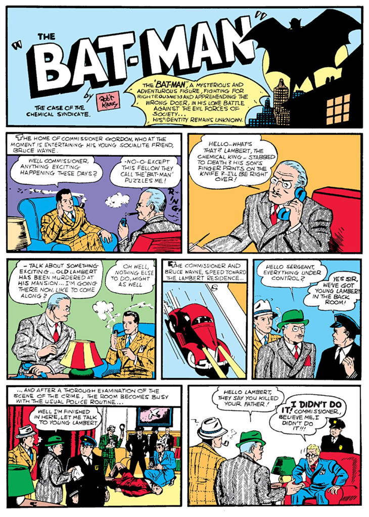
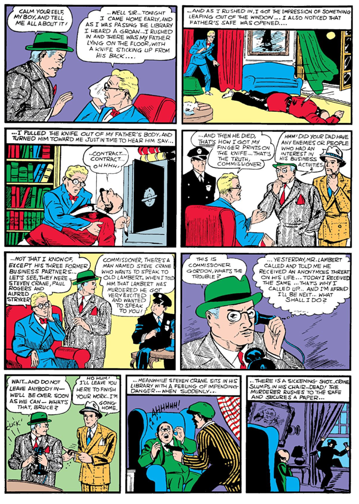
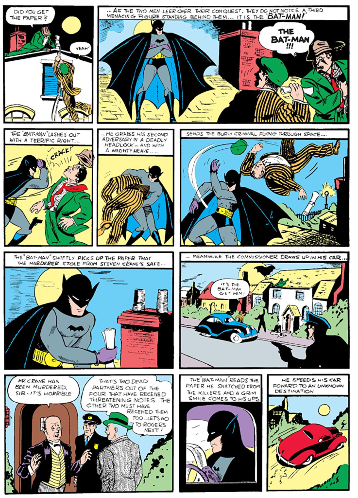
Legally, Bob Kane created Batman. the controversy surrounding this is that his collaborator, Bill Finger was probably more responsible for Batman’s success.
“After Superman debuted in 1938 and became an instant hit, DC editor Vince Sullivan asked Bob Kane to come up with a superhero, which he did with Batman…During that process, he went to a friend, Bill Finger, who gave him some tips on costume adjustments. For example, Bob initially drew bat wings on Batman. Bill suggested a scalloped cape. After Batman became a hit in May, 1939, Bob brought in more people throughout the year.
Bill was an amazing writer, who wrote for Batman for more than 30 years and came up with a lot of great stories, but so did others. Gardner Fox wrote a lot of the stories that inspired the TV series in 1966. Christopher Nolan credits Batman editor Denny O’Neil and writer Alan Moore with influencing him in Batman Begins. Kane, Finger, and Kane’s art assistant, Jerry Robinson, all claimed to have collectively come up with the Joker and Robin…both Finger and Fox laid claim to origin story, which appeared in Detective Comics #33 in November, 1939,” he adds. “We credit Gardner Fox, but I do know that some folks have given credit to Bill Finger over the years, so I guess it’s one of those stories where no one knows for sure.” -Steve Korté
I don’t pretend to be an expert about the origin of Batman, but I have read things to suggest that Kane was pretty well-off, and his father secured a good lawyer for him, so he nailed down the copyright for Batman with the DC comics editors before getting started. As I understand it, the name, the idea he was a detective, and the idea that he was a millionaire masquerading as Batman. This means Kane was riffing on a popular pulp character of the day called “The Shadow”. The difference was that Batman would be a comic book character who looked like a Bat. All the additional concepts, the outfit, the gadgets, the car, the butler, the Joker, etc. are believed to have come from Bill Finger.
The Origins of Marvel Comics
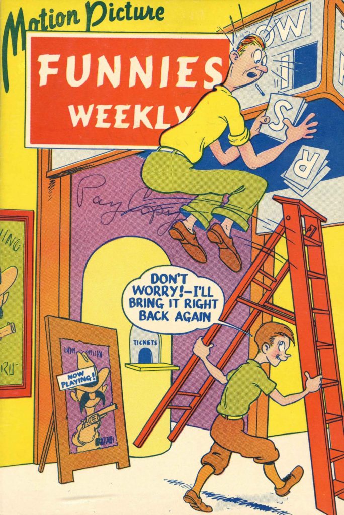
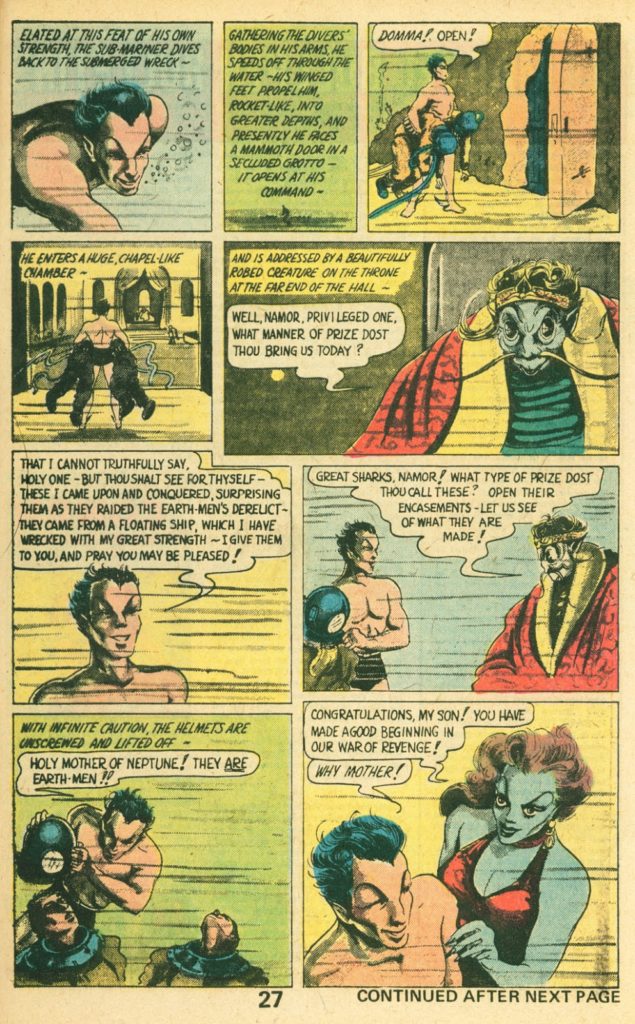
The same month Batman appeared, another “Super Hero” appeared in a comic magazine called “Motion Pictures Funnies Weekly” No 1. The character in that magazine was called “The Sub Mariner” and he was to become the first Marvel super hero, though Marvel didn’t have that publishing name yet. They were about to become known as “Timely Comics” What differentiated the Sub Mariner was that he was an anti-hero.
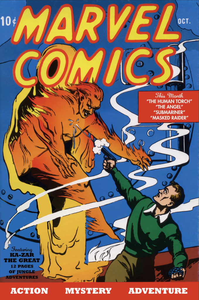
November of 1939 Timely introduced its second character. A flaming android called the Human Torch.
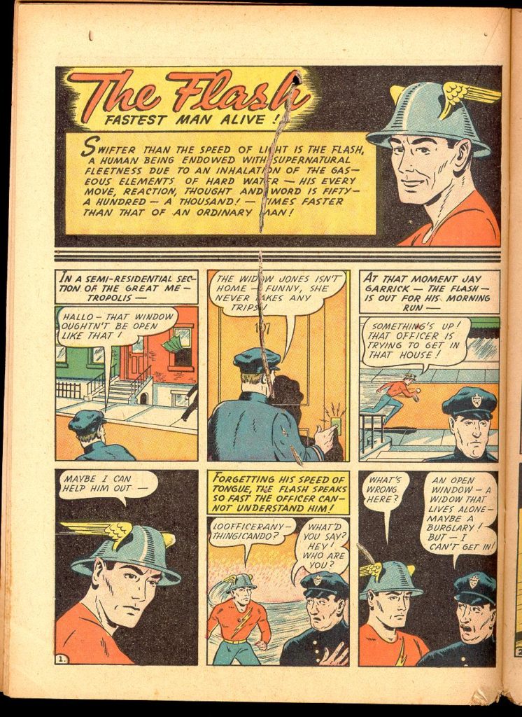
In 1940 the original Flash appeared in an All Star comics publication called “Flash Comics”, All Star Comics would eventually merge with DC.
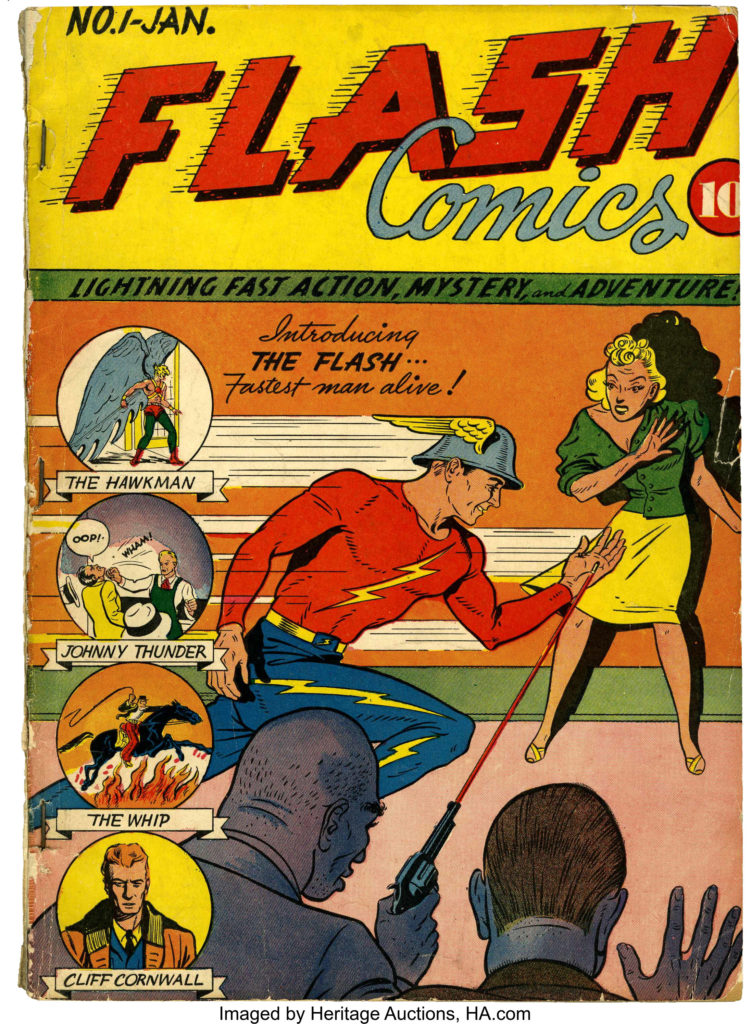
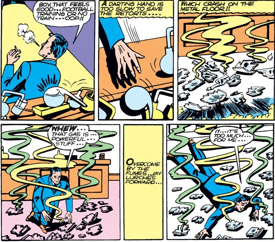
The Flash was the creation of writer Gardner Fox and artist Harry Lampert.
The following month Captan Marvel made his debut in Whiz Comics, published by Fawcett Comics. Written by Bill Parker, and drawn by C.C. Beck. The original name for Captain Marvel was going to be Captain Thunder, but Fawcett’s general manager suggested the change. The original idea was to create a group of characters that all had one special ability, but that idea was rejected. So he created one character with all the special abilities he’d envisioned: Solomon’s wisdom, Hercules’ strength, Atlas’ stamina, Zeus’ power, Achilles’ courage, and Mercury’s speed.
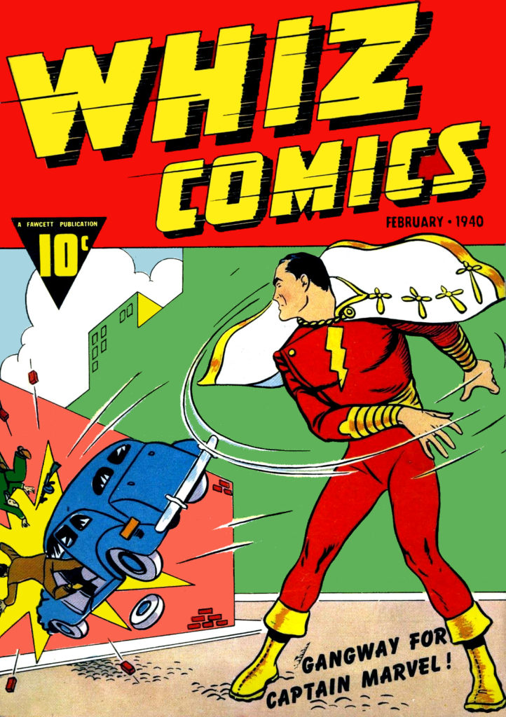
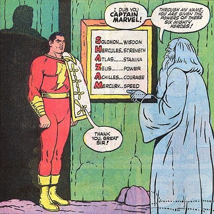
Captain Marvel and the Marvel family were incredibly popular, outselling Superman. DC later sued Fawcett claiming that Captain Marvel was too similar to Superman, and they won!
“The studio behind the film Republic Pictures was originally working with DC, or National Comics Publications at the time, to make a “Superman” picture, but they already had an existing cartoon deal with Paramount Pictures, which prohibited them from signing another. So Republic Pictures chose “Captain Marvel” instead. DC was obviously not pleased. Fawcett had already published “Master Man,” an obvious copy of “Superman” that they stopped publishing after DC had threatened with lawsuit. They believed “Captain Marvel” was just another imitation as well.
In June 1941, National Comics finally sued Fawcett for copyright infringement. This began National Comics Publications versus Fawcett Publications, one of the longest-running legal battles in the history of comic books, lasting over 12 years. Here’s what happened.
DC’s argument was simple, that Captain Marvel’s main powers and characteristics were too similar to Superman and therefore infringed on its copyright. Fawcett argued that although these two characters were similar, it wasn’t to the point of infringement and that similar feats have already been performed by other fictional characters like Popeye or Tarzan.
To prove their point, National Comics prepared a binder over 150 pages in length with panels from their comics of “Superman” juxtaposed with similar panels of “Captain Marvel.” Everything was in close scrutiny, from their costumes, boots, capes, the ability to leap great distances, the ability to fly, extraordinary strength and speed, invincibility to bullets, shells, explosives, and their secret identity. They went as far as to include that they both had clean-cut faces.
The verdict was clear, the judge eventually ruled that “Captain Marvel” was indeed a copy of “Superman,” but it was Fawcett who won the trial. It was all because of one tiny mistake, a mistake that looked like this. This was the copyright symbol used back in the 1950s. The lawyers from Fawcett discovered that McClure Syndicate, the newspaper company that published the “Superman” comics, had forgotten to place these symbols on several of their strips and argued that DC had no copyright to “Superman,” and the court agreed.
This was devastating news for DC. It meant that it did not own Superman and that anyone could publish Superman’s stories without legal repercussions. This lasted over two years. Out of 160 strips of “Superman,” published from January 1939 to April 1950, less than half of them were from Detective Comics.
DC immediately appealed, and despite the damage, the decision was reversed. The judge of the case, Learned Hand, declared “Captain Marvel” a deliberate and unabashed duplicate of “Superman” and told Fawcett to cease all of its publications and pay DC for the damage it owes. Fawcett settled.
By 1950, the Golden Age of Comic Books had come to an end. Sales were slumping to all-time lows, and Fawcett simply decided that it wasn’t worth fighting. They paid $400,000 in damages, almost $4 million by today’s standards, and with its last issue, it seemed like the end for “Captain Marvel.” As you well know, it was not.” – Nathaniel Lee.
A story for later on, but Fawcett reimagined Captain Marvel in the 50s as a character called “MarvelMan”, published later in America as “Miracle Man”, and that is an incredibly fascinating comic, as well as a fascinating story about publishing rights. We’ll discuss it at length when we get to the 90s.
Last thought about Captain Marvel: those comics created the action/comedy model that is the most popular tone for Super Hero properties to this day. It created the idea of the boy super hero, later utilized by Spider Man, and the Teen Titans, and it created the family of super heroes with their own magazines. Mary Marvel and Captain Marvel Jr were both popular enough to get their own books. Elvis famously based his rhinestone outfits on the look of Captain Marvel Jr.
Robin
In April of 1940 Robin debuted in Detective Comics #38. He was the first of the kid sidekicks. Created by Bob Kane, Bill Finger , and Jerry Robinson.

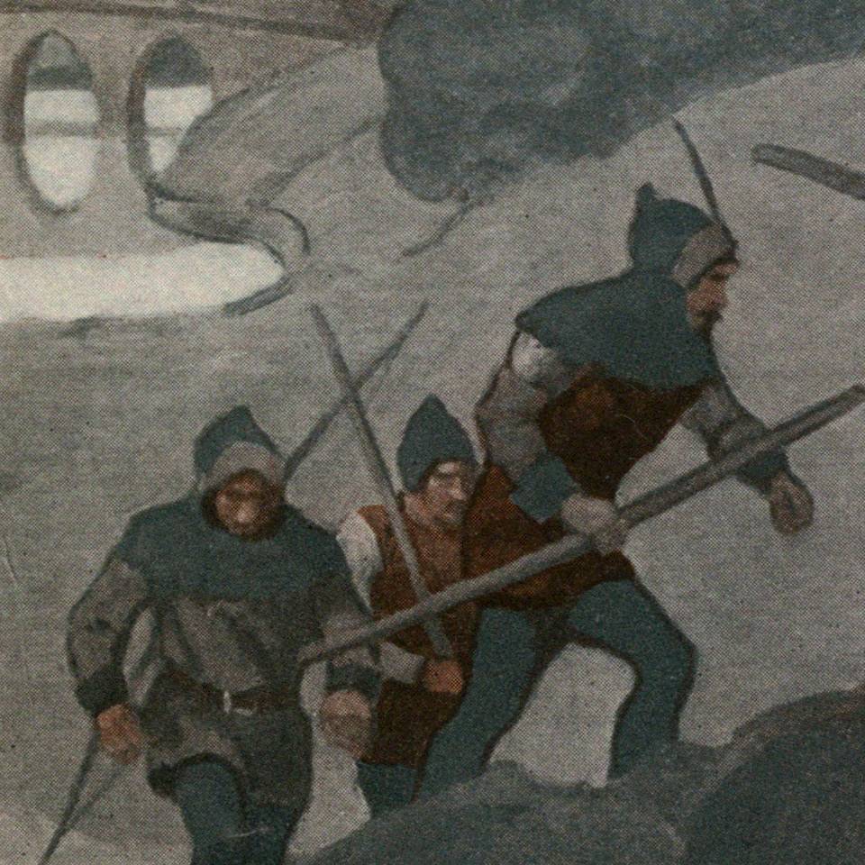
His look was inspired by the concept for the look of “Robin Hood” that was popular at the time. Here’s an illustration of Robin Hood by NC Wyeth
“Robin was an outgrowth of a conversation I had with Bob. As I said, Batman was a combination of Douglas Fairbanks and Sherlock Holmes. Holmes had his Watson. The thing that bothered me was that Batman didn’t have anyone to talk to, and it got a little tiresome always having him thinking. I found that as I went along Batman needed a Watson to talk to. That’s how Robin came to be. Bob called me over and said he was going to put a boy in the strip to identify with Batman. I thought it was a great idea.” – Bill Finger
Green Lantern
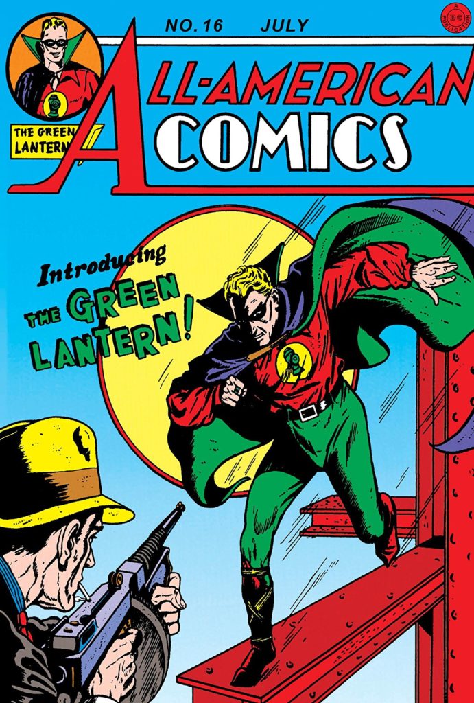
Published in All Star Comics no 16 (All Star Comics would later merge with DC), Martin Nodell created Green Lantern, a man with a magic ring, that could create and/or effect anything he imagined, but could not effect wood. He had to charge the ring every 24 hours by touching it to a battery shaped like a lantern.
Captain America
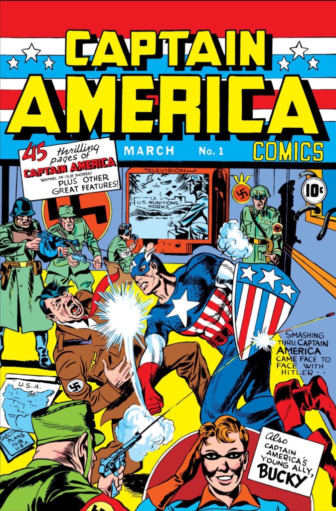
Captain America was pretty popular for a very short time in the 1940s, created by Joe Simon and Jack Kirby. We’ll talk about Jack a LOT in the 60s, 70s, and early 80s. Not the first, but the most popular of all the patriotic heroes that emerged at this time. Captain America would become more significant when revitalized by Kirby and Stan Lee in the 1960s, but even in the 40s he does demonstrate the popular conception of a comic book hero of the day: strong man dressed in bright colors with a teenage sidekick.
Super Hero Team Up
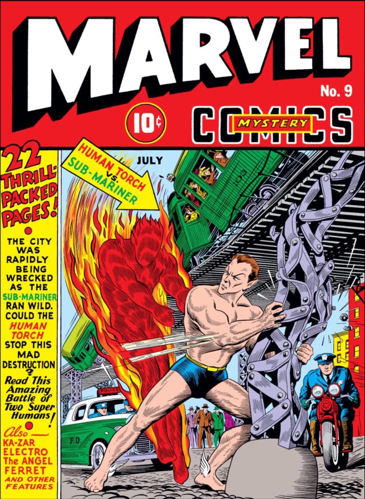
A way in which Timely comics were changing the game of super hero comics in the 40s was by introducing the idea of the super hero team up that begins with a battle between heroes. The first time characters from different books appeared together in one book was Marvel Comics no 9.
Later that year, All Star Comics developed the idea by introducing the Justice Society of America. The first Super Hero Team.
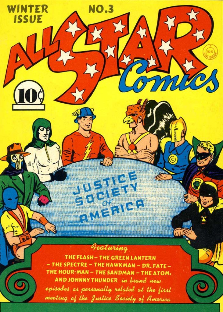
Briefly, the characters shown here from left to right are:
The Atom: a short guy who was a great boxer.
The Sandman: a crimefighter with a gas gun.
The Specter: another Jerry Siegle (of Superman fame) creation, the specter is a cop who died, and was brought back by the literal spirit of vengeance from the Bible. He avenges those who are wronged in godly ways.
The Flash: who we already mentioned.
Hawkman: Carter Hall is the reincarnation of Egyptian prince Khufu who discovered the ninth metal (later changed to nth metal) with gravity defying properties that allowed him to fly. As an archeologist, he used ancient weapons from the museum he curated.
Dr Fate: Without the helmet, Kent Nelson is an ordinary guy. With the helmet, he is possessed by the Egyptian sorcerer Nabu.
Green Lantern: we’ve already discussed.
HourMan: Rex Tyler, chemist, developed a pill that can give him great strength for an hour.
Wonder Woman
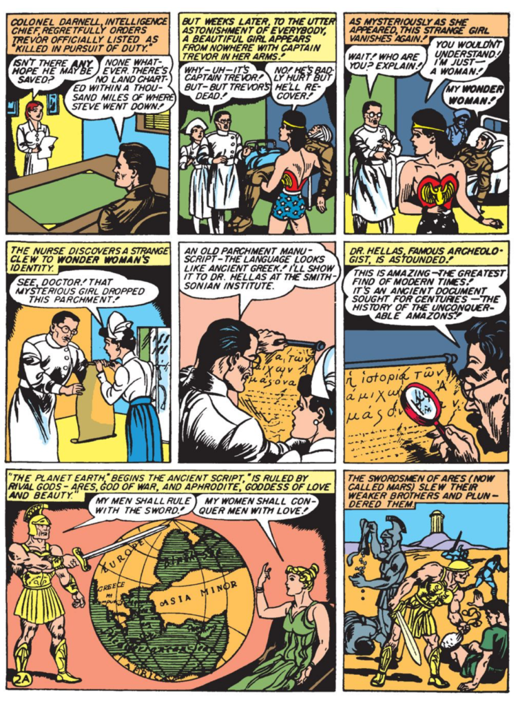
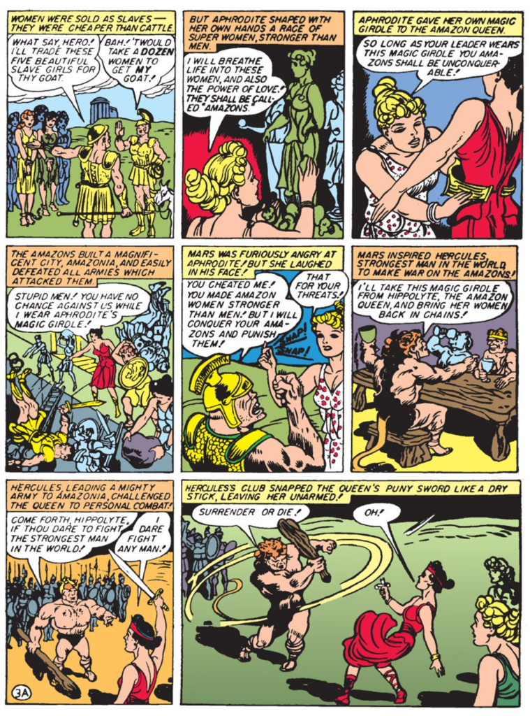
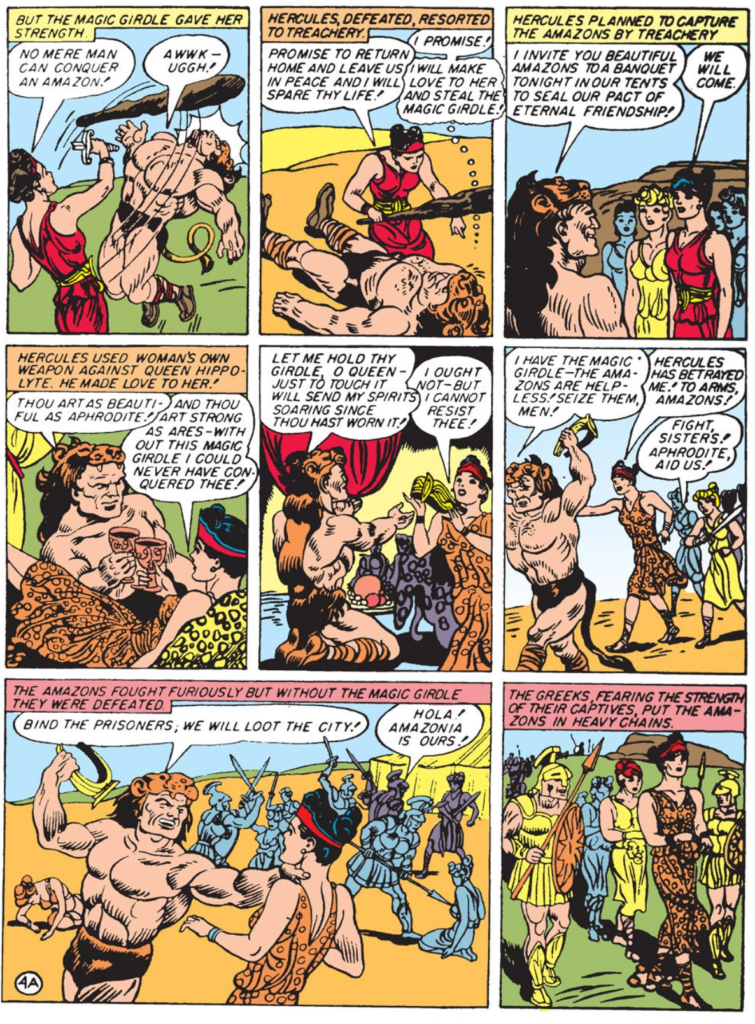
Though Fantomah was the first female super hero with powers to appear in a comic book, Wonder Woman Created in 1942 by William Moulton Marsden and H.G. Peter was the first popular female super hero.
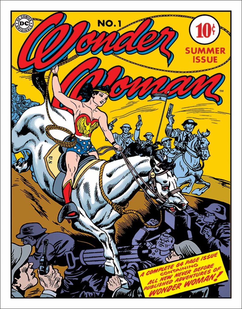
There is a lot to say about Wonder Woman, but I’ll try to condense it to the important points.
- Marsden was famous for having invented the technology that led to the invention of the polygraph. In an interview he mentioned his feelings that the comic book medium could go further.
- Max Gaines, a published at All American Comics, read the interview and immediately contacted Marsden to discuss his creating a comic book character.
- Marsden and his wife discussed the idea and felt the character should be a woman.
- “Not even girls want to be girls so long as our feminine archetype lacks force, strength, and power. Not wanting to be girls, they don’t want to be tender, submissive, peace-loving as good women are. Women’s strong qualities have become despised because of their weakness. The obvious remedy is to create a feminine character with all the strength of Superman plus all the allure of a good and beautiful woman.” — William Moulton Marston
- This is where it gets tricky. Marsden was a swinger who was into bondage. He and his wife had a woman who lived with them named Olive Byrne, and it’s pretty well documented that the three of them coexisted in all the ways you think I’m implying.
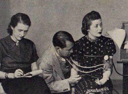
- Wonder Woman, as conceived by Marsden, was an amazon (to connect her to mythology), but he gave her 2 tools I want to mention first: a lasso of truth (whenever she puts it around someone they are compelled to tell the truth) and bullet proof bracelets. However, while the bracelets give her the power to deflect bullets they also rob her of her power if they are bound by a man. I think the metaphor is clear when you see this photo featuring Marsden’s wife hooked up to a lie detector, and Olivia taking notes as she wears he bracelets that were likely used for other activities behind closed doors.
Decline of Super Hero Comics
After World War II super hero comics felt trite. Nearly all ceased publication by 1949. The ones that remained were Batman, Superman and Wonder Woman.
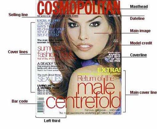
Magazine Cover ANATOMY
Dateline: Month and date of the publication, often with the price underneath
Main image: This is where the main image of the model is shown
Model Credit: It is rarely seen on normal magazines but it is done sometimes on fashion magazines.
Coverline: From the 1950s, greater competition on the newsstands resulted in more cover lines
Main Cover Line: This is very large – taking up almost a quarter of the magazine cover – and comes in three layers, each with a different colour.
Left Third: The left third of the magazine cover is vital for sales in shops where the magazine is not shown full-frontage.
Bar Code: Standard bar code used by retailers, displayed on UK magazines since 1988.
Cover lines: They may be tweaked to exploit new printing techniques; switch from full face to a body shot; use illustration rather than photography; move the target readership age up or down; or simply to freshen things up.
Cover Lines
Cover lines are exclusively the domain of periodicals. The content, use and placement of cover lines are up to the designer, but placement in the newsstand is a high determining factor.
Tag Line is a line under the logo or a slogan that helps the reader understand what the periodical is about and helps identify target market.
Headline is a line that tells the reader something about the main story in the publication, can also be attributed to every story in the periodical as a title for each story. This headline helps inform the reader what they are about to read should they purchase the periodical. Many periodicals misuse the headline, generating interest with a misleading phrase or quote. This practice is known as “yellow journalism”.
Kicker is the copy appearing after the headline that sets up the thesis of the article, sets the tone, etc.
Pull-Quotes are a design tool for breaking up the copy and drawing the reader’s attention to material in the article the designer feels is important, or eye catching.
Sub heads or subheadings also known as cross heads are another way to break up the copy and help a reader find a specific section in an article, or just break up dense copy so that it is more legible.
Bylines and Credits tell us who wrote the article, and possible who contributed photos or illustrations to the story.
Body Copy this is the actual substance of the articles in the publication.
Panels, box copy, sidebars, and infographics these all function as a way to add insight to the larger idea without actually interrupting the body copy.
Captions used to clarify images or provide a bridge between image and body copy.
Folios page number, publication title, sometimes a section or chapter title, this helps the reader navigate the publication if the publication is designed so that they can skip around.
