For every printing need there is a specific type of paper that will suit the job perfectly.

However, with so many different sheet types and sizes available on the market, it can be difficult to determine which ones can be used with your printer and which ones are right for a particular job.

Even when you’ve got to grips with the range of paper types and sizes, there are also different coatings and weights to choose from.

Printing paper types

Printing paper comes in many different types, each with different uses and benefits. Here are some of the most popular types of printing paper:

Inkjet Printer Paper

This type of paper is designed for specific use with inkjet printers. There are different forms of inkjet paper which work well with inkjet ink, including photo, glossy, business card, and greeting card variants.

Laser Printer Paper

Laser paper is best used with a laser printer. This is used more in business environments for tasks such as printing documents, cheques, and mailing labels.

Matte

This paper is one of the most frequently used, as it is suitable for all everyday printing tasks. Matte paper is finished with a white coating which helps the ink to dry faster than on other paper types, and means it is suitable for a document that is needed quickly.

Bright White

Bright white paper sheets are much smoother and are non-textured, which makes them ideal for high-quality, presentable double-sided printing. The brightness of the paper ensures that both sides can be printed on without the ink showing through on the other side.

Glossy

This paper type is traditionally used when printing images or photographs rather than text, as it has the ability to produce brilliant colours and sharp images. The glossy surface absorbs the ink, creating much higher clarity images than you could expect from matte paper.

Card Stock

This strong, sturdy paper type is most often used for scrapbooking or to print business cards and postcards. As it is significantly thicker than other types of printer paper, it is much more durable and can be carried and passed around without becoming tattered.

Resume

Slightly heavier than traditional paper, and with an off-white appearance, this type of paper is unique from other forms of printer paper. Resume paper features an ivory or cream tone and is commonly used for CVs or other important documents, to indicate that printed information is of high importance.

printing paper types

Paper sizes

A size

Most printer users are probably already aware of ‘A size’ paper. These are the most widely used, and easily distinguishable paper sizes. These paper sizes are simple to understand, as they increase and decrease in successive order, with A1 being the biggest paper size and A10 the smallest.

Paper Size Width x Height (mm) Width x height (inches)
A1 594 x 841 mm 23.4 x 33.1 in
A2 420 x 594 mm 16.5 x 23.4 in
A3 297 x 420 mm 11.7 x 16.5 in
A4 210 x 297 mm 8.3 x 11.7 in
A5 148 x 210 mm 5.8 x 8.3 in
A6 105 x 148 mm 4.1 x 5.8 in
A7 74 x 105 mm 2.9 x 4.1 in
A8 52 x 74 mm 2.0 x 2.9 in
A9 37 x 52 mm 1.5 x 2.0 in
A10 26 x 37 mm 1.0 x 1.5 in

A4

A4 paper is the most commonly-used for printing and measures 210mm x 297mm. This paper comes in many different weights and with several different coatings, meaning there is an A4 paper that is suitable for any printing job. This paper size is not only suitable for everyday tasks but can usually fit special purposes too.

A3

A3 paper sizes measures 297mm x 420mm, which is twice the size of A4 paper. This larger sheet allows you to print documents that need to make more of a visual impact, including large graphic pieces or high-resolution images. Large format A3 printers are extremely versatile as they have the ability to print in both A3 and A4, along with having faster print engines.

Other A sizes

Smaller A sizes such as A5 and A6 are also available, which are great paper options for printing flyers or other small media. There are also larger options like A2 and A1 which allow you to print posters and banners.

SRA

The SRA paper, or the ‘supplementary raw format A’ range is produced slightly more oversized than A size paper. Due to this it’s mainly used for commercial printing, as it allows room for bleeding, gripping and trimming. The most common size in this range is SRA3 paper, which can be used in many digital print machines.

C size

C size paper is a range of paper used exclusively for envelopes. The sizes vary from C1 to C10, and mainly correspond to their similar sizes in the A range of paper, although by design they are slightly bigger. This marginal difference in size allows the similar A size sheet to fit inside the envelope.

Size Width x Height (mm) Width x Height (in)
C1 648 x 917 mm 25.5 x 36.1 in
C2 458 x 648 mm 18.0 x 25.5 in
C3 324 x 458 mm 12.8 x 18.0 in
C4 229 x 324 mm 9.0 x 12.8 in
C5 162 x 229 mm 6.4 x 9.0 in
C6 114 x 162 mm 4.5 x 6.4 in
C7 81 x 114 mm 3.2 x 4.5 in
C8 57 x 81 mm 2.2 x 3.2 in
C9 40 x 57 mm 1.6 x 2.2 in
C10 28 x 40 mm 1.1 x 1.6 in

Paper weights

paper being printed

Image Credit: iStockPhoto.com / johnnyscriv (Via Custard Online Marketing)

As well as a range of paper sizes, there are various weights available for different uses.

Paper weight is generally measured in GSM. This stands for ‘Grams per Square Metre’ and is a measurement of paper thickness or density, which directly relates to the quality of the media.

The higher the GSM value of the paper, the thicker it is. As the description suggests, it indicates how much a 1 metre x 1 metre square piece of the paper would weigh in grams.

Generally, the thicker the paper, the more durable the sheet will be. Therefore, different paper weights have different uses, with thicker paper being used for more industrial purposes.

Common printer paper weights

300GSM+ Good quality business card, or heavy card media
180GSM – 250GSM Middle market magazine cover
130GSM – 170GSM Promotional posters
80GSM Standard issue day-to-day office matte white paper
35GSM – 55GSM Most everyday newspapers

Paper coating types

Printing paper can also be found with many different coatings, which will give the sheet a specific finish and thereby determine its suitability for a certain job.

Some of the most common paper coatings are as follows:

Varnish

These coatings can be found in either gloss, satin or dull finishes, and can be tinted in certain colours.

They are an incredibly affordable choice of coating, but have a lower level of protection compared to other laminates. Varnish coatings are useful for adding a gloss to a photo, giving a professional appearance.

UV

This coating offers a much higher level of protection to printed sheets and will enhance the printed colours.

It is applied as a liquid before being hardened under ultraviolet light, and can therefore vary in thickness. This coating can be applied either matte or gloss, along with specialised glitter or tinted finishes.

Aqueous

These coatings protect prints from fingerprints and other markings or damages.

Aqueous coating is fast to dry as it is water-based. Its major plus point is that these coatings are more environmentally-friendly than alternative options.

Paper opacity

Another thing to consider when purchasing printer paper is the opacity of the sheets. This refers to how transparent or opaque they are, or how much light they let through.

The weight of paper generally influences the opacity of the paper, with heavier paper usually being more opaque.

The opacity of a sheet of paper is measured on a scale of 0 to 100. A sheet which measures as 0 is a transparent sheet, while 100 would be a completely opaque sheet.

Different opacities will have different uses, for example, extremely transparent sheets can be used for tracing paper.

There you have it, a definitive, in-depth look at the different types of paper available on the market. This guide should clear up any questions or hesitations you have about which paper you need for your print job.

However, if you need any more assistance or have further questions regarding your printer, feel free to contact our team of experts who will be more than happy to help.

Any publication needs to be broken into its components to maximize design/artistry. There are several issues to consider. We will discuss physical considerations in another post, but this post will focus on content specific ideas.

Book Specific Issues

The Cover (Front Cover, Back Cover, and Spine)

The End pages

Front Matter (preliminary pages) often comprising the title, author name, publisher, and sometimes an image. Sometimes the image is on an additional page. On a separate page there is often a copyright statement. Often a dedication will appear here or around the title page.

Title Page often includes the same info: the title, author name, publisher, year of publication, and sometimes an image

Contents Page if included this will help a reader find sections within the book, assuming it is divided thusly.

Preface a short statement about the book’s thesis, goals, origin, and perhaps additional author notes.

Forward similar to a preface, but usually written by someone other than the author

Content the material written by the author.

Bibliography and Recommended Reading will appear in an academic work or a work that has used citations. It may also appear in fiction if the author wants to point people toward sources of inspiration fiction and non-fiction alike.

Index may appear in a reference volume of any type. May also appear in an illustrated volume. This may also be an alternate position for a dedication.

Magazine Specific Issues

Magazines usually break down into 3 areas:

  1. The News-led first section: generally this contains contents, letters, editorials, contemporary news specific to the subject of the magazine/newspaper. Uses a variety of font sizes to help organize the elements of the page, but also to provide energy
  2. The middle section housing “features” or “The Feature Well”: contains celebrity interviews, or in-depth analysis of something happening in the industry specific to the magazine. The designer may employ white space, illustrations, photographs, or a wide variety of typographic ideas in order to differentiate the publication and/or grab attention. 
  3. A back section called (shockingly) “the back of the book” that houses information-based content.

Comics Specific Issues

Comics and Graphic Novels often borrow from book design and magazine design as those publications are sort of a cross between the two. The biggest thing to know about comics is that left/right facing pages matter more than in most other publications. Many comic storytellers build their “reveals” (the moment where something really interesting happens) into the material one would first see as they turn a page. The big comic specific problem is that art work that is really eye catching can spoil a story point if a reader gets to it before the artist intended as a result of glancing over too soon.

When one creates a new publication standard practice is to visually establish the brand message. This is also known as the identity, or how the publication feels emotionally to its intended audience.

Traditionally, this is created by the editor and designer working to create this “brand” for the client. However, in recent years, these roles are merging. Often the client will deal directly with the designer. In this instance the designer and the client take on the roles once held by the editor.

The challenge to creating this identity is that the designer must look at established norms for the intended audience, then determine how to communicate with that audience in a way that feels relevant. The term “relevant” in-and-of-itself has become “irrelevant” due to overuse, but the idea is that the design needs to be fresh without alienating the established customer base. Sci-fi novels, for example, have a look that is unlike a “Dummy’s Guide”, and “Dummy’s Guide’s” have a look that is unlike literary fiction.

The cover should help the target audience understand at a glance that this is a publication that might appeal to them.

There are several ways to accomplish this goal without having to stick to established current norms.

Look to the past. What has worked in this market before?

Look adjacently. Is there a trend in this market in another medium, like TV, movies, games, the internet, etc. where the designer might pull ideas?

Look at closely related publications to see if there are developing trends. For example: a sci-fi novel may have roots in comic books, fantasy novels, or the tech market.

Remember to take care of basics. For example: a publication for young readers might want you to design with a larger than normal font size to help younger readers read. Likewise, a book for younger readers will typically use a wider range of colors than a publication for teens and adults. Conversely, a publication aimed at an elderly market may also use large type, but utilize a more limited color palette. An “indie” publication should take more risks with design, because they will need those risks in order to stand out, and appeal to a customer base that is looking for something different.

Often, publishers will make use of a “dummy”, sometimes called a “pilot” (just like a tv show). The idea is to make the publication using self-publishing techniques, so one can look at the completed finished product in a physical form before sending it to a printing office. I have seen a publication go through 5 to 10 variations before a final version is achieved. I have heard of people producing many more than that, especially in the magazine industry. In comics (my primary medium) I am constantly surprised by my own inability to see drawing errors till “the next day”.

In some industries the “dummy” will be used in order to experiment with typefaces, paper stock, grid systems, and anything else that might be up for debate.

Typically, as one achieves knowledge of the brand’s “standards” those standards will be written down in some format easily accessible by a wide range of freelancers who might need the information. If it is a publisher who is producing a wide range of publications, but they want some elements to be consistent across their line they will often collect that data in an online format for freelancers to access. Trade dress, typefaces, logos, are all stored in this way.

Psychology can be utilized in designing a publication. Hard data to suggest that many, or any, of the norms established over the last century are real, but if you work in publishing, you will encounter people who have very specific “taste” opinions about what is and is not good. I know an editor who thinks gradients are passé. I know an editor who won’t publish the product unless there is a minority on the cover. I know an editor who won’t publish the product unless a blonde woman is on the cover. Some think red sells, and green does not. Yellow is typically avoided by most magazine publishers. 

I would say that these people are right, until they are wrong. In other words, there is a ton of anecdotal evidence to suggest that what editors think makes something work is not what makes something work.

So, what makes a publication work?  

Who knows?

I think it is good content that people know about. I heard a great story in comics once. There was an artist named Jack Kirby. In the 60s he was doing the best work of his life. He was in his late 40s/early 50s. His co-creator was a writer named Stan Lee. It has been argued that Stan did very little of the work in creating their comics. Stan would call up Jack, talk through an idea, then Jack would go turn it into a story. Then Stan would look at the drawings, and add words.

The question becomes: who wrote the story? Many of Kirby’s fans say he did, and I tend to agree with them. Having an idea for a story is not writing a story. The person who sits down and fleshes it out, and figures out the structure, and the emotional beats wrote the thing. It is pretty well documented that was Jack!

However, Jack had been drawing comics by this time for over twenty years. he never enjoyed the success he had with Stan before or after their collaboration. It could just as easily be argued that if it weren’t for Stan’s final polish, and if it weren’t for Stan cheering Jack on publicly, letting all interested parties know they should look at Jack’s work, no one would have known about it. 

Stan and Jack created the Avengers, Iron Man, the Hulk, Ant-Man, the Fantastic Four, Black Panther, and a host of other amazing characters. 

My point is that for something to be remarkable content it has to both be exceptionally crafted as well as exceptionally marketed. 

Branding, as presented in this article is the beginning of that marketing. There are other applications for the term “branding” we will discuss shortly, and in some ways it’s the last thing a marketer should worry about. 

One of the best ways to create vector graphics is to trace them. We can do this with the pen tool, but sometimes we want trace something more complicated, and it makes more sense to let the software handle it.

I will show you two examples of this:

  1. I have a drawing I need to blow up really big.

So, this is a drawing I made to celebrate a friend’s birthday. My friend, June Brigman, is a very accomplished comic book artist. This is my recreation of one of her most celebrated covers. Imagine that I need to put this image on a 36″ poster. That would be a pixilation problem, because I drew it at 6″. So, the only real solution I have here is to scan it at a really high DPI (in this case the scanner I had maxed out at 1200 DPI). It I simply turned this into a 300 DPI image (minimum requirement for printing) I could print it at 24″ effortlessly, because it is already that scale. However, to get all the way to 36″ without pixilation problems, the easiest thing to do is to drop it into adobe illustrator, and do a “trace and expand”

I’ve opened it up in Illustrator

As you can see, one of the first options is “Trace”. This option only appears when you open a raster image in illustrator. There is a dropdown menu. You can chose the option that’s right for you, but in this case I’m choosing “High Fidelity Photo”.

The next step is to “expand”, meaning to convert the tracing into “paths” as you might create with the shape tool or the pen tool.

Now the image is essentially a series of paths and you can expand the image or output the image as much as you’d like without pixilation.

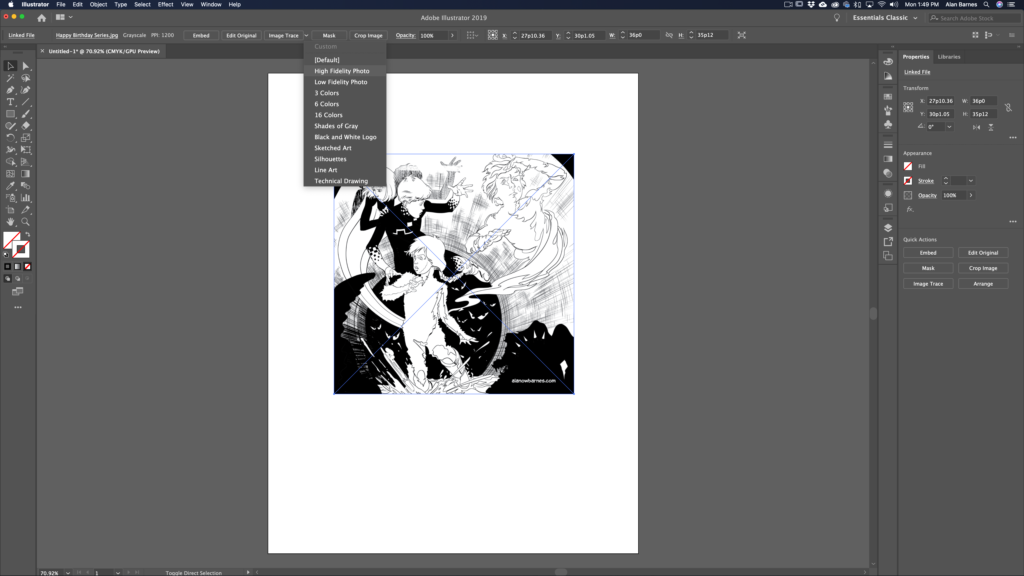
There are some “gotchas” related to this technique. For example: you will loose some of the fine detail intrinsic to drawing on paper. Brush details, and drawing effects will be lost.

Also, you may need to “clean up” the image by removing white bits. This happens with more complete drawings. It’s easy to do. Put a colored shape behind the drawing so you can see what you need to see. Then, using the magic wand tool, select white, then delete that white you’ve selected. In all honesty converting line art like this to a vector graphic works best when the image comes in as a 2-bit file (white and black only…no gray marks).

          2. The second reason you may want to use something like this is if you need to recreate an icon quickly.

Here’s an icon I made for a book a while back.

I drew this. So now I want to make it a vector graphic.

First I might “clean it up by removing my ink spatter, and convert it to a 2-bit file.

Then take it in to illustrator and do a trace and expand.

In this case I did it as a “Black and White Logo”

Then I did a “simplify” in order to clean up the marks even more.

An added reason to do this is that it would make it really easy to change the color of the icon or add a stroke, or whatever!