Month: February 2020
Graphic Design and Typography
The 1980s were so totally tubular that it can be challenging to find authentic graphic design from that decade – so much of what is on the Internet is actually current and was only inspired by the ’80s. And why not? Carrying the brashness of ’70s graphic design over, the Me Decade was all about grabbing attention, with its bold, neon colors, jagged typography and hair-raising styles.
The ’80s saw the launch of such memorable ad campaigns as “Where’s the beef?” from Wendy’s, “Just do it” from Nike, “Be all that you can be” from the U.S. Army and “What would you do for a Klondike bar?” Urban culture became mainstream through movies such as “Breakin’” and “Krush Groove,” with the fashions and designs infiltrating themselves into pop culture and advertising.
What were some of your favorite campaigns to come out of the ’80s?
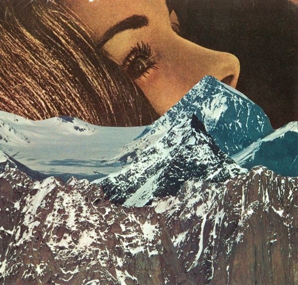
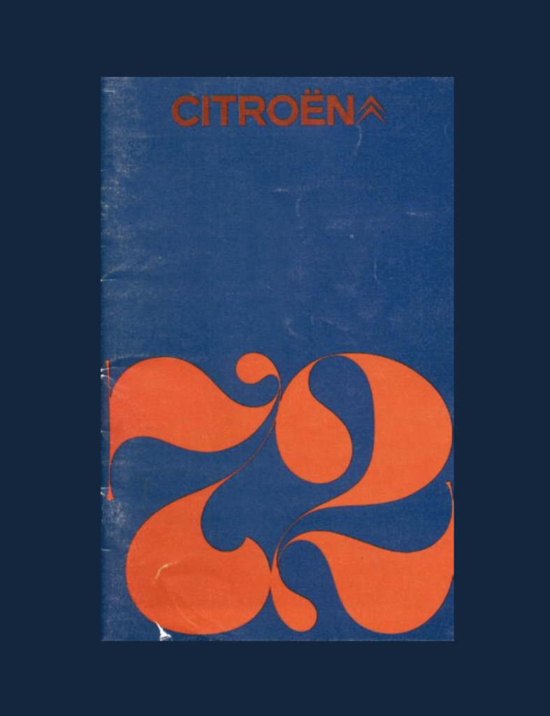
Note the disco text effect that carried over from the ’70s.
The “Just Do It” ad campaign, launched in 1988, was chosen by Advertising Age as one of the top five ad slogans of the 20th century.

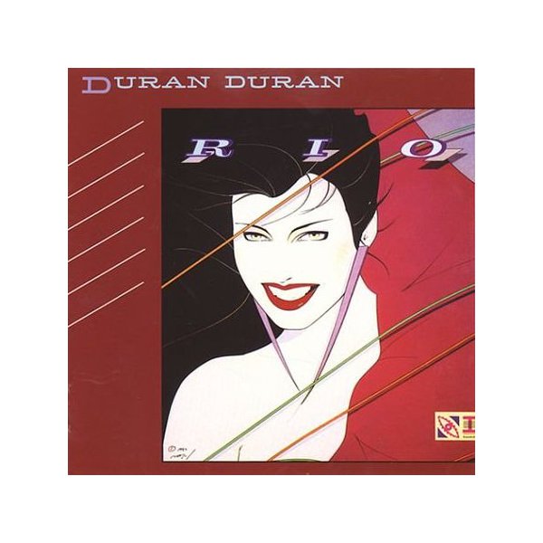
Artist Patrick Nagel was perhaps best known for designing Duran Duran’s “Rio” album cover.
Inspiration for Dharma products in “Lost?”
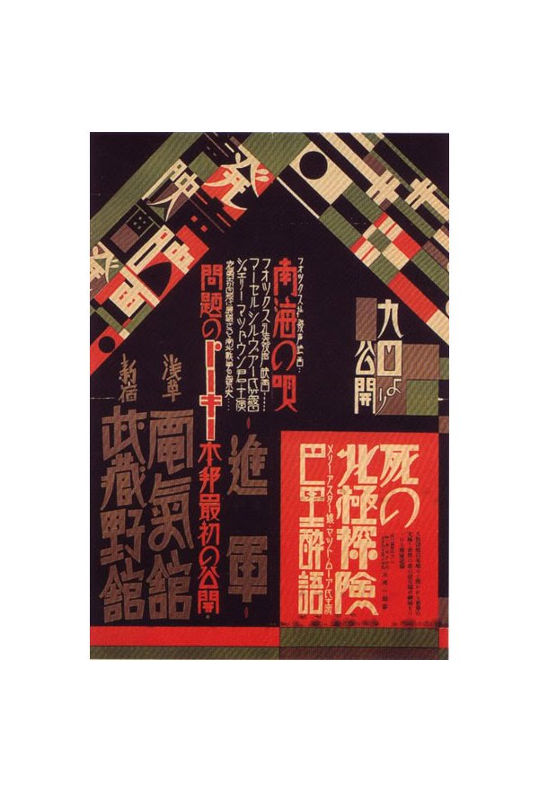
Japanese graphic artists also turned toward brighter hues in the ’80s.
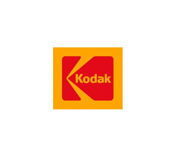
Kodak’s 1987 logo redesign.
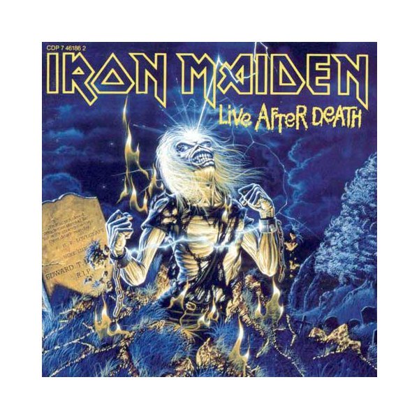
The skin-ripping skull adorned many skateboards and hoodies back in the day.
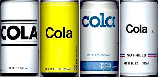
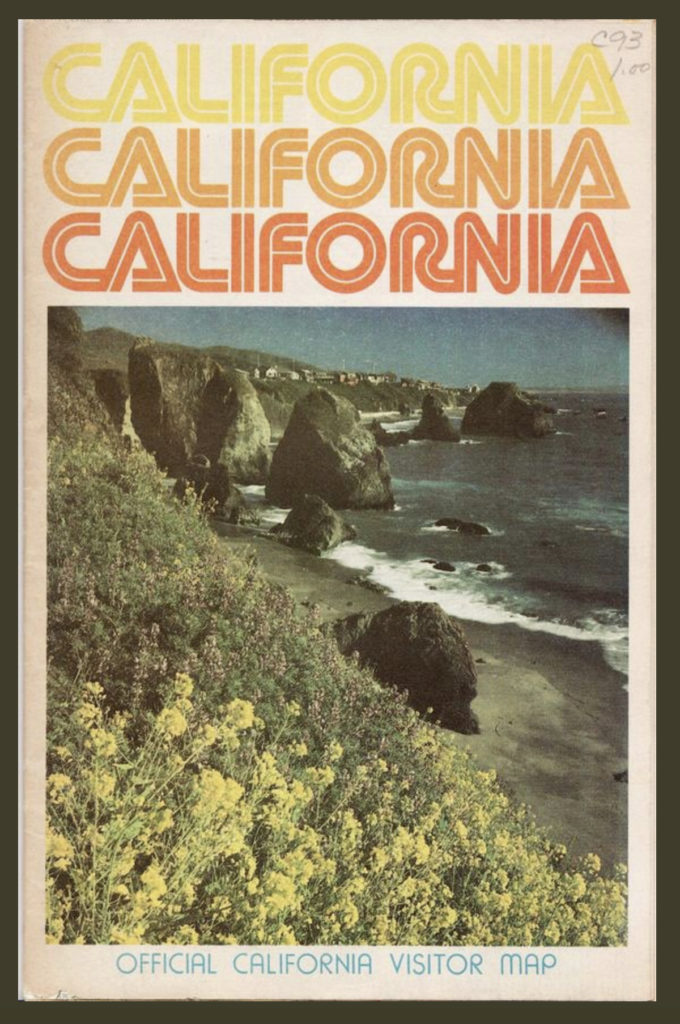
The ubiquitous ’80s logo: blocky text in pastel colors.
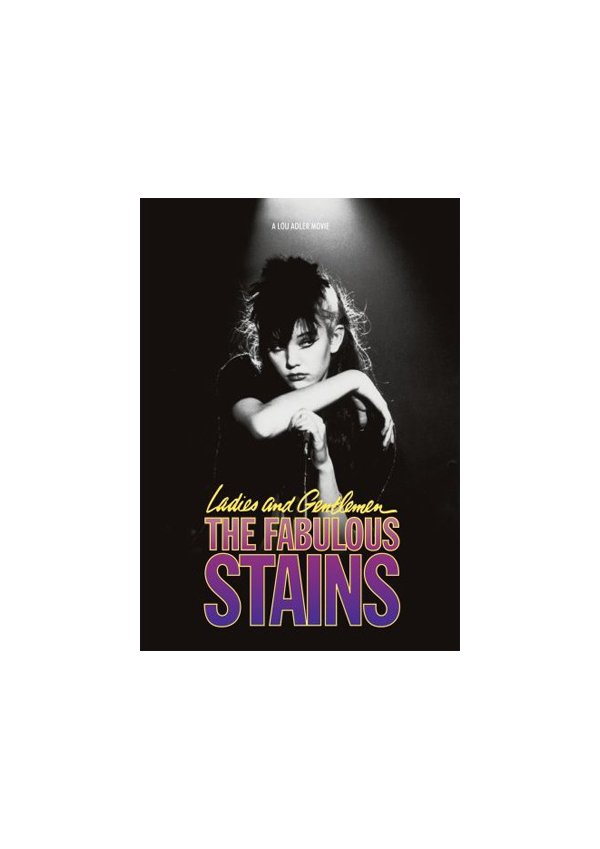
This 1981 cult classic starred a very young Diane Lane.
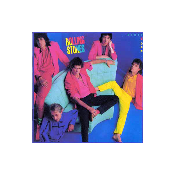
Even the Rolling Stones couldn’t escape the trends of the decade.
Heavy metal of that decade tended toward shock and gore.
A lot of ’80s design incorporated the American flag in some way with stripes and red, white and blue.
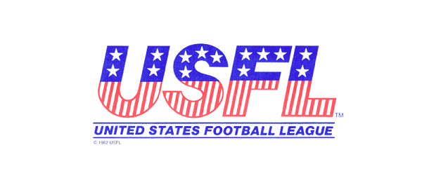
The 1984 Summer Olympics in Los Angeles followed that same trend.
![]()
Microsoft introduced the Windows operating system in 1985 – note Microsoft is following the line trend in its name.

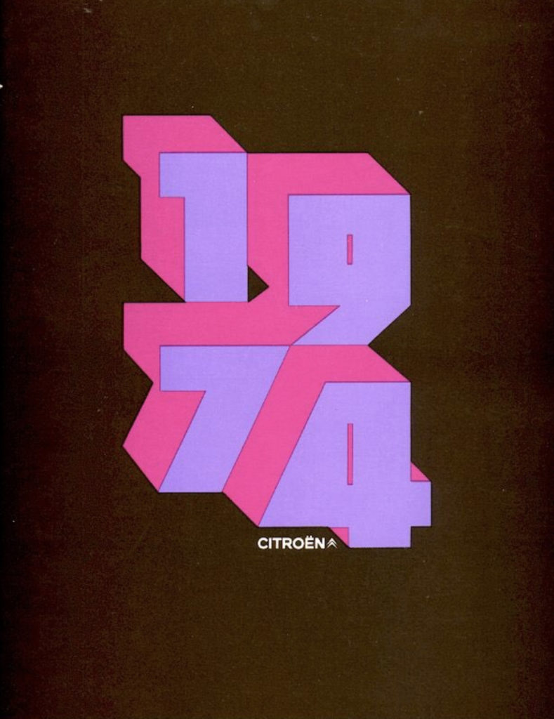
More of the popular “liney” text effect, like with the 1984 Olympics logo.
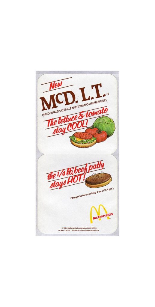
The short-lived McDLT was an environmental controversy with its extensive styrofoam packaging.
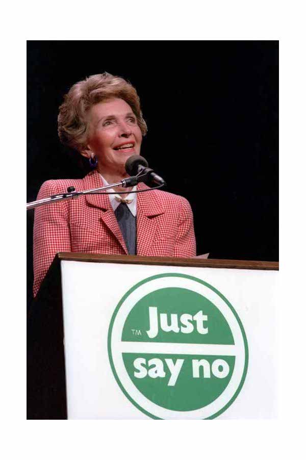
The phrase “just say no” was first uttered by First Lady Nancy Reagan in 1982.
Co-founder Shawn Stussy used to scrawl his surname on his handcrafted surfboards with a marker.
![]()
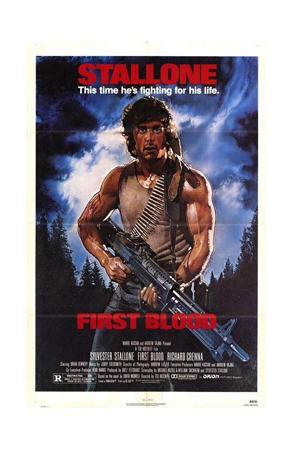
Before becoming parody fodder, Sylvester Stallone received critical acclaim for “First Blood.”
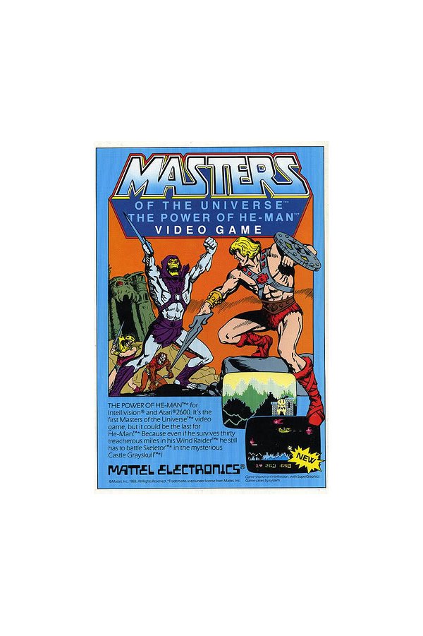
The font for Mattel Electronics is so cliche 1980s.
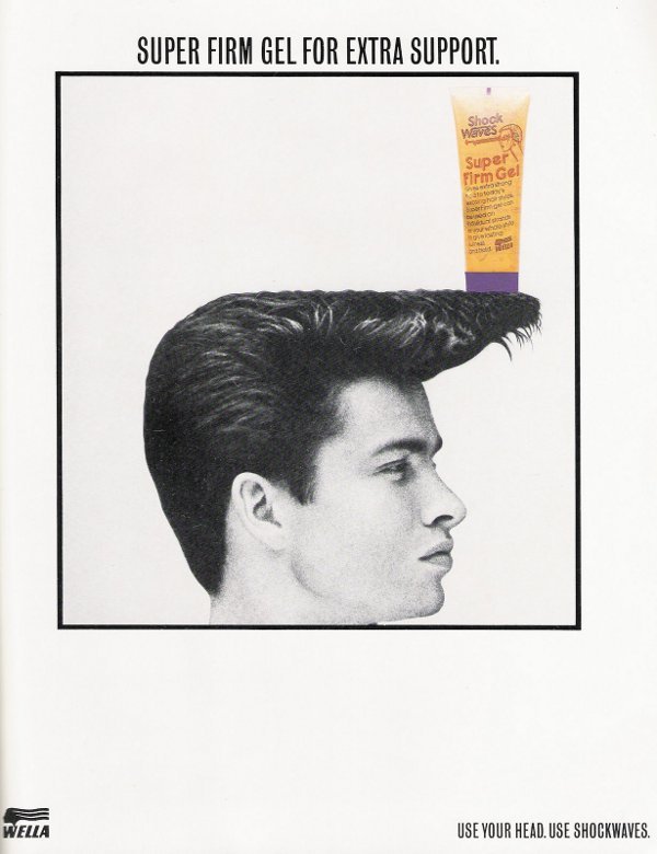
The selective color stands up to the severe hairstyle.
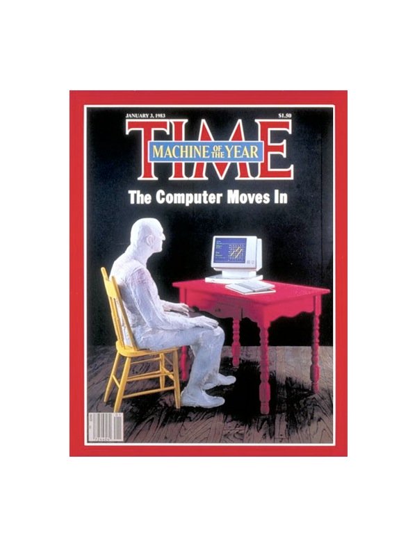
Time magazine made curious use of selective color in this 1983 cover.
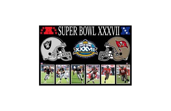
The Swashbuckler Bowl featured skulls and serif fonts. UPDATE: Totally wrong decade! Thanks to commenters for pointing out my error. Which Super Bowl of the 1980s would you include?
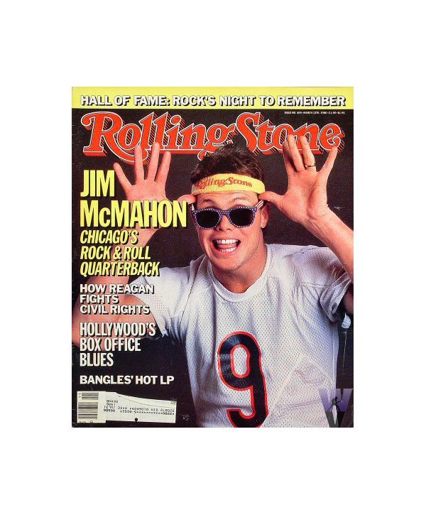
Rolling Stone’s font and header matched Jim McMahon’s headband.
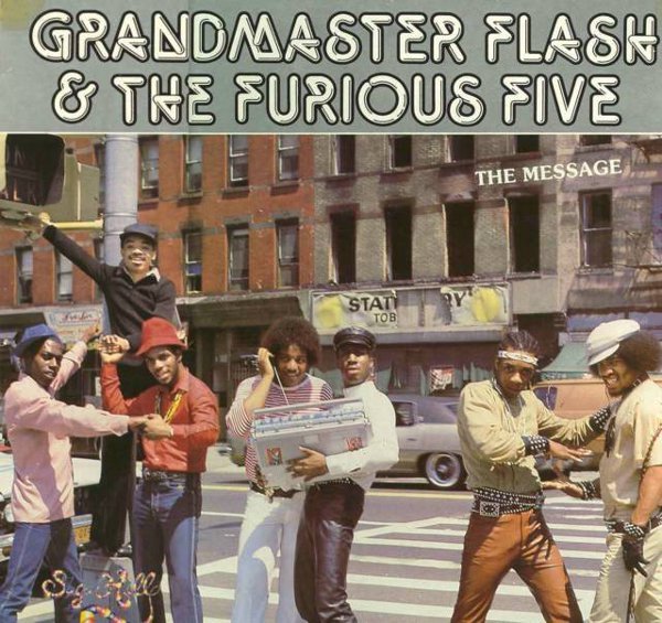
The album cover font resembles neon tubing – a popular text effect of the decade.
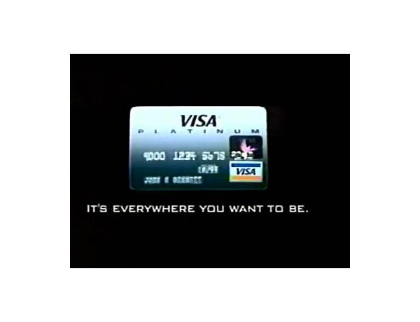
In 1984, most Visa credit cards began to feature a hologram of a dove.
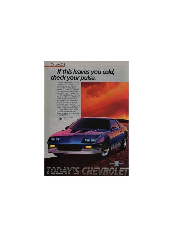
So much text in this ad – and all of it in a serif font.
Illustration
The 1980s were creative years in illustration. “Neo-Expressionist” artists like Marshall Arisman and Gary Panter shook the mildness out of magazine art with their scratched lines, splattered inks, jagged shapes, and implied violence. “The New Illustration” showed influences of punk rock attitude, while making social and cultural commentary. Crude or primitive drawing became more acceptable in the minds of some art directors, while most of the profession maintained the status quo of past decades.
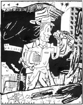
Gary Panter
Gary Panter and other comics artists rose from the underground into the light of mainstream publishing as comics attracted a wider audience. The extended length comic narrative surged forward with the The Dark Knight Returns by Frank Miller, a story that delved into the psychology of the most troubled of crime-fighting heroes, Batman, and led the way to other thoughtful and complex story-telling that would form the genre called the “graphic novel.”
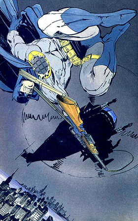
Frank Miller, graphic novel, The Dark Knight Returns, 1986
Beginning with the conceptual illustrations done for The New York Times in the 1970s, a symbolic and surrealistic illustration style became popular in the 1980s and 1990s in other areas of publishing. In advertising and marketing for businesses, in corporate annual reports, and in business and financial publications, concepts were being treated with solutions, which, although often creative, were of a common type. The businessman or woman, the office worker, and the investor were symbolized by a single generic figure interacting with a symbolic, concept-based environment that represented the company. The “corporate everyman” (or team of employees) was seen climbing ladders to attain goals, crossing half-built bridges to show perilous transitions, and facing many other metaphorical situations.
George Abe
There were lucrative markets in the favored business world of Reagan-era economics. Artists like Mark English, Fred Otnes, Bernie Fuchs and Robert Heindel earned large fees for the paintings they produced for corporations, institutions, and advertising clients. And, if they chose to, they could also function as fine artists by creating self-authored works on subjects of their choice and selling them as art for corporate offices for very substantial sums. This, along with editorial and book illustration assignments, allowed this first rank of American illustrators to live an envied lifestyle and to serve as role models for both financial and artistic success.
Mark English
Robert Heindel
Children’s book illustration continued to grow as a field in the 1980s and showed a wide range of styles and content. In a strong economy illustrators could conduct fully active careers solely on income from children’s publishers. Trina Schart Hyman, Nancy Burkholm Eckert, Chris van Allsburg, Barry Moser, Alice and Martin Provensen, Susan Jeffers, Mercer Mayer, and Tommy dePaola were among the most successful ones. And in this decade, for the first time in history, there were picture books being created by African-Americans about the African-American experience. These include Leo Dillon, of the illustrator team Leo and Diane Dillon (Ashanti to Zulu), Jerry Pinkney (Tales of Uncle Remus), and John Steptoe (Mufaro’s Beautiful Daughters). Steptoe’s career was cut short in 1989 when he died of the AIDS virus but Pinkney and the Dillons continue to create wonderful books today.
Leo and Diane Dillon, Ashanti to Zulu, 1977
Change was coming quickly in the illustration profession. For a hundred years, the art and business of illustration had been conducted in pretty much the same ways. The conventions of looking for work, getting a portfolio reviewed, promoting work, gaining commissions, and communicating with art directors were not much different for Howard Pyle than they were for Mark English. In this decade, when art school illustration programs were turning out young illustrators with brand new portfolios each spring, art directors were beginning to limit personal interviews. They came to prefer seeing artist’s representatives who could bring samples by multiple artists and were professional sales people, rather than interacting with eager artists seeking input and advice. Agencies and publishers instituted “drop-off” policies, where portfolios were reviewed only on a particular day of the week, and often by someone other than the art director, such as a designated “art buyer,” junior designer, or assistant. With fewer opportunities to have their work reviewed personally, artists began seeking these “reps,” who could more easily get into the doors of the agencies and publishers, while also seeking commissions, communicating assignments and sharing promotional costs. Artists without a rep were at a distinct disadvantage and in order to compete had to pay closer attention to marketing and promotion and spend more and more money on advertising. Occasional mailings to prospective clients had been the rule, but now illustrators were spending thousands of dollars for their own pages in new advertising annuals like American Showcase in the hope that art directors would see their work and get in touch. For the art directors, these annuals provided a huge menu of choices and became the primary way that artists or reps were selected. The most talented artists did well, and the less talented suffered discouraging losses and longer periods of downtime when commissions were scarce. The fax machine and new overnight delivery services all but replaced personal contact during the process of making an illustration, and artists communicated with their clients only by a voice on the telephone—if at all.
Then, in the mid-1980s, the greatest advance in communication technology since Gutenberg invented the printing press took place. The desktop computer was invented. With its revolutionary combination of software and hardware, it would completely alter the ways that designers worked and provided the promise of a dynamic new medium for illustrators.
Comics
Alan Moore: Miracle Man, Swamp Thing, V for Vendetta, (Dave Gibbons artist) Watchmen, Superman
Frank Miller: Daredevil, Elektra, Batman Year One, Dark Knight Returns, Sin City (Also mention Klaus Janson, David Mazzucchelli, and Lynn Varley)
Marv Wolfman/George Perez: Teen Titans and Crisis on Infinite Earths
Camelot 3000: Maxiseries
Chris Claremont/John Byrne: X-Men, Northstar (first openly gay super hero)
Independent Comics on the Rise: American Flagg, Groo, Comico, Teenage Mutant Ninja Turtles
Animation
Japanese Anime continues to accelerate but in unexpected ways: Voltron and Robotech
Syndicated animation becomes more popular than “Saturday Morning”: G.I Joe, Transformers, Thundercats, Care Bears, My Little Pony, He-Man, Teenage Mutant Ninja Turtles
The Simpsons: Longest running television show in America
Film
Directors
Stephen Spielberg – ET, The Color Purple
Ron Howard – Cocoon
Personalities
Film Score
Alan Silvestri – Back to the Future
Danny Elfman – Tim Burton Films More info
Special Effects
Rick Baker – American Werewolf in London
Theodor Pistek – (Costuming) Amadeus
John Bruno, Dennis Muren, Hoyt Yeatman – The Abyss
Cinematography
Stuart Craig and Gerard James (Art Direction) – Dangerous Liaisons
Screenwriting
John Patrick Shanley – Moonstruck
Tom Schulman – Dead Poets Society
Advertising
Ad Agency Consolidations
Two years later, WPP acquired Ogilvy Group which included Ogilvy & Matherin a bitter hostile takeover, the first in advertising history, in which agency founder David Ogilvy publicly attacked Mr. Sorrell.
Saatchi & Saatchi, which had acquired McCaffrey & McCall earlier in the decade, absorbed Dancer-Fitzgerald-Sample, Backer & Spielvogel and Ted Bates & Co. in a deal that also included Bates subsidiaries Campbell-Mithun and William Esty Co.
In 1986, Omnicom was created, merging Needham, Harper & Steers Advertising and Doyle Dane Bernbach into DDB Needham and maintaining Batten, Barton, Durstine & Osborn, the third agency in the deal, under its own name.
Of the top 15 U.S. agencies at the start of the decade, only Leo Burnett Co., Young & Rubicam, McCann-Erickson and Grey Advertising survived the 1980s with their ownership intact. With a recession that developed late in the decade, however, the agency “buying binge” slowed.
Financier Kohlberg Kravis Roberts & Co. scored the greatest leveraged buyout of the decade with its purchase of Nabisco for $25 billion, a deal that also included Standard Brands, which Nabisco had already absorbed. Philip Morris Cos. bought Kraft, Kodak bought Sterling Drug and Grand Metropolitan of England bought Pillsbury. Companies such as Kroger Foods fought against takeovers but found the battle expensive, and much of the cost was reflected in diminished ad spending.
Several companies that had long been international marketers?such as Coca-Cola Co., IBM Corp., General Motors Corp., Monsanto and McDonald’s Corp.?were joined by countless others seeking their share of the world market as they made international advertising part of their general advertising strategy.
Effects of technology
Cable TV had a profound impact in reshaping the TV industry during the decade. As cable channels prospered, they undermined the influence of traditional broadcast networks. By the early 1990s, the once-dominant broadcast networks saw their portion of the evening TV audience slip to less than 60%. Whereas ABC, NBC and CBS each claimed about 19% of the TV audience, “independent” TV and cable TV, as exemplified by CNN (launched in 1980) and MTV (1982), captured more than 40%.
In addition to cable TV, the VCR allowed viewers to manage, organize and control the programs available to them. In addition, remote controls gave TV viewers the ability to “zip” and “zap” their way through TV commercials. The term “zipping” was coined to describe the practice of using the remote control to change channels during commercials. Viewers could also “zap” commercials out of recorded programs by fast-forwarding through them, thus ignoring ad messages. Eventually, certain VCRs were marketed that could be programmed to automatically skip commercials, compounding the problem for advertisers.
Cable TV further contributed to the internationalization of advertising. CNN sold advertising worldwide, offering companies the ability to advertise their products to a worldwide audience.
A new form of electronic advertising, direct-response home shopping services, developed in the ’80s. Cable networks such as the Home Shopping Network (launched in 1982) and QVC (1986) sold discounted goods directly to viewers, who called in orders to telephone operators. Instead of purchasing airtime for advertising from cable operators, home-shopping networks paid cable operators a percentage of the profits from sales generated in their viewing area.
The infomercial, another new ad vehicle, became one of the fastest-growing areas in TV advertising. These 30-minute commercials often featured celebrities and appeared as news or informational programming; in reality, they were promotional pitches for all types of products.
In an effort to maximize profits and enhance ad effectiveness, agencies made a shift in the mid-1980s to 15-second TV spots, moving away from the earlier 30-second standard. The new :15s theoretically allowed advertisers to double the number of ads run and reduce the cost per ad, maintaining and often increasing revenue levels. The shorter spots posed a new creative challenge to the industry, which had to pack incentive to purchase and product information into a shorter message. They also drew critics, who claimed they were cluttering the airwaves.
Noteworthy advertising
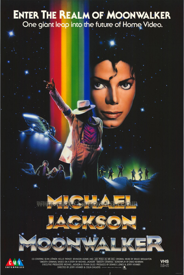
Pepsi-Cola changed its slogan in the 1980s from “Pepsi generation” to “Choice of a new generation” with the help of BBDO and contracted with music icon Michael Jackson in one of the largest celebrity endorsement agreements in advertising history.
“Lunch Box,” for the California Raisins Advisory Board, featured hip Claymation raisins wearing sunglasses and shuffling to the 1960s hit tune “I Heard It Through the Grapevine.” Foote, Cone & Belding, San Francisco, was the agency behind the 1986 spot.
Memorable as well was the Cheer commercial in which a silent, deadpan presenter smudged a handkerchief and put it in a cocktail shaker with water, ice and a dash of the detergent. With an opera aria as background music, viewers saw that the hankie, of course, was spotless when pulled from the shaker.
The Energizer Bunny, ranked among the top icons in advertising history by Advertising Age, was introduced in 1989. The commercials, from Chiat/Day, were called the “ultimate product demo” because they showed the product’s unique selling proposition?long-lived batteries?in an inventive, fresh way. The Bunny first appeared in three :15s, sending up coffee, wine and decongestant spots.
Perhaps one of the best commercials?and marketing strategies?of all time was the Orwellian Apple Macintosh advertisement entitled “1984,” which launched the Macintosh revolution. The one-time airing of the 60-second spot during the 1984 Super Bowl became a watershed of American advertising.
That same year, a senior citizen named Clara Peller became a star when she appeared in a now-classic Wendy’s commercial (“Where’s the Beef?”), produced by Dancer-Fitzgerald-Sample and directed by Joe Sedelmaier.
In 1986, JWT introduced “Herb,” a man who had never tried a Whopper, for Burger King. Viewers were urged to be on the lookout for Herb in Burger King outlets, but the campaign was dropped four months later. Advertising Age later termed it “the most elaborate advertising flop of the decade.”
In reaction to the inroads that foreign automakers were making in the U.S. market, U.S. advertisers responded with increasing defensiveness. Ads told the American people, “At Ford quality is job one” and “GM puts quality on the road.”
Other noteworthy campaigns from the ’80s included E&J Gallo Winery’s “plain folks” approach from Hal Riney & Partners for Bartles & Jaymes wine cooler; Lee Iacocca’s debut in Kenyon & Eckhardt-produced spots for Chrysler; Ally & Gargano’s “fast-talker” spots for Federal Express; Coca-Cola’s “Mean Joe Greene” spot from McCann-Erickson; Della Femina, Travisano & Partners’ exaggerating Joe Isuzu character for automaker Isuzu; and Calvin Klein’s spots tagged, “Know what comes between me and my Calvins? Nothing,” featuring teen-age spokesmodel Brooke Shields. At the end of the decade, Nissan grabbed attention with its “rocks & trees” campaign from Hill, Holliday, Connors, Cosmopulos for its luxury Infinity, which never showed the car.
Politics, critics, milestones
No discussion of advertising in the 1980s would be complete without noting the high priority placed on TV advertising by the re-election campaign of President Ronald Reagan. The Reagan “feel good” spot for the 1984 campaign, handled by the re-election team’s ad hoc Tuesday Team and written by Hal Riney, included a number of patriotic vignettes on the theme “It’s morning again in America.”
In his handling of the 1984 campaign, President Reagan dramatically altered the traditional relationship between the media and politics. He and his aides staged news events for maximum media coverage, timed announcements to be seen by large TV audiences and demonstrated an unprecedented understanding of the power of visual media.
The 1980s were marked by some serious criticism and challenges for the advertising industry. For example, long-held assumptions about advertising’s effectiveness were challenged by Gerald Tellis, who put together a sophisticated statistical model and concluded that people are relatively unmoved by TV advertisements in making brand choices, especially with regard to everyday products. His 1983-84 examination of consumer purchasing patterns generated discussion and concern. The research continued into the 1990s.
Government deregulation under President Reagan ushered in a philosophy of “less government” and more free marketplace decision-making and autonomy. During the Reagan presidency, a political and economic environment was created that allowed for mergers and acquisitions and also tolerated tremendous corporate media growth. In 1986, General Electric Corp. was allowed to purchase RCA Corp., which already owned NBC. In 1989, Time bought Warner Communications and formed Time-Warner, bringing together under a single corporate umbrella an empire consisting of magazines, motion picture and TV production companies, cable TV networks, book publishers, record companies and a major comic books company.
Other significant milestones of the 1980s include the introduction of Rely tampons by Procter & Gamble Co. in May 1980 and the subsequent withdrawal of the product four months later when the U.S. Centers for Disease Control linked its use to toxic shock syndrome. Two years later Tylenol capsules were pulled from shelves across the U.S. after an incidence of product tampering in Chicago that resulted in seven deaths.
In addition, the decade saw the sudden rise of blue jeans into the realm of high fashion with such brands as Sergio Valente, Bon Jour, Calvin Klein, Gloria Vanderbilt and Jordache. Hershey’s Reese’s Pieces saw sales leap 70% in 1982 after its exposure via product placement in the movie “E.T. the Extra-Terrestrial.”
Caffeine-free soft drinks were introduced in 1983, and AT&T Corp. divested itself of its local phone companies, which became seven independent regional companies known collectively as the “Baby Bells.” ACNielsen Corp. was sold to Dun & Bradstreet Corp. in 1984, and Nike signed Chicago Bulls rookie Michael Jordan in a deal said to cover five years for $2.5 million. The following year, Capital Cities Communications acquired ABC for $3.5 billion. In response to the spread of AIDS, which by mid-decade had become an epidemic, magazines such as Bride’s, Family Circle, Parents and Vogue began accepting ads for condoms in 1986.
In 1986, “The Cosby Show” commanded a record $400,000 for a 30-second spot. Oat bran became a sensation in 1989 when research suggested it might help reduce cholesterol. Kellogg, General Mills, Quaker, Nabisco, Post and even Mrs. Field’s competed for their share of the oat bran market.
There was a lot happening in the 70s, from diverse pop culture to social movements, all of which influenced graphic design in different ways. From punk to postmodernism, there are many things about 1970s graphic design to inspire you today.
Photography and Collages
Graphic design in the 1950s and 1960s often featured cartoons and illustrations.
In the 1970s, this changed, and photography became more popular. The 1970s took things the extreme, which meant that photography was often dazzling or in grayscale.
Examples:
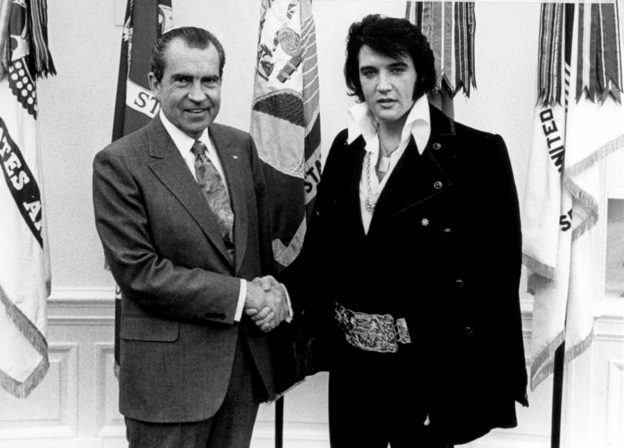
Nixon and Elvis
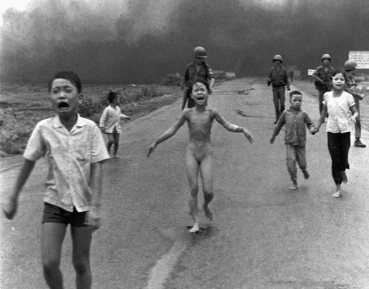
Result of napalm in Viet Nam
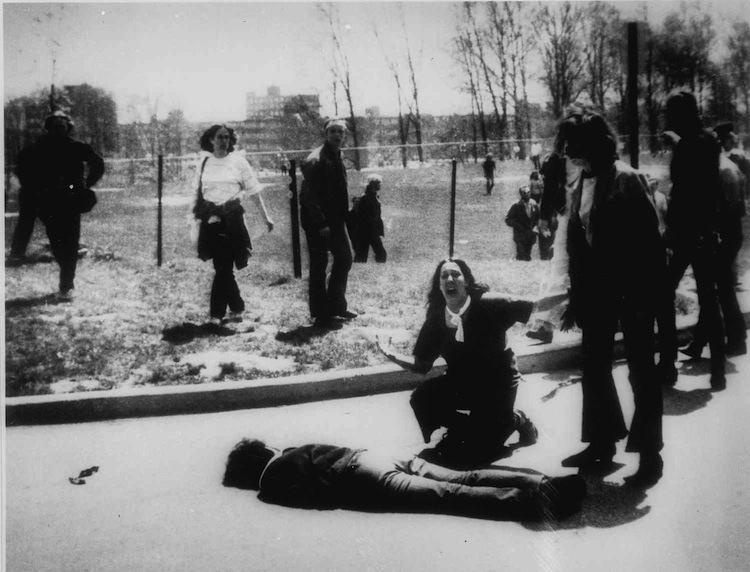
National Guardsmen opened fire on peaceful protestors.
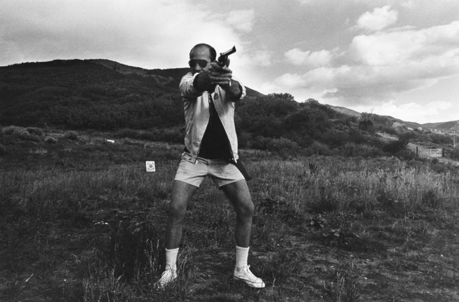
Hunter S Thompson
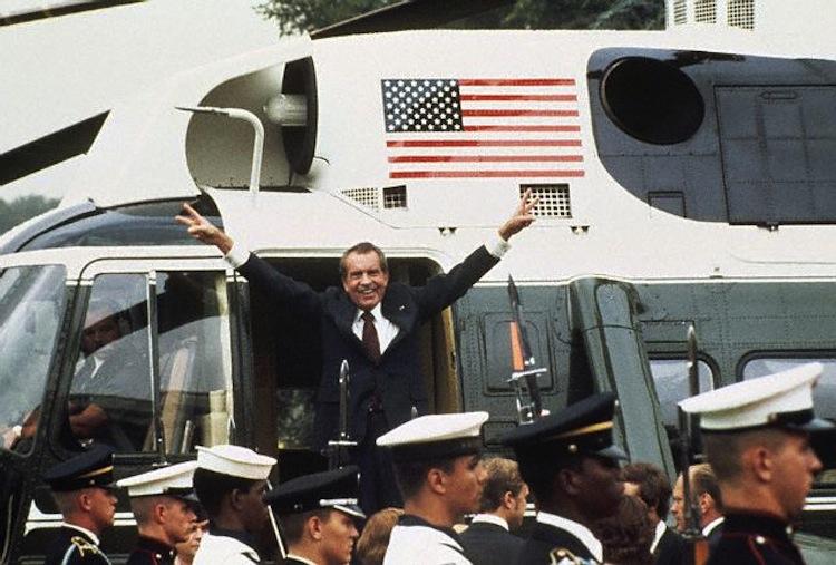
Nixon
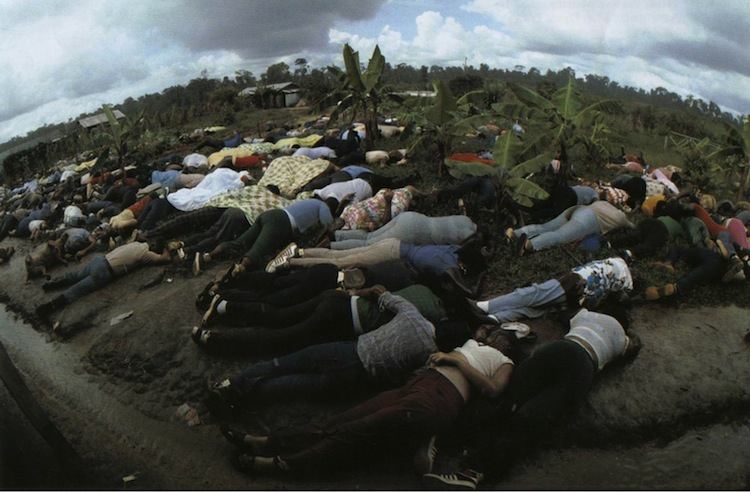
Jim Jones
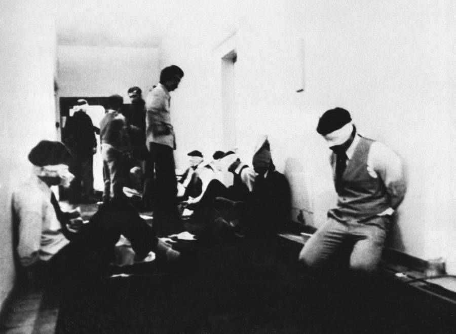
Iran Hostage Crisis
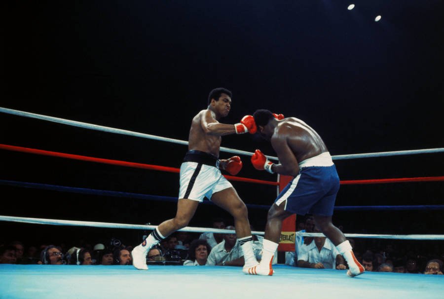
Muhammad Ali
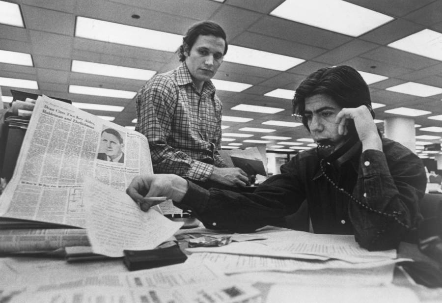
Woodward and Bernstein
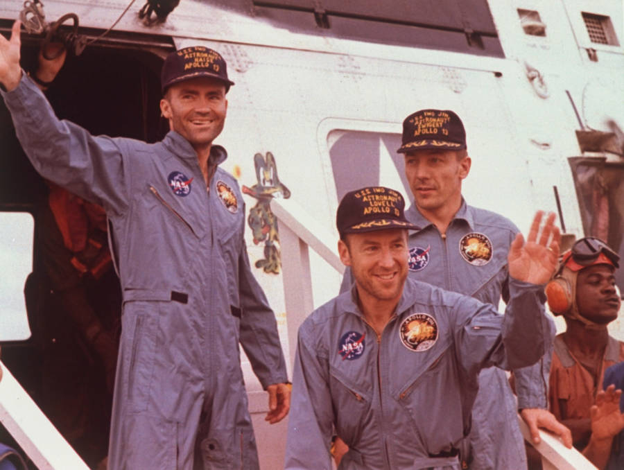
Apollo 11
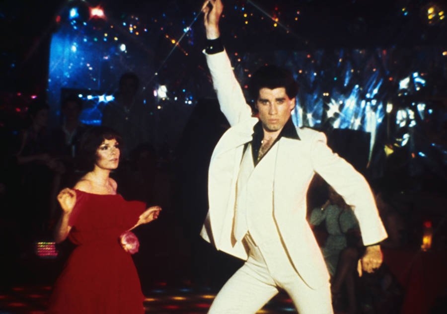
John Travolta
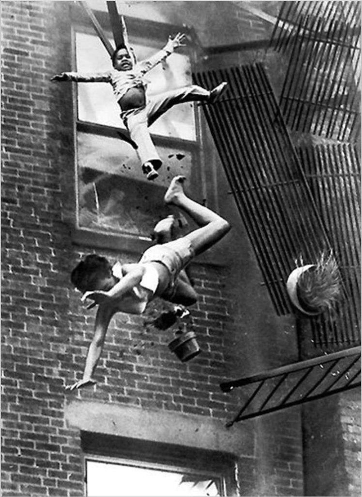
Diana Bryant (bottom) and Tiare Jones fall from the collapsed fire escape of their burning building on Marlborough Street in Boston just before firefighters could save them. July 22, 1975.
Bryant soon died as a result of her injuries, while Jones, who landed on Bryant’s body, did not.
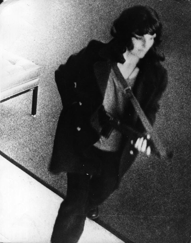
Patty Hearst
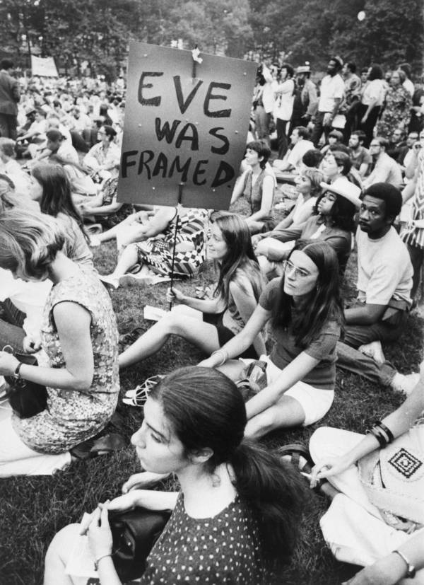
Women sit in protest during the Women Strike for Equality demonstration — emblematic of the growing power of the women’s rights movement throughout the decade — in New York’s Bryant Park on August 26, 1970.
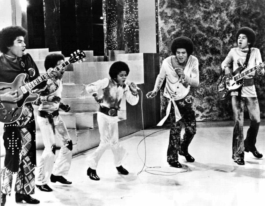
Jackson 5 first TV appearance.
Adding collage elements to photography was popular too, and eye-catching typography was used to enhance photos, particularly in popular magazines such as Rolling Stone. Illustration didn’t disappear, but it was used more to support photography instead of standing on its own.
Use of Famous Faces
Connected to the use of photography in 1970s design was the use of famous faces to promote products. As real people were models in advertisements more, it made sense to have well-known names and faces as the face of a brand.
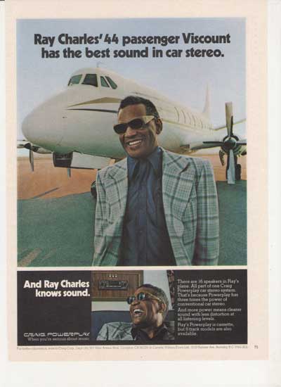
A 1977 Craig Stereo advertisement featured Ray Charles promoting a stereo, emphasizing his name and face while downplaying other elements of the graphic design. This use of famous faces is something that has continued today in magazines, on TV or on social media.
Developments in Typography
Another prominent area of development in 1970s graphic design was typography. Typesetting technology during the decade made it possible to create revolutionary typography.
Typography was often combined with photography to create striking graphics. Everything was bold and bright, with elements such as 3D styles and large lettering.

![]()


Punk Graphic Design and Musical Influence
There was plenty of musical influence on graphic design in the 1970s. The different movements in the music scene, such as punk, inspired graphic designers the most.
Like the music, there wasn’t anything refined about punk graphic design. It was often black and white, homemade and with a DIY feel, even if it was made for professional materials, such as album artwork.
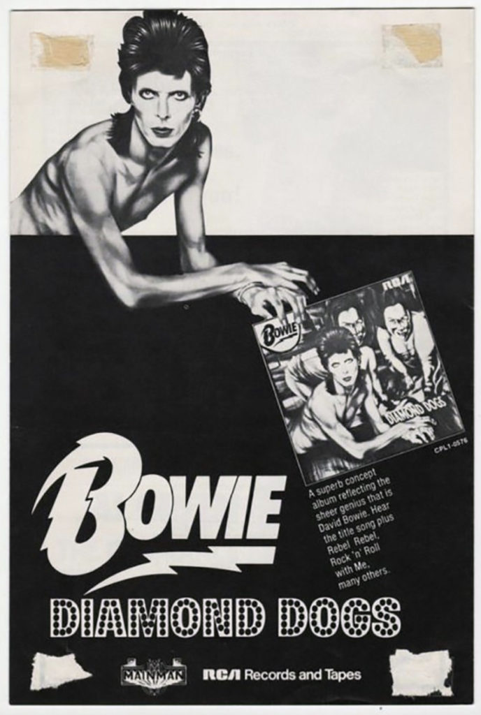
Some of the most famous album covers come from the 1970s, from Sex Pistols and The Ramones to the Rolling Stones and David Bowie. Like many other graphic materials, they often featured photography.
Use of Color
Previous decades had been colorful with design too, but the 1970s took colorful design to new heights. Bright colors stood out even more against black and white photography using vivid shades.
In the 1960s, the psychedelic style that went along with the hippy movement grew. That continued into the 1970s, tied into the other stylistic choices that designers of that time were making.
Even though the colors were bright, they were chosen to go well together, although some color choices pushed the barriers.
The Beginning of Postmodernism
Postmodernist design began to emerge in the 1970s, with designers embracing historical styles that had been rejected. Older styles were adopted and designers experimented with them, making them more exaggerated and fun.
From neo-classicism to art deco, these older design styles provided inspiration for 1970s designers, and can still inspire designers in the modern age. The 1970s was a great decade for testing styles and rejecting academic definitions previously found in graphic design.
The 1970s was only the beginning of postmodernism. Much more would come.
Influences from Around the World
Various cultural and design influences from around the world were important in graphic design in the 1970s. As the world became more global, different cultures influenced each other.
For example, Japan’s recovery from the Second World War and its growth meant that it had a strong influence on the rest of the world.
How Japanese design influenced design elsewhere included a new set of colors that go well together, centered icons and symmetry.
Stand-out Graphic Design from the Decade
There are many recognizable examples of graphic design that can provide inspiration for graphic designers today. One particular example is the NASA logo and the striped IBM logo, which replaced the solid version in 1972.

![]()
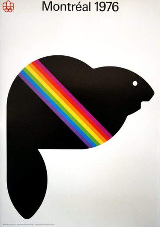
Other notable designs from the decade include the rainbow-striped beaver for the 1976 Vancouver Olympics and adverts from Apple, such as the Introducing Apple II advertisement from 1977.
Graphic Design and Typography
Illustration
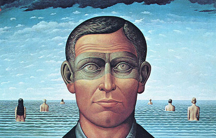
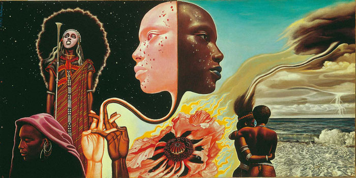
Illustration (detail) above: “Memory” by Richard Hess
In the second half of the 20th Century, America’s expanded middle-class consumer society demanded entertainment, and all media were growing exponentially. The music, movie, and publishing industries were becoming stronger than ever. The post-war generation began their professional careers, and those interested in art and design had many kinds of employment opportunities in publishing, advertising, and with corporations—from insurance companies to fashion houses.
The Society of Illustrators in New York City, formed at the beginning of the 20th Century as an elite men’s club, is an important professional organization which sponsors public exhibitions of the best contemporary and historic original illustration art. The annual juried competition is open to any practicing illustrator, from well-established pros, to up-and-coming young artists doing their first work. At “the Society” original works of illustration art were being exhibited regularly in the 1970s and were being seen by larger numbers of people, especially students of illustration at art schools. Also, examples of award-winning published work were being shown in the trade magazines and provided young artists with inspiration to enter the field.
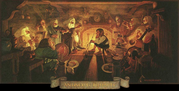
Tim and Greg Hildebrandt, Tolkien Calendar, 1978
The publishing of J.R.R. Tolkien’s The Hobbit and Lord of the Rings in the mid-1950s led fantasy literature to be reborn after a long sleep—since Victorian England’s love of fantasy and the freshly retold and illustrated fairy tales of the early 20th Century. The long-established genre of science fiction often included fantasy tales, but it wasn’t until the late 1960s that young people fully latched on to reading about fully developed fictional worlds like Tolkien’s “middle-earth” and the imagined histories of medieval-inspired cultures populated with wizards, dragons, knights and princesses, trolls, goblins, elves, fairies, and unicorns. Writers began to generate fantasy novels, which were treated with beautifully illustrated covers. Jim Henson’s studio in the early 1980s produced very popular fantasy films like The Dark Crystal, which benefitted from character drawings by artists who specialized in fantasy, like Brian Froud, himself influenced by Arthur Rackham and the Swedish artist John Bauer. In 1972 the film, Star Wars, brought together familiar worlds of medieval-like cultures, gave them advanced technologies, and pitted their knights against militant cultures bent on universal domination. The film’s combination of science fiction and fantasy was irresistible and its advanced production techniques, model making, animatronic figures, painted scenic, and adventure plot line made it immensely popular with the public and a broad influence to writers and artists. Teams of illustrators helped the director to visualize the characters and sets with their drawings, enlarging what had previously been a small sub-field for artists: character and scenic design for films. This grew to become today’s “concept art,” which is a major area of interest and opportunity for illustrators.
Fantasy games began as an outgrowth of the fantasy movement in popular culture. With illustrated board games, role-playing fantasy card games, video games, and then—with the development of the personal computer—computer games, there was a range of new media requiring illustration. This expanded the employment opportunities of illustrators who no longer had to rely solely on the publishing industry’s books and magazines for commissions.
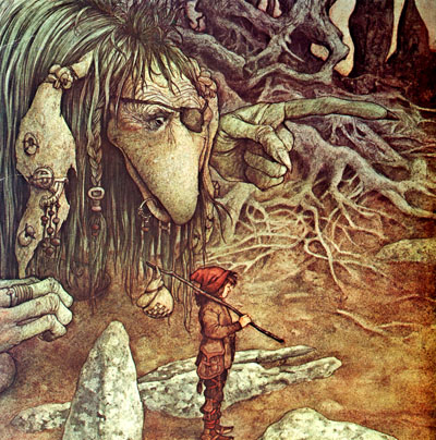
Brian Froud, The Dark Crystal
The recording industry grew in the 1970s, and illustrated album covers provided a dynamic twelve-by-twelve inch format for illustration. Mati Klarwein’s two-panel, two foot wide fold-out cover painting for Miles Davis’ album, Bitches Brew, changed the way that people thought of album art. Music magazines took a firm hold, with Rolling Stone and Crawdaddy leading the field and hiring illustrators to portray musicians, writers, entertainers, and political personalities, generating a revived interest in and enjoyment of caricature and celebrity portrait illustration. Playboy and other men’s magazines commissioned the top illustrators of the day for the short fiction they published, attracting international artists to their pages. Illustrators from England, France, Germany, and Eastern Europe were being commissioned by American art directors. Magazines were published in international versions exposing more people than ever to illustration of all kinds and styles.
Mati Klarwein, album art, Bitches Brew, 1970
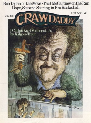
Edward Sorel, Crawdaddy magazine, 1974
With the post-war generation beginning to raise families, there was also an increase in books published for children, especially “picture books,” where the story is brief with its words carefully designed and where the illustrations provide a world for the child to enter and enjoy. The masterful Maurice Sendak, Alice and Martin Provensen, and Eric Carle were joined by a host of new artists entering that field including Swiss-born Etienne Delessert.
Etienne Delessert, Just So Stories by Rudyard Kipling, 1972
The New York Times made a bold move to bring illustration to its editorial pages. Other papers used political cartoons, but the Times either commissioned or bought conceptual illustration, meant to illustrate the ideas and opinions of its “Op-Ed” page articles and letters as in the illustration below by Brad Holland. Using metaphor, allusion, and symbolism, this art led readers to think more deeply about political and social issues.
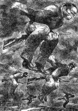
Brad Holland, The New York Times, “Firing Squad”
Under all of these influences young artists wanted more than ever to become illustrators, and art schools were ready to oblige them with training. There were numerous ones to choose from and a variety of approaches to education that might suit their needs—private art schools, art colleges, part-time evening programs in Continuing Education with a selection of courses in illustration, and even full illustration programs leading to BFAs—with most courses being taught by working professionals sharing their knowledge and experience. Parsons School of Design, the School of Visual Arts, and Pratt Institute in New York City all had full or part-time illustration programs, as did other schools around the country, like the Rhode Island School of Design, Art Center College of Design in Pasadena, the Art Institute of Boston, and the Philadelphia College of Art.
Comics
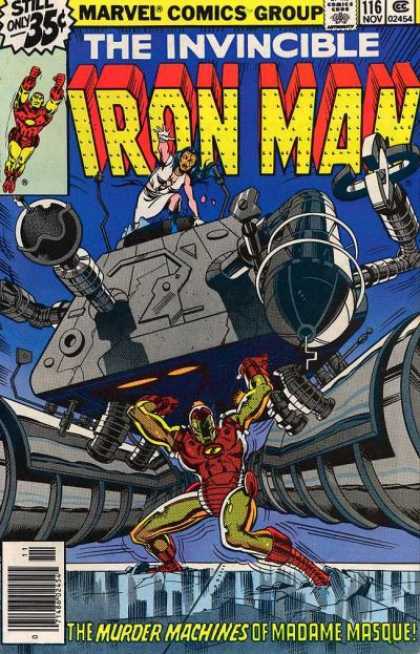
David Michelinie, Bob Layton, and John Romita Jr took Iron Man to new heights as well as a huge personal low in 1978. The art was slick and Iron Man looked sharp and shiny. The massive low was that Tony took a turn for the worst; he became an alcoholic. It was subject a that was frowned upon at the time. Yet it embraced a new level for Stark and 70’s comics in whole. As a side note Jim Starlin created Thanos, Mentor, and Drax the Destroyer during his 70’s run on Iron Man as well.

Jack Kirby
How could Jack Kirby not make our list? If you know comics you know Kirby. In the early 70’s Kirby left Marvel for DC. Kirby had one of the most successful runs in comics history. So you would think he could do it again? Of course! The New Gods, The Demon, Kamandi, and Mister Miracle. Some of these characters haven’t really stood the test of time like The Hulk or Iron Man, but it’s important footnote that Kirby left in his legacy and a great time for DC.

Team-Up Books
The 70’s saw a rush of team-up books. The first big hit was the Brave and the Bold which had been in print since the 50’s. Brave and the Bold normally teamed Batman up with some unlikely heroes and sometimes even villains. Marvel Team Up was the next title. It teamed Spider-Man with many other heroes. Marvel Two-in One was the book featuring the Thing in his various team-ups. Finally DC Comics Presents was Superman hanging out with other heroes to stop crime. The team-up books were fun and mostly a guilty pleasure, but also kind of a pain. They would change writers and artists constantly. If you think about it, most of the heroes were fighting villains that they normally could handle on their own anyways, so two heroes actually made it harder on the villains. The team trend went up and down for several decades later.

Dave Sim’s Cerebus
In 1977 Dave Sim’s Cerebus came out as a self published comic by Aardvark-Vanaheim. Dave used Cerebus (who was an anamorphic Aardvark) to convey Dave’s controversial beliefs. The art was black /white and very detailed. The series ran for a solid 300 issues.

Batman had been around since 1937. You would think that he had been played out. In 1970 Dennis O’Neil created one of the Batman’s greatest villains of all, Ra’s al Ghul. Neal Adams brought him to life with realistic pencils that hadn’t been seen in comics before. Batman needed a new look and a face lift really bad and this did the trick. The 60’s Batman was fun and savvy but really a lot of BAM, POW and blah. Batman needed to be the Dark Knight he was meant to be which is what we finally started to get.

Several new artists came out of the 70’s, but none really knew how to put 20 superheroes on one page like George Perez. Team books were struggling and George Perez was the answer. He helped bring the Justice League to a new maturity that was deeply needed. It also lead to our next positive. This version of the Justice League was my Justice League: Batman, Superman, Wonder Woman, Green Lantern, Flash, Black Canary and a grumpy Green Arrow.

George Perez also worked on the Avengers. He made Ultron look like the character we all know from Avengers: Age of Ultron.

Green Lantern/Green Arrow
Dennis O’Neil and Neal Adams created the Green Lantern/Green Arrow team up. Green Lantern was a space cop with a magic ring and Green Arrow was just a guy with a bow and arrows, however, they were played as a republican (GL) and a democrat (GA) teaming up to examine the socio-economic problems in America.

Spider-Man
Like Batman, Spider-Man needed an edge that was missing. He had been around since 1963 and you would think they had done everything with the character they could at that time. So then in Amazing Spider-Man #122, Roy Thomas decided to kill off Spidey’s girlfriend, Gwen Stacy. Killing characters in the comics was almost unheard of for the time, yet here went Gwen, with her father having been killed off not long before. It is said that this is when the Golden Age ended and Spider-Man was never the same again. Spider-man also bears the legacy of having been the first mainstream super hero comic to ignore the comics code authority and published an issue concerning drug addiction. GreenLantern/Green Arrow followed suit, and within a decade the comics code had very little remaining authority.

The Uncanny X-Men
In the 1970’s, Marvel cancelled the X-Men. No body cared about our poor mutants by the point. Then in 1975, Giant Sized X-Men #1 hit the stands. It starred new characters including Colossus, Storm, Nightcrawler, Thunderbird, and brought in some little runt originally introduced in Hulk #181, Wolverine. The X-Men were a huge hit again. Mutants were now a thing. John Byrne made iconic images in every page he penciled during his run. Chris Claremont begin one of the longest run on any comic to date.
Animation
Animation for the grown-up market: Best example – Ralph Bakshi – Wizards, the Lord of the Rings
Animation in Europe: European market expected child-friendly television programs from animation. Best example – Viki the Viking
Short animation at film festivals became the way for animators to showcase their abilities. Best example: Russian animator, Yuri Norstein Battle of the Kerjenets
Animated music videos: best example: Elvis Costello, Accidents Will Happen
Japanese animation became popular in the American market. Best example: Battle of the Planets
Film
Directors
James Leo Herlihy for Midnight Cowboy
Franklin J Schaffner for Patton
William Friedkin for the French Connection
Francis Ford Coppola for The Godfather
Personalities
Film Score
Francis Lai for Love Story
John Williams for Jaws, Star Wars, and Close Encounters
Popular Entertainment
Special Effects
Sound Design – Ben Burtt
Visual Effects
The Poseidon Adventure – L.B Abbott A.D. Flowers
Jaws
Star Wars:
Film Editing: Star Wars Richard Chew, Paul Hirsch, and Marcia Lucas
Verna Fields Film editing for Jaws
Art Direction, Editing, etc for All the President’s Men
Cinematography
Screenwriting
William Peter Blatty for the Exorcist
Oliver Stone for Midnight Express
Advertising
Poloroid – It’s So Simple Bill Bernbach
Life Cereal – Hey Mikey – Doyle Dane Bernbach
Burger King – Have it Your Way – BBDO
Budwiser – There is no Other One – D’Arcy Masius Benton & Bowles
Coca Cola – The Real Thing – McCann-Erickson
Coca Cola – I’d Like to Teach the World to Sing – McCann-Erickson (Mad Men ending