Rudolphe Töpffer – Primitive comic book creator. His books were known as “Graphic Literature”. He developed the concept of the cartoon face more than anyone previous.
William Randolph Hearst – Publisher in the late 19th and early 20th centuries. He is best remembered as a progenitor of “yellow journalism” (today we call it “fake news”). He was one of the two major publishers of comic strips as they developed.
Joseph Pulitzer – Publisher in the late 19th and early 20th centuries. He is best remembered today as the man for whom the “Pulitzer Prize” is named, but he was also famously involved in “Yellow Journalism“, and was Hearst’s biggest rival. The two of them developed a way of conveying news stories through sensational exaggeration related to sex, crime, and graphic horrors. He was the other major publisher of comic strips as they developed.
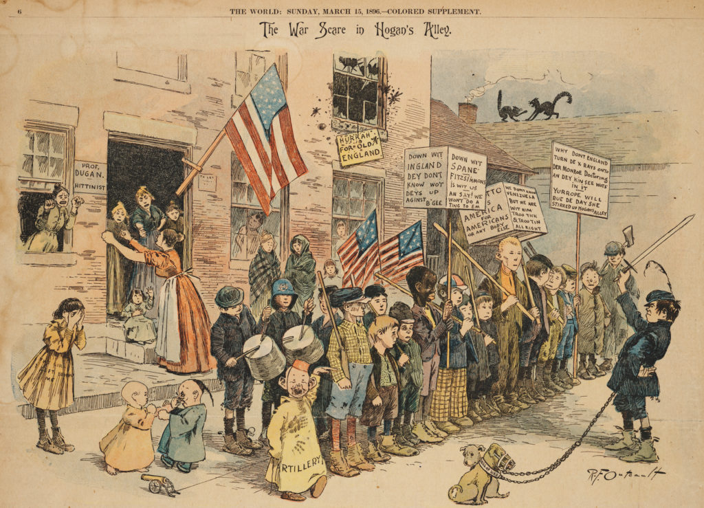
Richard F Outcault – The first comic strip “super star”. Created a strip called Hogan’s Alley. Later also known as the Yellow Kid (The term “Yellow Journalism” was coined by journalists trying to describe the war between Hearst and Pulitzer who both published Hogan’s Alley, and The Yellow kid separately. It became a symbol of their rivalry. The over sensationalized reporting techniques they employed were first known as “Yellow Kid Journalism…later the term was shortened). It was published under one title by Hearst, and under the other title by Pulitzer. The character the Yellow Kid was the fist published comic strip to utilize the device of “the word balloon“. It was also the first strip to utilize modern printing techniques for color. Specifically, it was the first time a CMYK color printing press was utilized for a newspaper in regular circulation.
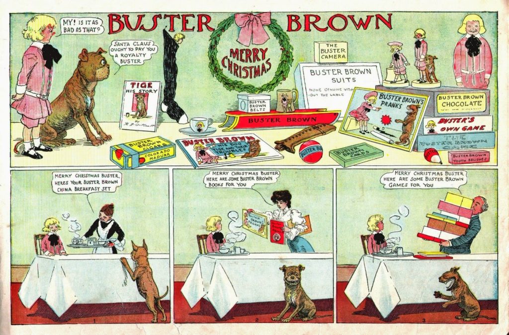
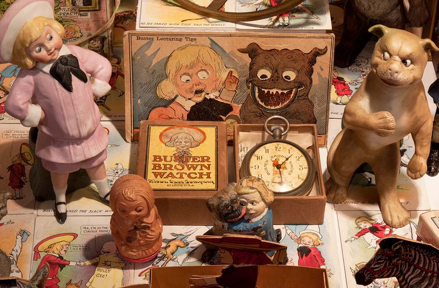
Later, after a series of legal battles, Outcault abandoned that property and created Buster Brown, which was the first comic strip to utilize marketing gimmicks later employed by people like George Lucas, though this is leaping ahead in time a decade or so. Buster Brown first appeared in 1902. Hogan’s Alley first appeared in 1889.
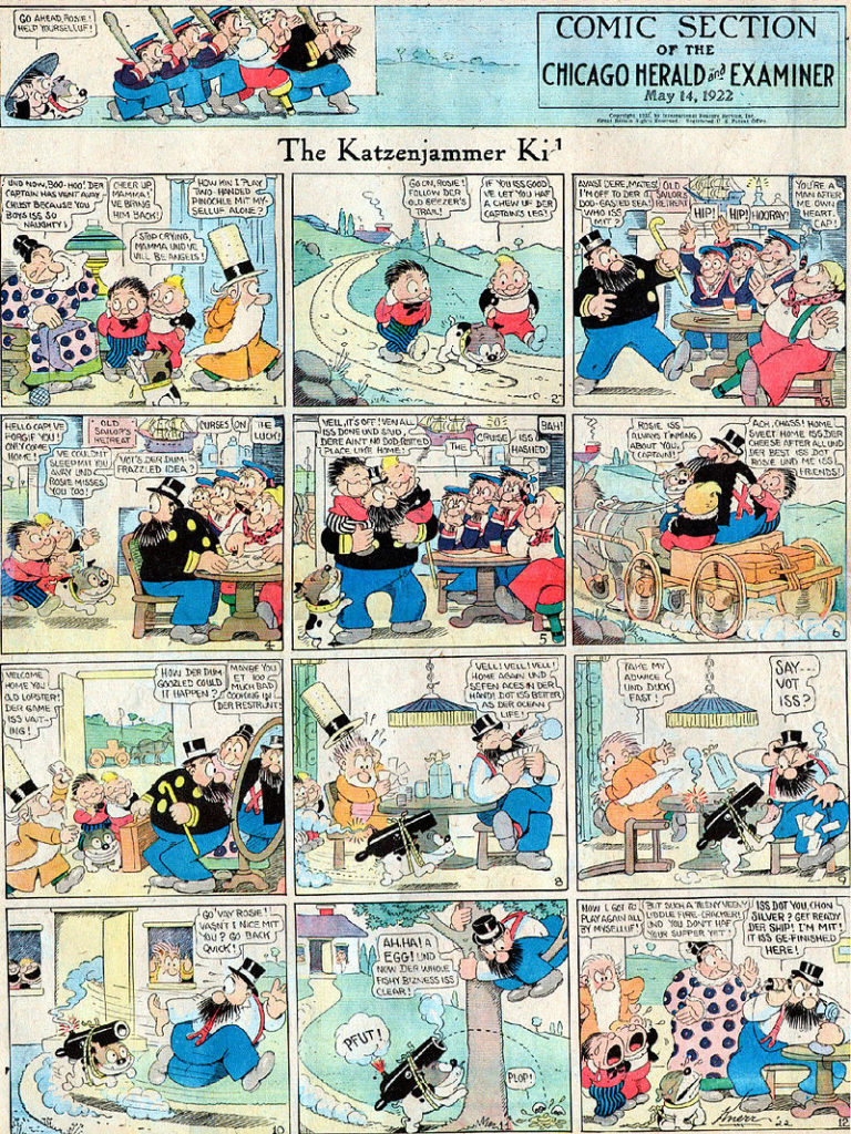
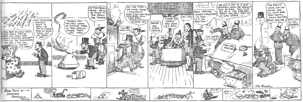
Rudolph Dirks – Creator of the Katzenjammer Kids 1897. First strip to regularly employ word balloons. The Katzenjammer Kids were like an early version of South Park.
The defining theme of the strip was Hans and Fritz pranking der Captain, der Inspector, Mama, or all three, for which the boys were often spanked, but sometimes shifted the blame to others.
The strip was immensely popular, but I think it is really remarkable because it is an early example of a legal case involving creator rights. Dirks took a break from the strip in 1913, or he tried to leave Hearst for Pulitzer. I’ve seen the story presented both ways. Hearst continued publishing it with an alternate artist named Harold Knerr. Dirks sued. In a highly unusual court decision, Hearst retained the rights to the name “Katzenjammer Kids”, while creator Dirks retained the rights to the characters. Hearst continued hiring Harold Knerr to draw his own version of the strip. Dirks renamed his version Hans and Fritz (later, The Captain and the Kids). Thus, two versions distributed by rival syndicates graced the comics pages for decades. Dirks’ version, eventually distributed by United Feature Syndicate, ran until 1979.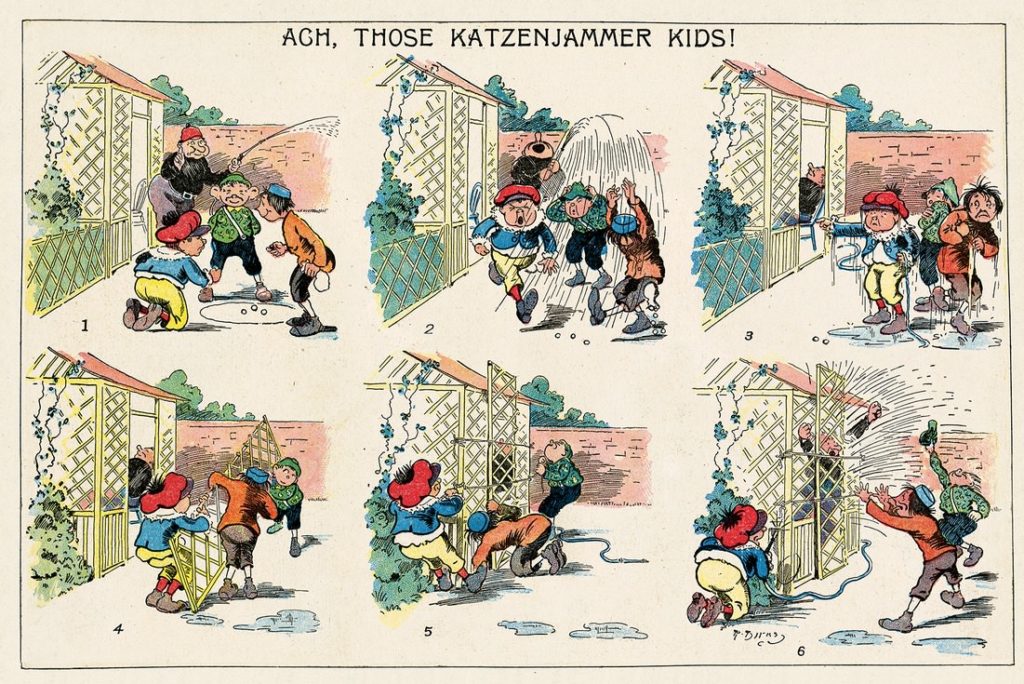
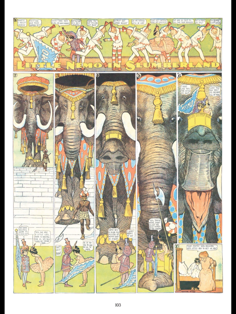
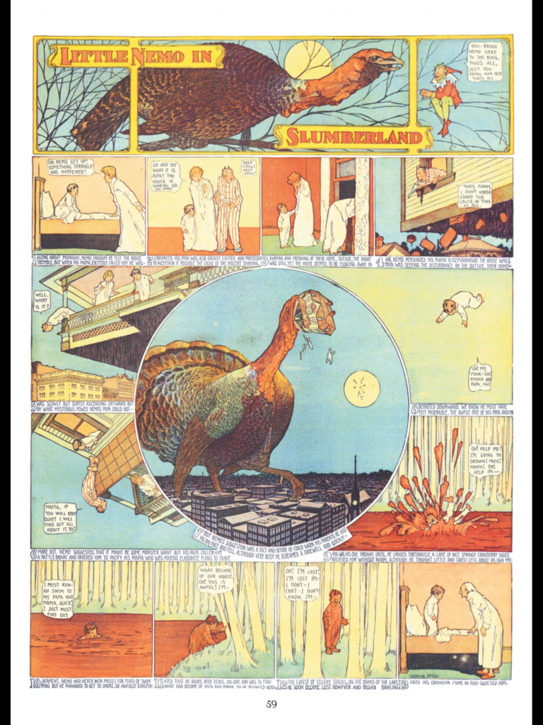
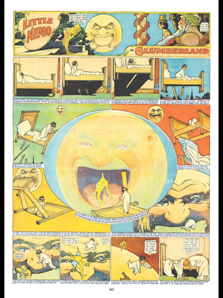
Winsor McKay – Little Nemo in Slumberland – Amazing draftsman. He is also a significant figure in early animation.
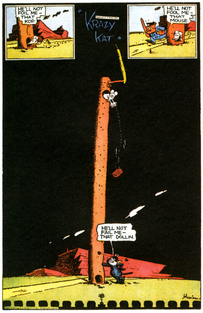
George Herriman – Krazy Kat – Often considered the most “literary” of the early comic strips. Here’s a great article about it. When looking at Crazy Ket pay special attention to the layout as well as use of language. Gilbert Seldes, author of the 7 Lively Arts, argued that it helped break down the high vs low art barrier. Never a popular comic strip, but the intellectuals loved it. There was even a Krazy Kat Ballet.

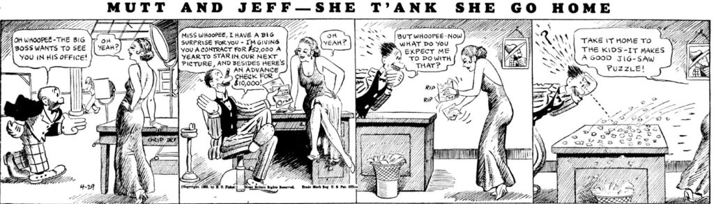
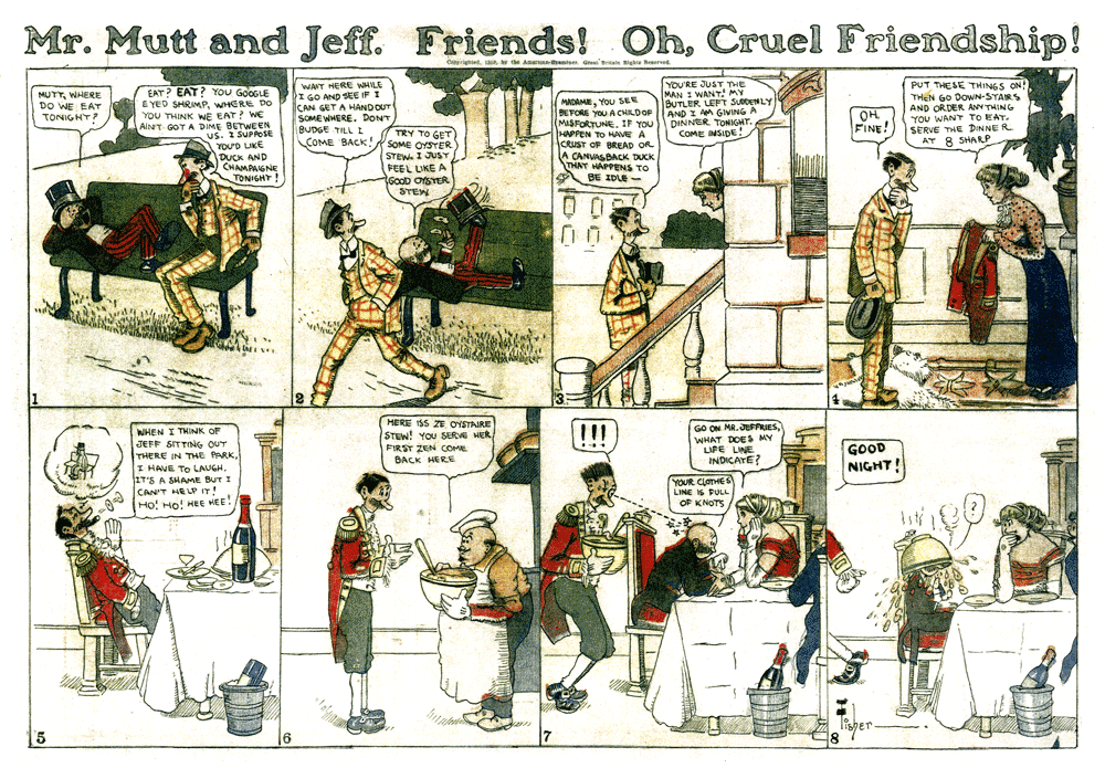
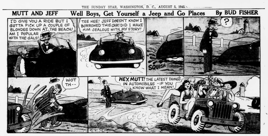
Bud Fisher – Mutt and Jeff – first successful daily strip. Creating a 4-panel comic strip produced 6 days per week had not happened successfully before. There were attempts, but they were short lived. Mutt and Jeff is the origin of the Odd Couple archetype. The pairing of tall and skinny with short and stout. It debuted in 1907.
In 1908 it moved to the sports page of the San Francisco Chronicle, where it became a national hit. “A 1908 sequence about Mutt’s trial featured a parade of thinly-disguised caricatures of specific San Francisco political figures, many of whom were being prosecuted for graft.” (from the wikipedia article)
Fisher had taken the precaution of copyrighting it in his own name, so he was able to change the syndication distributor from King Features to Wheeler Syndicate in 1915.
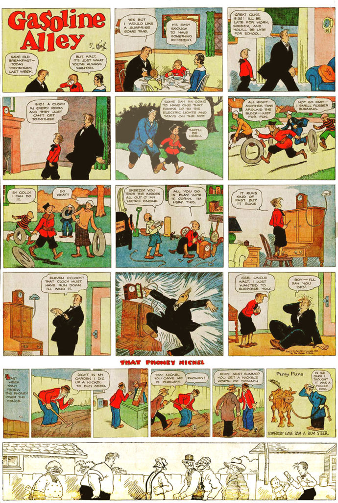
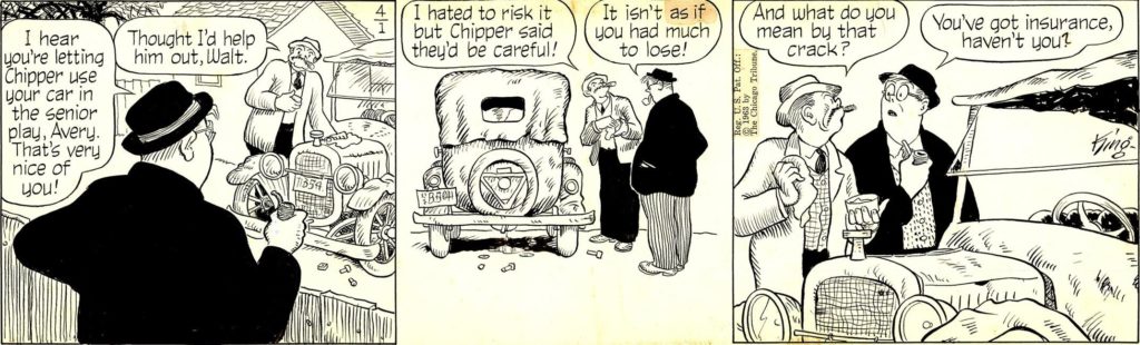
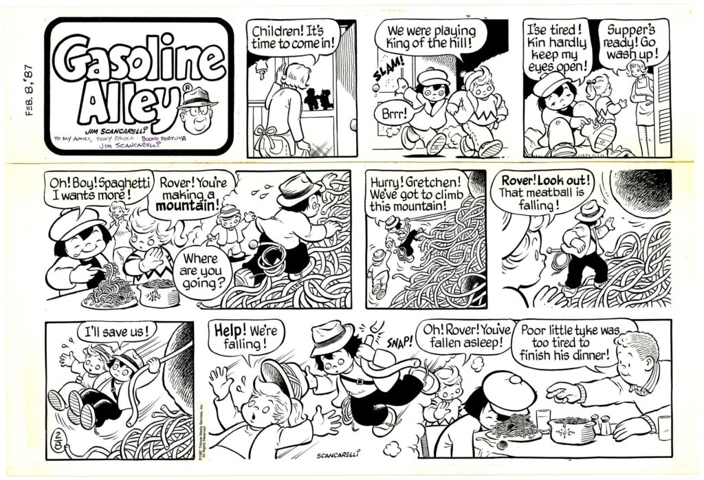
Frank King – Gasoline Alley – made significant improvements in page design (utilization of grid systems), and color.. This strip utilized the concept of continuity: the first strip to show characters aging.
It is the second longest running strip in the United States, having begun in 1918 and is still running today.
The core concept of the strip is reflecting family values.
![]()
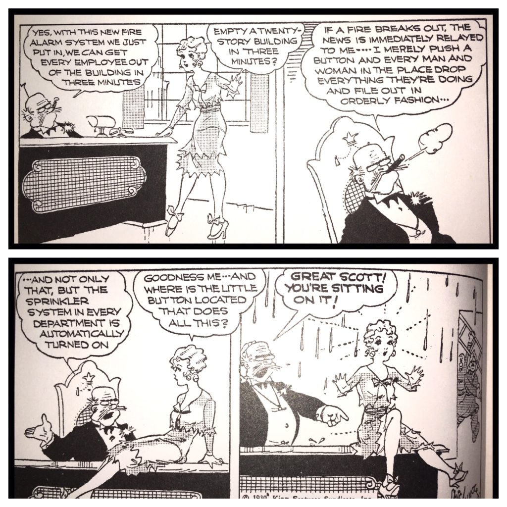
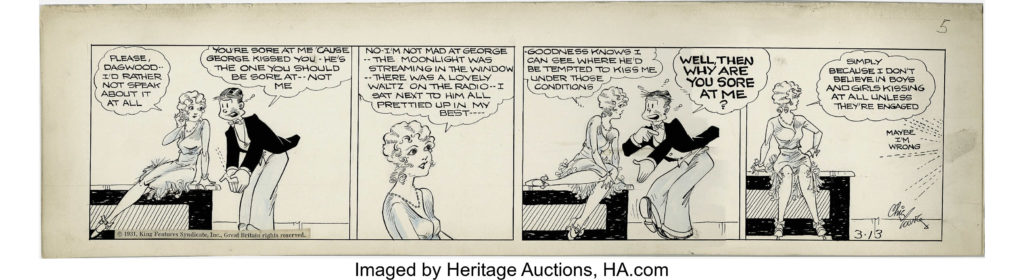
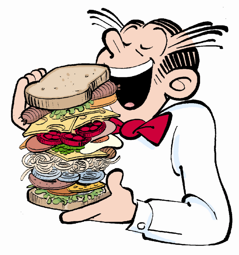
Chic Young – Blondie – boasted a readership of 52 million readers at its height. He was a “rock star” in 1930. Blondie was originally a carefree flapper girl, and Dagwood Bumstead was her sandwich loving husband (they married in the strip in 1933). After their marriage, Blondie’s personality gradually changed as she became the sensible head of the Bumstead household.
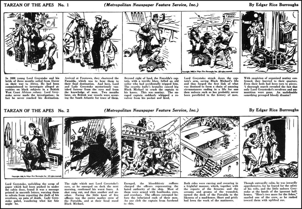
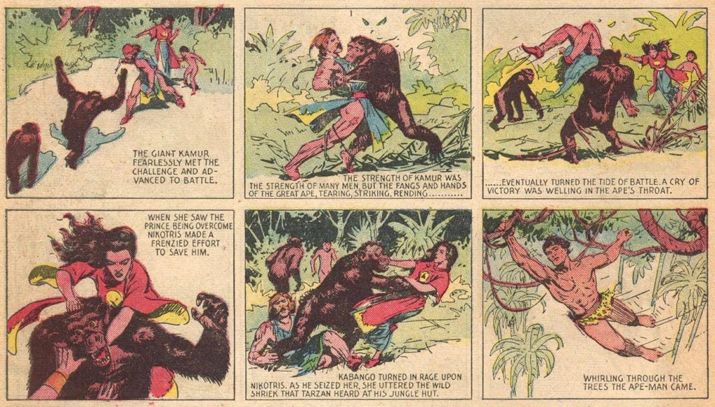
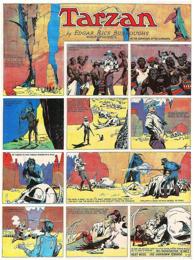
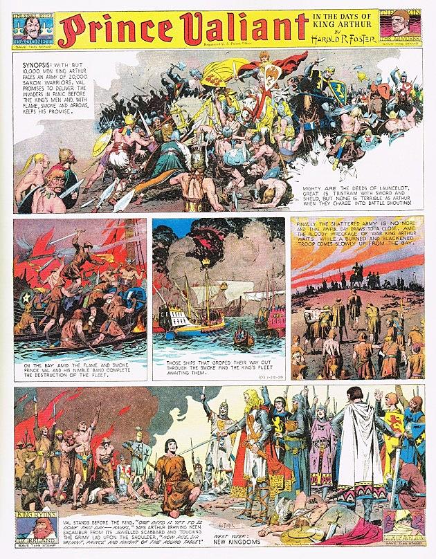
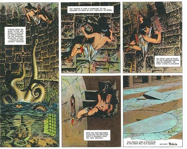
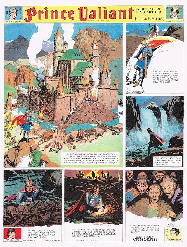
Hal Foster – Tarzan, Prince Valiant – known for a more illustrative style. Here is a good, if hyperbolic, article about Foster.
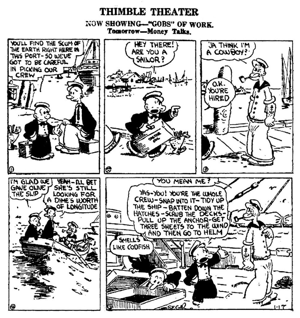
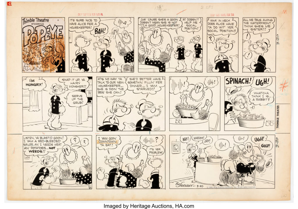
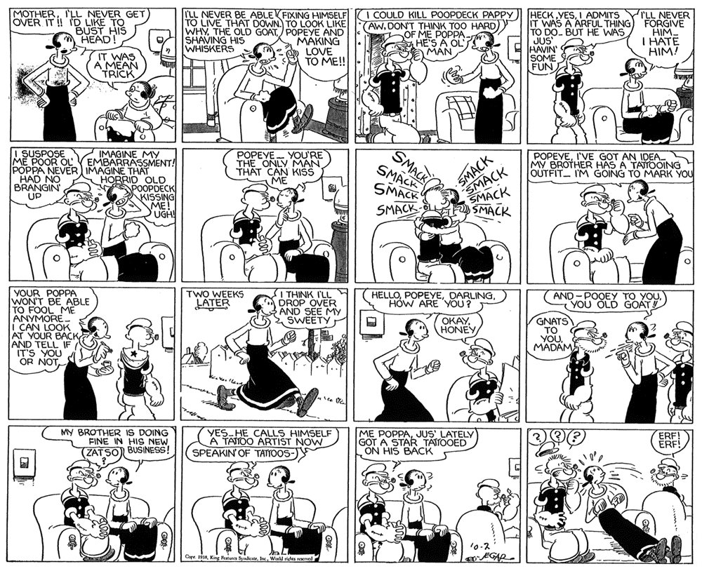
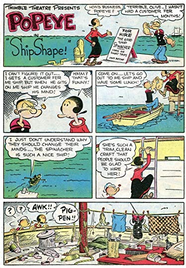
E.C. Segar – Creator of Thimble Theater, and therefore: Popeye, one of the most popular cartoon characters of all time.
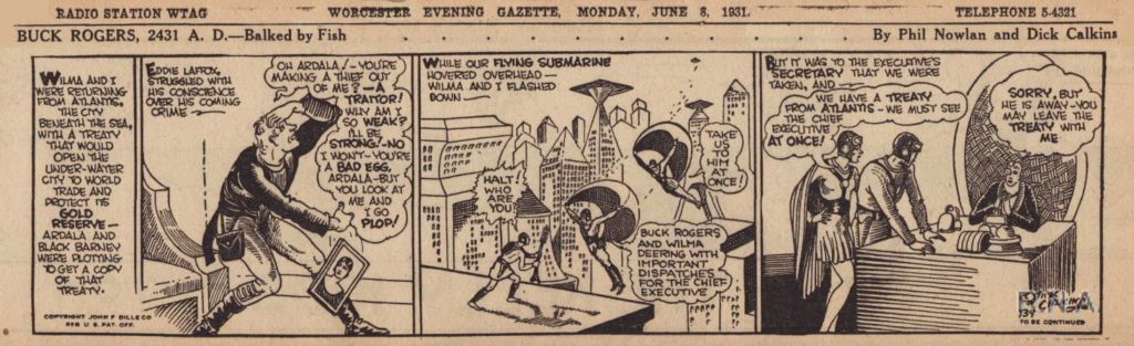
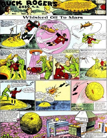
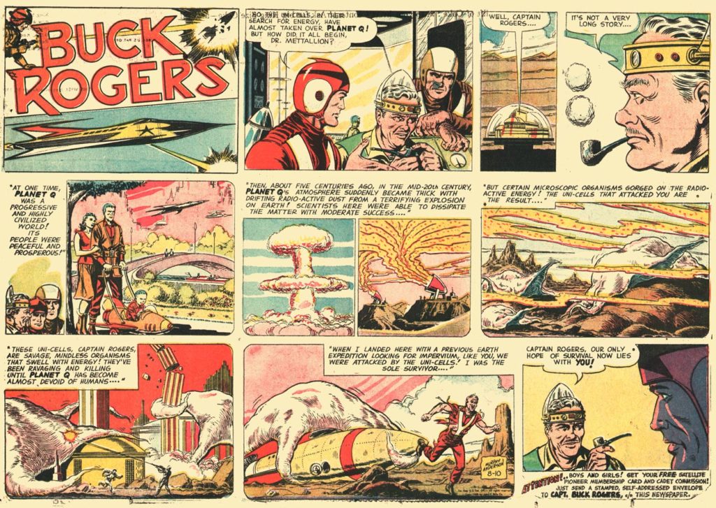
Philip Francis Nowlan – Buck Rogers – the most popular of the early science fiction serialized comic strips. Another article about it here.
Because Nowlan died in 1940, Buck Rogers is one of the few popular early comic strips that falls in public domain.
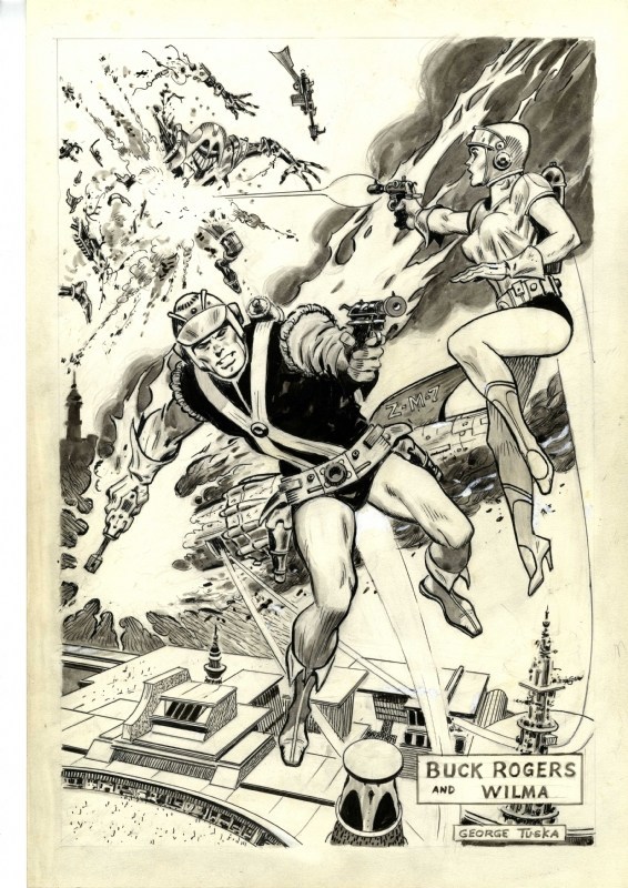
George Tuska drew the strip beginning in the 1950s.
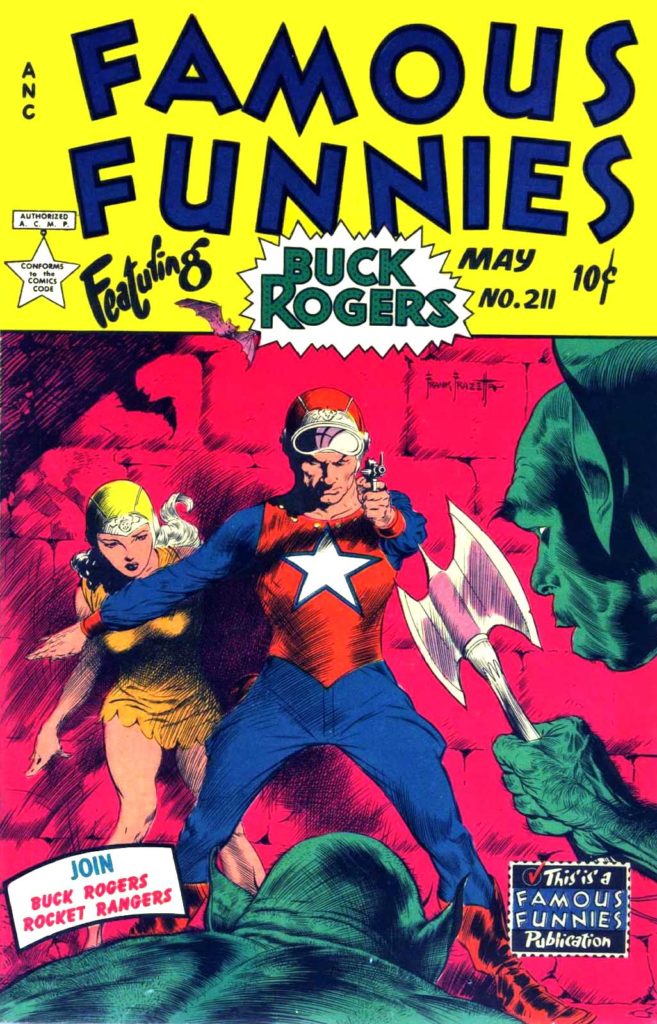
This is a comic book about Rogers also from the 1950s. I included it because the cover was drawn by Frank Frazetta, who we will discuss later.
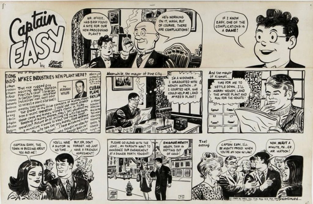
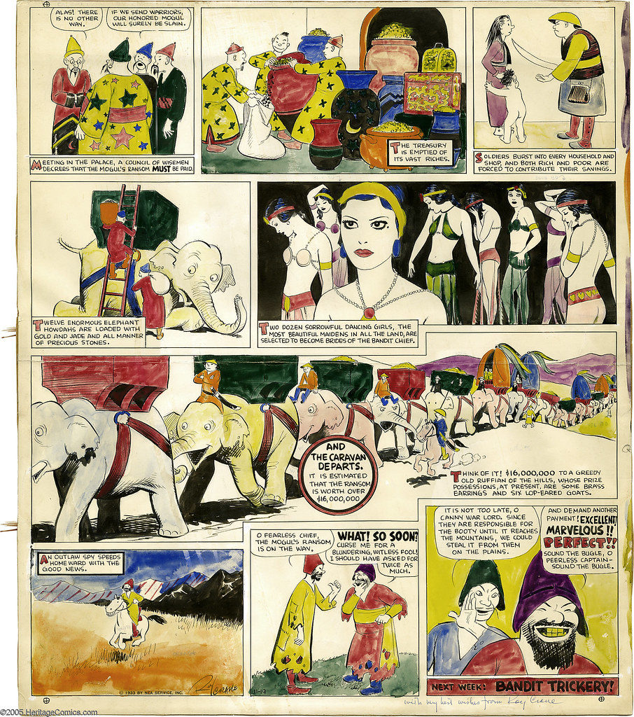
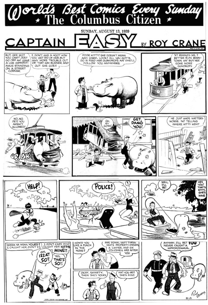
Roy Crane – Captain Easy – another of the most popular serialized action/adventure strips. The prototype for Han Solo and Indiana Jones.
Alex Raymond – Flash Gordon – another of the most popular serialized action/adventure/science fiction strips. most notable because Raymond was the first cartoonist to really use “cross contour” lines in his cartooning. It was only created because of the popularity of Buck Rogers. Flash Gordon was produced by a rival distributor. Famously, George Lucas created Star Wars because he could not afford the rights to Flash Gordon. But you can really see the influences. Gordon goes from realm to realm within the planet Mongo. Each realm is based on an archetypical environment. There is a desert realm, a forest realm, a realm in the sky, etc. Also, Flash has a feisty brunette girlfriend, as well as an older, wiser mentor. Star Wars is a conversation for another day, but it is worth remembering that this is an influence.
![]()
![]()
![]()
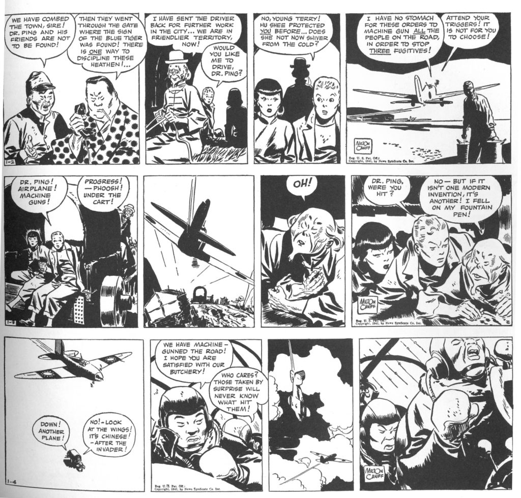
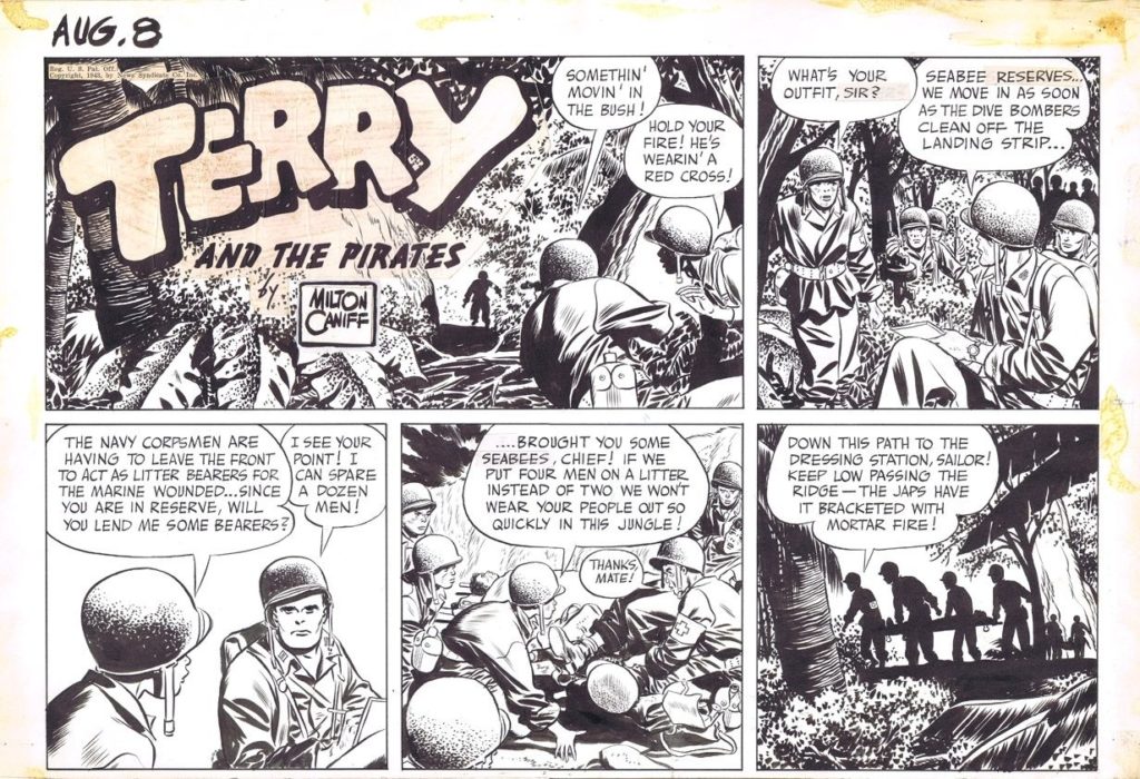
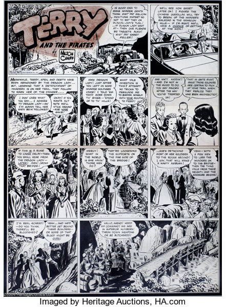
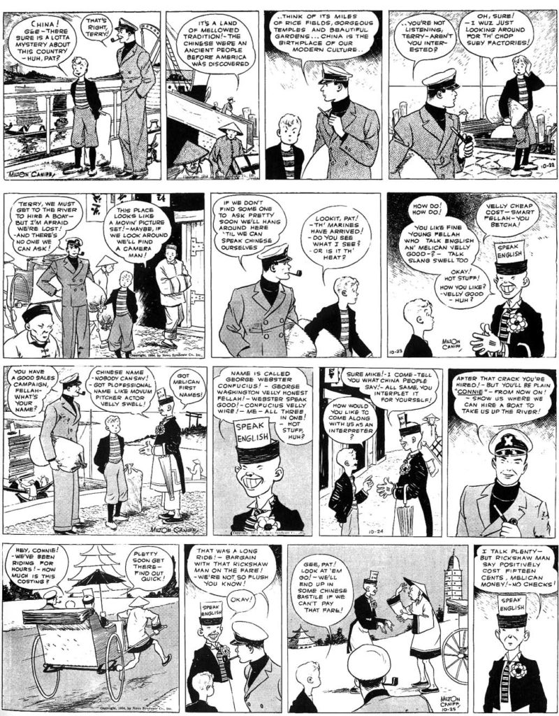
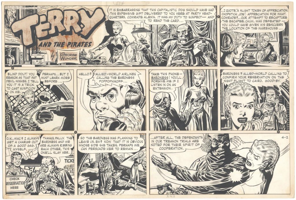
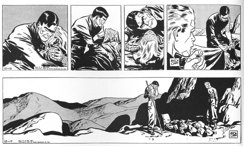
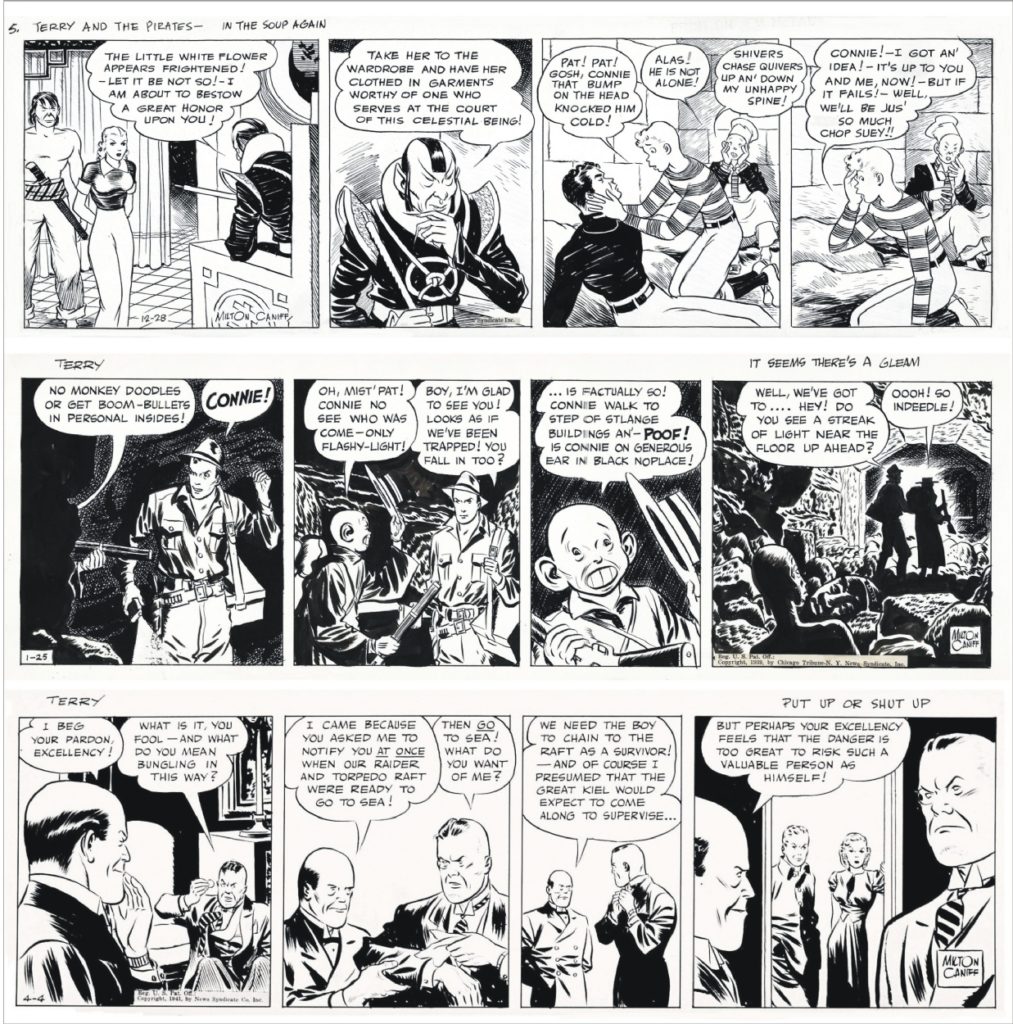
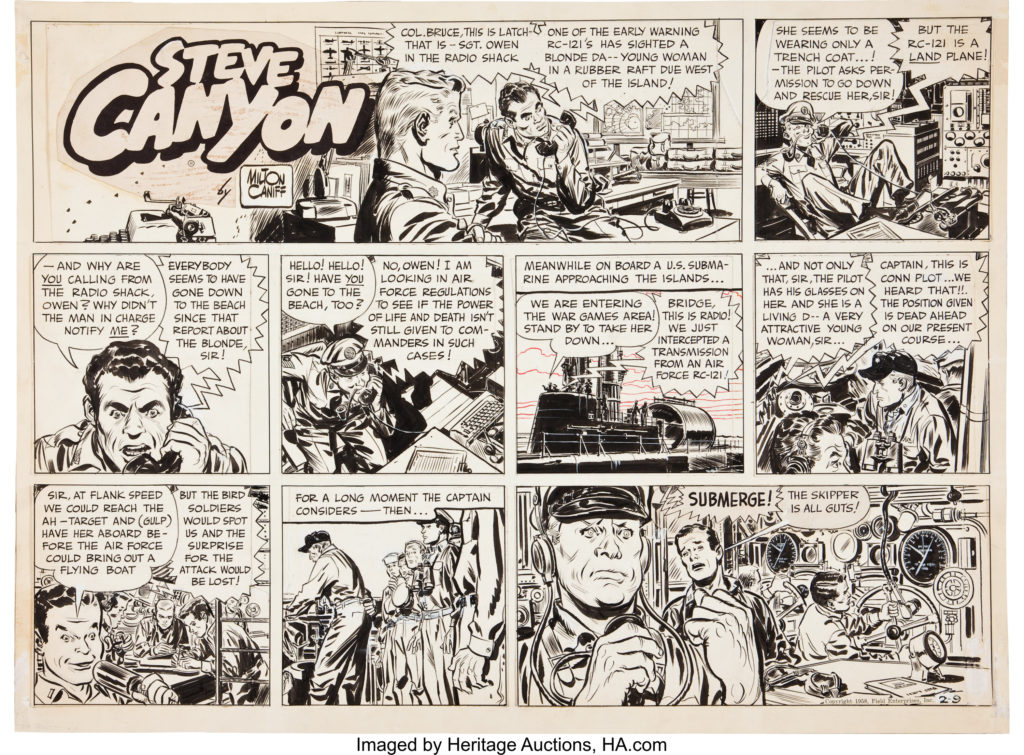
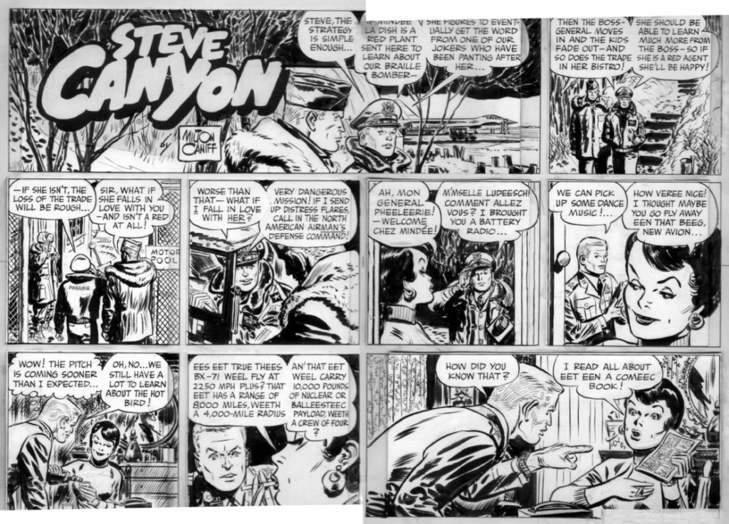
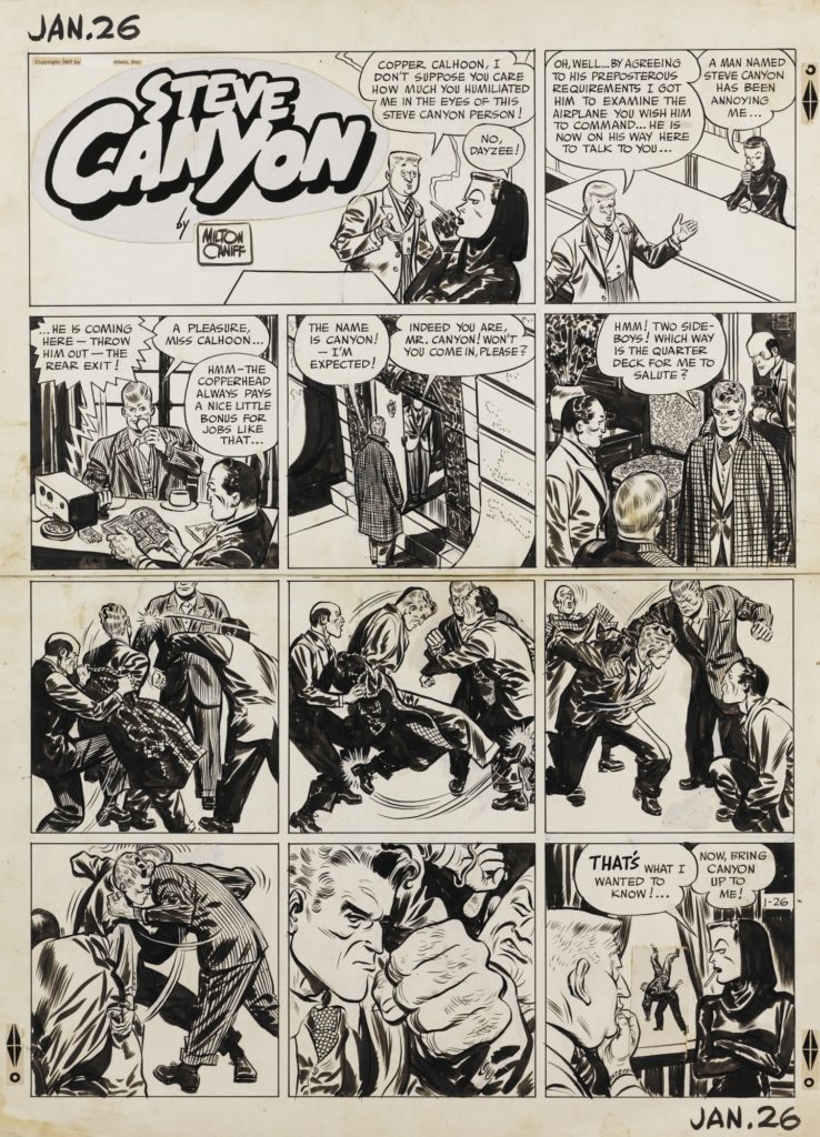
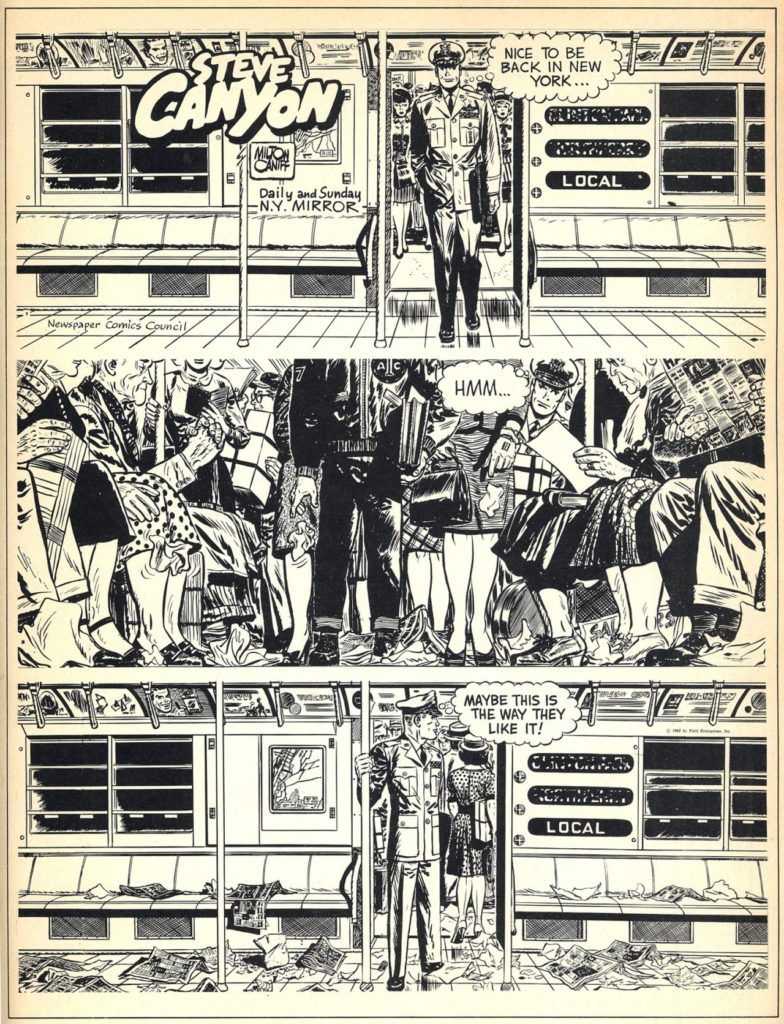
Milton Caniff – Terry and the Pirates – Steve Canyon – another of the most popular serialized action/adventure strips. Most notable because of the continuous experimentation in drawing/art technique by Caniff who set the standard many comic book artists would later try to attain. Terry and the Pirates copyright was owned by the syndicate. In 1947 he started Steve Canyon so he could retain creative and financial control of his work.
![]()
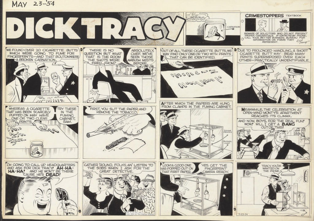
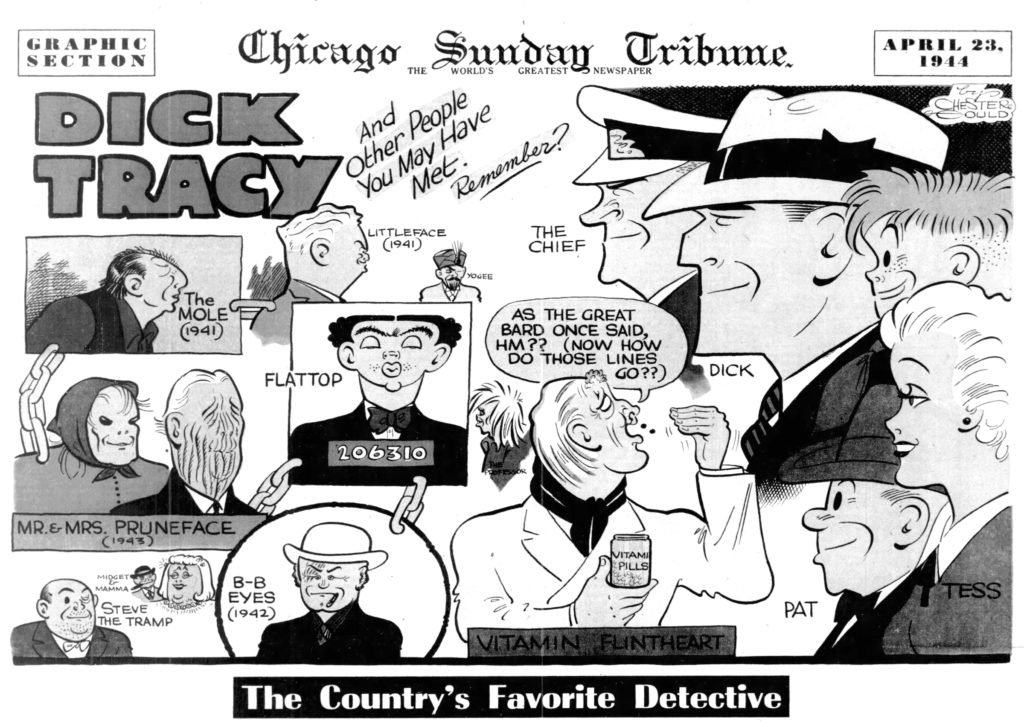
Chester Gould – Dick Tracy another of the most popular serialized action/adventure strips. Most notable because of character design
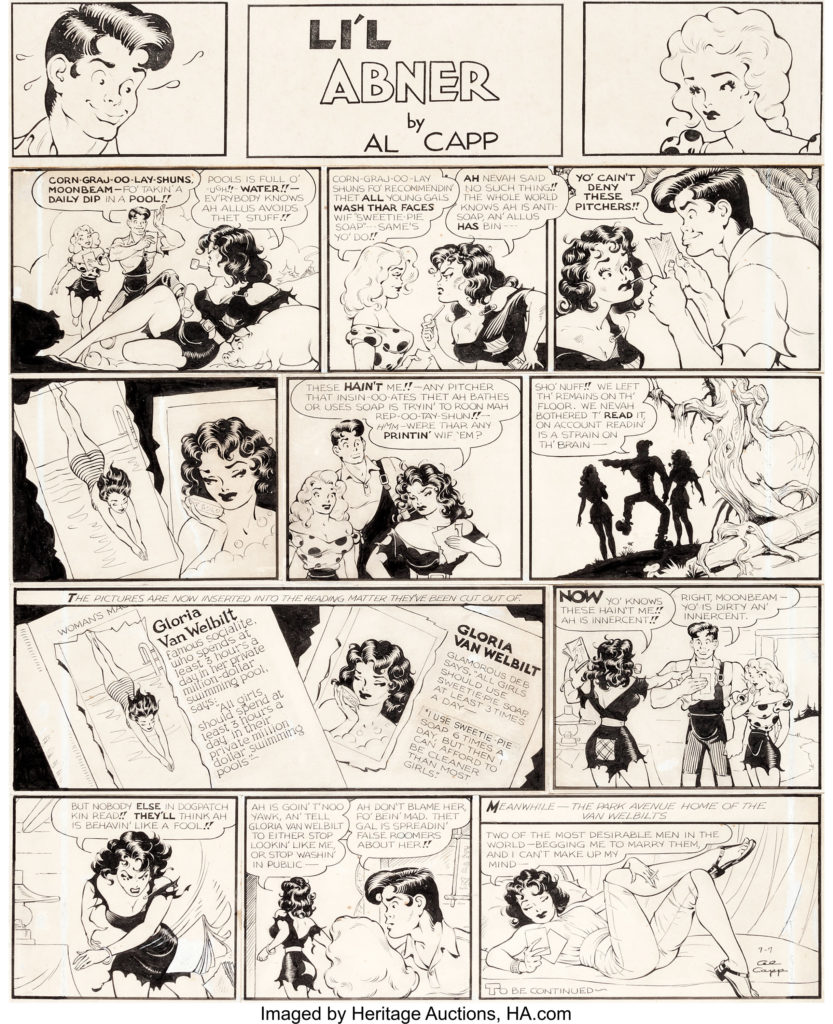
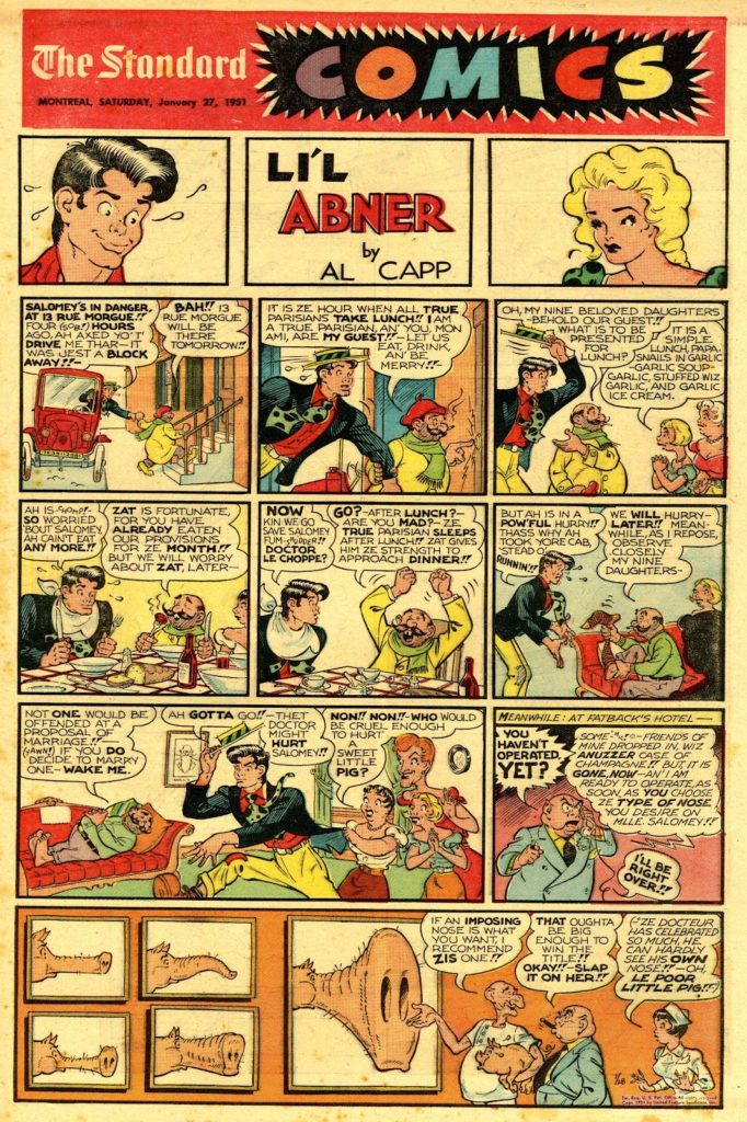
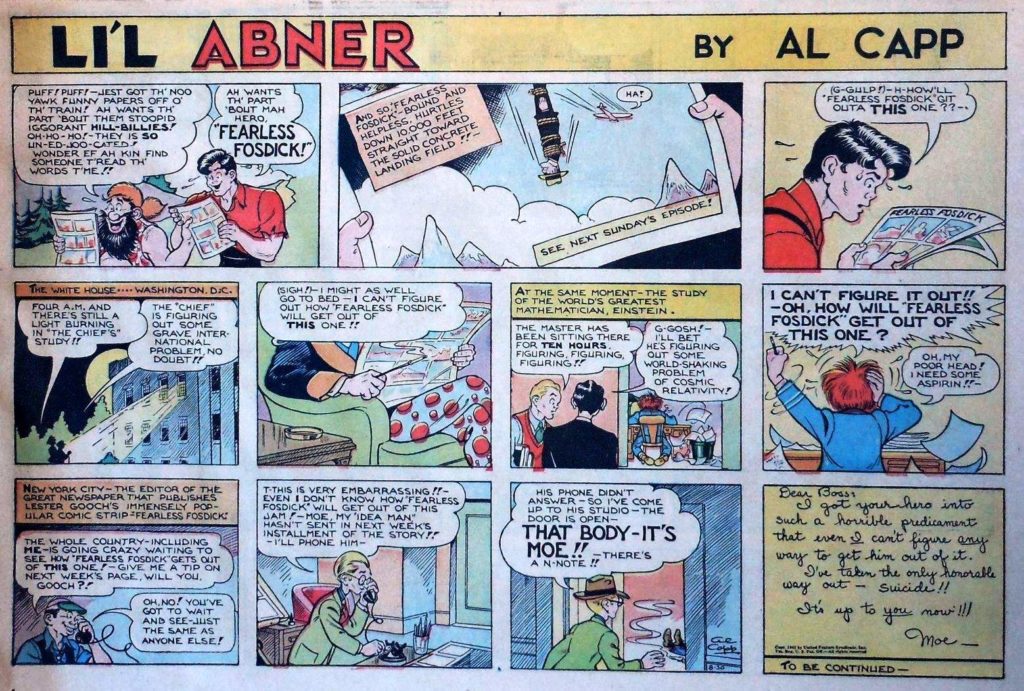
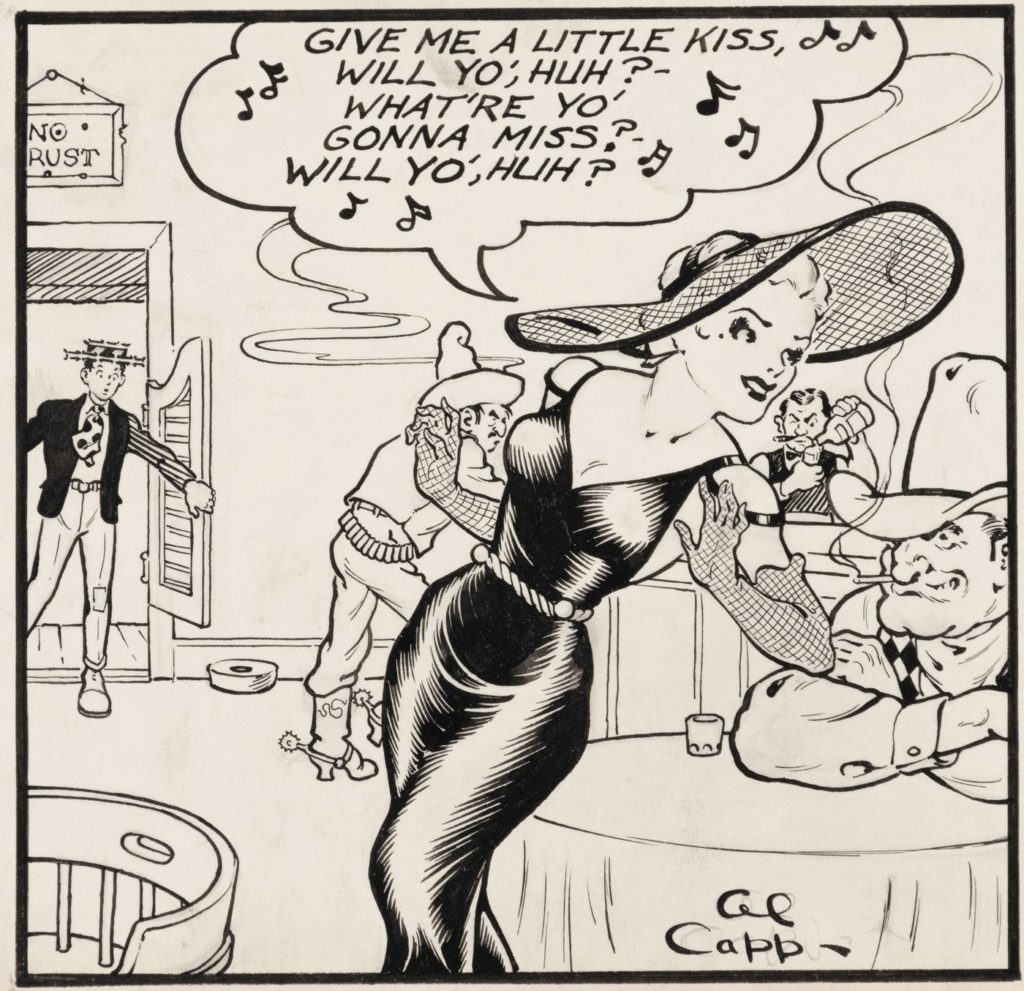
Al Capp – Li’l Abner was a satirical comic strip set in the south. boasted 60 million readers in 1935.
![]()
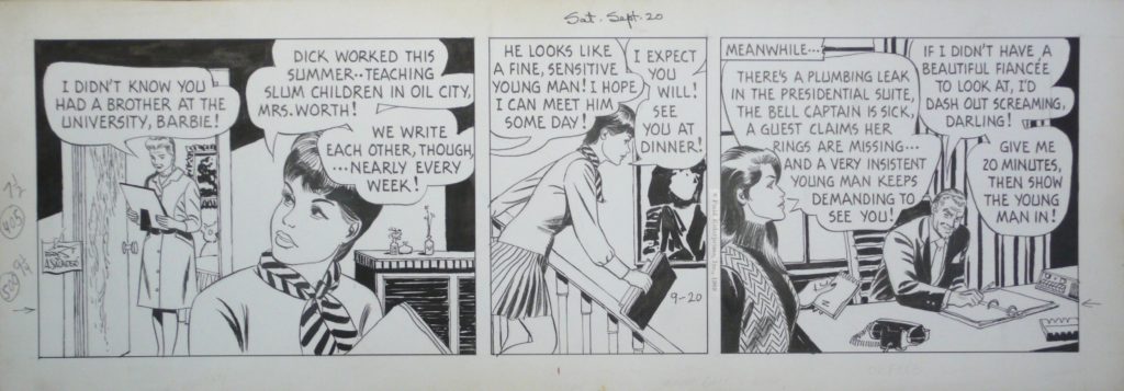
Allen Saunders – Mary Worth – first significant soap-opera-style strip. The idea was to create an “open ended novel”
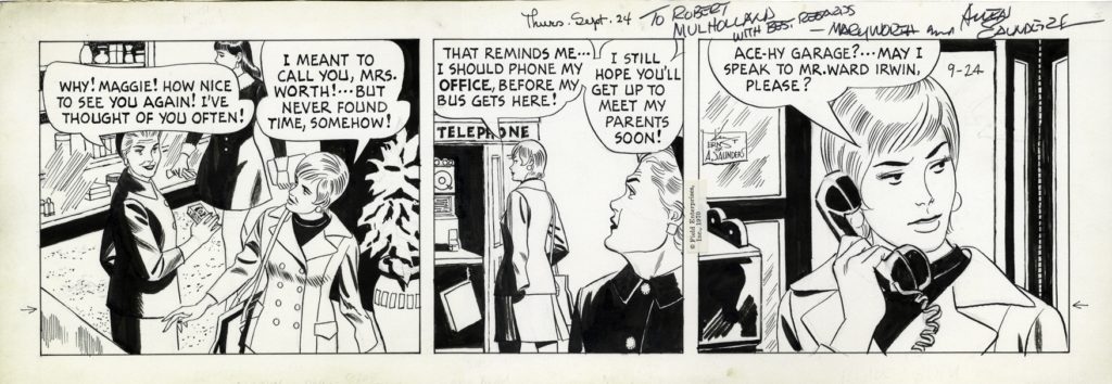
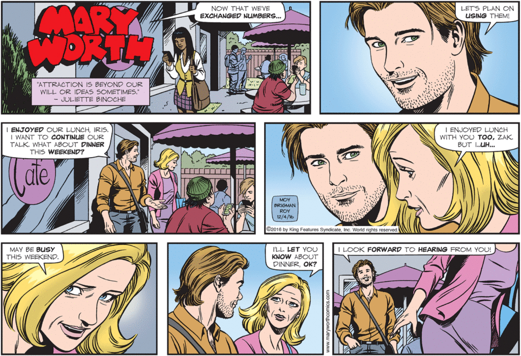
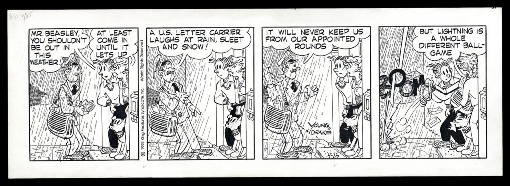
The last image from Mary Worth is pretty recent. This strip still runs today and is drawn by my dear friends, June Brigman and Roy Richardson. We’ll talk a lot more about June when we get to the 80s, and we’ll talk a bit about Roy when we get to the 90s.
Nicholas P Dallis – Rex Morgan, M.D. – another significant soap-opera-style strip.
Elliot Caplin – The Heart of Juliet Jones – as the younger brother of Al Capp he worked on several iconic comic strips. The Heart of Juliet Jones is his most successful personal creation, though the first several strips were based on a treatment by Margaret Mitchell, of Gone with the Wind fame.
Dale Messick – Brenda Starr is significant because it was the first ongoing “serious” adventure strip staring a female protagonist.
Mort Walker – Beetle Bailey – by 1954 boasted a readership of 200 million people daily.
Walt Kelly – Pogo – most notable for the extreme draftsmanship of Kelly (check out the backgrounds)…he started out as a storyboard artist for Disney.