“It was actually quite difficult to avoid Wim Crouwel’s work. In the 1960s the Netherlands was inundated with posters, catalogues, stamps designed by him, even the telephone book.”
– Karel Martens
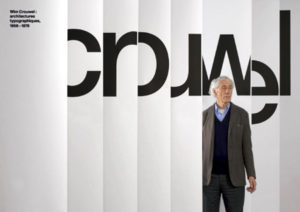
Wim Crouwel : architectures typographiques 1956-1976
An exhibition that ran from February 10th to April 28th, 2007, at Galerie Anatome in Paris. Catalogue and invitation designed by Experimental Jetset.
Wim Crouwel, born in Groningen (the Netherlands) in 1928 is a remarkable and inspiring figure with an inventive spirit and vision, vigorous and always distinguished.
He designed his first poster in 1952. After leaving artschool he became a painter leaning towards Expressionism, but as he designed this first poster he discovered the pleasure of organising visual information in an aesthetical context.
The contrast between Crouwel as a lyrical expressionist painter and objectivating functionalist designer couldn’t be more extreme. As a designer he felt related to the Bauhaus ideas, the swiss-inspired international style. He was fascinated by the rational aspect in Bauhaus typography, which he discovered through Karl Gerstner’s and Gerard Ifert’s work.
Although his ideas were bauhaus-related, unlike many Crouwel was not a dogmatist. He was fascinated by the ideas about serial and mass production, as he stated “we need the machine since we have no time”. But he also believed “the machine cannot replace the precision of the human eye and human feeling”.* Crouwel’s work has always consisted of these two essential elements: the emotional aspect and the rational one.
|
The task of the designer consists of analysing the design project and solve the problems he distilled in an objective way. The message and the way it should be presented flows out of this process. Graphic design is a wide field in which Crouwel mainly focussed on type. He works quite constructive, constructs type, and works on grids. Crouwel is especially admired for his systematic approach and his creative handling of the shape of letters. His work was influenced by the pre-war Werkmann and post-war Sandberg, an individualistic generation of typographers who dared to juggle with letters. |
|
|
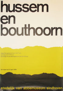
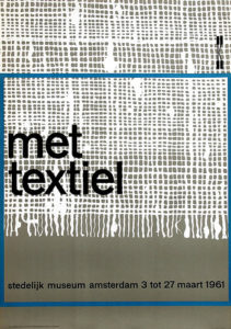
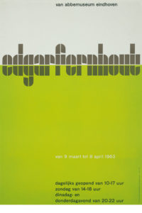
CROUWEL AT THE VAN ABBE MUSEUM In 1954 Crouwel designed the catalogues and posters for the Van Abbe Museum. He took the position that the design of a catalogue or poster must not be an interpretation of the artist’s ideas. It should merely provide relevant information to the reader, without ornaments or styling as this would only lead to confusion. The catalogue should not refer to the artist as an individual, but to the museum and its range of activities. The development of the programme as a whole is more important than creating the best poster ever for each new project. |
|
|
Eduard de Wilde, Director of the Van Abbe Museum at the time Crouwel was asked for this task, remembers he found himself in an ambiguous situation. “Crouwels’s position of subjecting highly different appearances of art under the same typographic style would not be acceptable to some artists. But i also had to appreciate that transferring most different artistic trends and tem-peraments into typography might lead to a typographic chaos.”
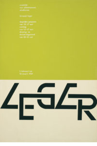
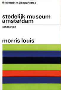
MODERNIST, FUNCTIONALIST, PURIST Crouwel is a modernist and impressed by a typeface like Helvetica, which was more neutral than any other typeface. “A face shouldn’t have a meaning in itself, the meaning should be in the content of the text.”* In his work Crouwel chose sans-serif faces that allowed numerous combinations, like Gill (Van Abbe museum) and Universe (Stedelijk). The essential information was set in one returning typeface and the title of the exhibition slightly reflected the feel of the exhibition. He looked at the work of the artist, got an impression and tried to translate it typographically. An example of this way of working is found in the exhibition about Leger. Leger’s work could be recognized by its heavy lines around the images. This influenced him to create the word Leger with thick black lines so it would dominate the poster. Crouwel always searched for the abstract, something that would strike the eye.
As a functionalist Crouwel focussed on the readability of his work. But when he had to make a choice between readability and aesthetics, he chose aesthetics. “When you’re a functionalist you want to make things comprehensible, readable, make your ideas visible. I feel myself being a modernist, a functionalist, but aesthetics always stand in the way.” He says.*
Couwel is a purist as he mainly uses type, but in the course of time non-typographic elements like lines and even reproductions would appear in his work. These slight changes of direction can be explained by his non-dogmatic view. Crouwel takes his customers’ wishes seriously and tries to match them with his own fundamental typographic principles. Often curators have their own opinion concerning the design for their exhibition. Crouwel’s carreer is marked by both his flexibility and his integrity.
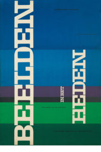
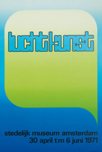
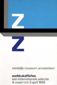
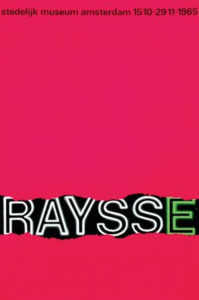
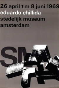
TOTAL DESIGN Together with colleagues Benno wissing, Friso Kramer and Dick & Paul Schwartz, Crouwel started a designstudio named Total Design. Total Design was to be the first bureau that managed to accept large and multidisciplinary designtasks for the government, as well as commercial clients. In 1963 Eduard de Wilde succeeded Willem Sandberg as director of the Stedelijk in Amsterdam. Crouwel (and Total Design) moved along with him as he was asked to continue their cooperation. During the next twenty years he designed catalogues, invitations, posters and brochures and created what we now recall the SM-design style: a cool, pragmatic artistry in the variation of normal and semi-bold grotesque faces on a page at once fully utilized, yet open to all sides.
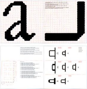
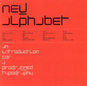
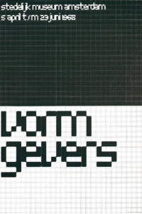
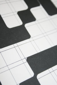
NEW ALPHABET Besides printwork Crouwel has designed several font sets, of which the New Alphabet (1967) is best known. This typefaces was developped after seeing the first digital typesetters at a print exhibition in Germany. The digital production of the Garamond, as presented on this exhibition looked horrible to him. The roundings of several sizes of a typeface were not alike, because of the small amount of pixels used, as you could see when the letters were enlarged.
Crouwel thought it would be better to design a typeface that was suitable for this machine instead of forcing it to use the typefaces we knew. He drew the New Alphabet, a highly abstract font, based on a dot-matrix system. With its straight lines, 90 degree angles and 45 degree roundings, either big or small, it always looked exactly the same. The face was as high as it was wide, thus lining in every way so it would fit in every grid system. Crouwel teached at diverse academies during the 70’s, before the computer period really started and was director of the Museum Boijmans Van Beuningen in Rotterdam In the years 1985-1993. TODAY Crouwel still is an active member of the Dutch graphic design scene as an advisor in Total Design. Today known as Total Identity it has more than 150 designers spread among 6 cities. You can find their recent work on http://www.totalidentity.com/ |