The point of these posts is to familiarize the student with concepts in typography. In addition to anatomy of type, one of the basic ideas is simply understanding the development of typographic forms in western culture over time. As a result we usually begin such discussions with typefaces that are considered “Humanistic” or “Humanism” as type. Humanism as type was the first step in the development of modern/post-renaissance moveable type, it was based on the way humans write.
This explanation for Type as “Humanism” was written by Mark Simonson. You can see the original here.
“Humanism” is generally understood as a stance that values the power of human beings over dogma or superstition. It follows that something labeled as humanist would reflect those values–that the human creation is paramount.
However, while the word itself is certainly related, a “humanist” typeface is something very different. Rather than being named for the contrast of dogmatic belief vs. the paramount status of the individual, “humanist” in this context refers to something very specific–the lettering style that came about in the Renaissance, based upon organic human calligraphy.

The first typefaces that are considered humanist appeared following the invention of movable type. They were based on the handwriting of the medieval scribes of Italy, featuring softly rounded shapes, based upon a lighter, flowing script. They replaced the claustrophobic “Black Letter” forms of writing that were the norm prior to the Renaissance, bringing a lighter organic flow to the writing.
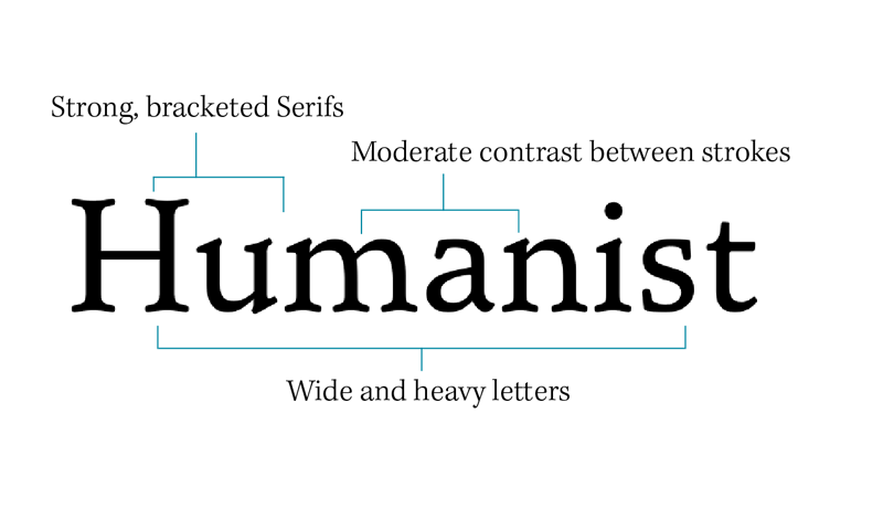
Whether serif or sans, humanist fonts tend to look more like they are done by a human hand, with a natural, organic expanding and contracting of the strokes as if the letters were drawn calligraphically. They tend to have an axis that resembles calligraphy that is drawn at an angle with a pen nib.

The wikipedia category for humanist fonts.