A large-scale exhibition of photographs by pioneering early photographer, Eadweard Muybridge will open at Beetles+Huxley in July. The exhibition showcase 65 collotype prints made by the artist in 1887, from his influential series “Animal Locomotion”, which features images of animals and people captured mid-movement.

Muybridge made his most enduring work in the project “Animal Locomotion” between 1884 and 1887 for the University of Pennsylvania, Philadelphia. Each plate in the series shows the same subject in sequential phases of one action. Muybridge recorded varied forms of movement in a wide range of animals, mostly taken at Philadelphia zoo, from pigeons in flight to the subtleties of gait found in sloths, camels and capybaras. Muybridge also documented human subjects walking, running and descending staircases and engaging in boxing, fencing, weight lifting and wrestling.

The works in this exhibition will collectively demonstrate how “Animal Locomotion” broke new ground in terms of both science and the emerging art form of photography. Muybridge’s work from this period has contributed to the science of physiology and biomechanics and the photographs have had a profound influence on a wide range of artists, including artists Marcel Duchamp, Francis Bacon, Jasper Johns and Cy Twombly.

Born in 1830 in Kingston upon Thames, London, Muybridge emigrated to America as a young man and worked as a bookseller. After being injured in a runaway stagecoach crash in Texas he returned to the UK for a five-year period where it is thought he took up photography. Upon his return to America, he quickly established a successful career as a landscape photographer, producing dramatic views of both Yosemite and San Francisco. His reputation as being an adventurous and progressive photographer led him to work as both a war and official government photographer. In 1872, the former Governor of California, Leland Stanford, hired Muybridge to photograph his horse galloping, to discover whether the animal’s hooves were lifted off the ground at the same time a popular debate at the time. In order to photograph the horse at speed, Muybridge engineered a system of multiple cameras with trip wire shutter releases to capture each stage of the movement which proved conclusively, for the very first time, that a galloping horse lifts all four hooves off the ground. This work laid the foundations for “Animal Locomotion”.

Eadweard Muybridge’s work has been the subject of recent major retrospectives at the Smithsonian Institution, National Museum of American History, Washington DC; the Corcoran Gallery of Art, Washington DC; Tate Britain, London and the San Francisco Museum of Art. His work is held in over 90 international collections including those at the American Museum of Natural History Library, New York; British Library, London; the Los Angeles County Museum of Art; Metropolitan Museum of Art, New York; New York Public Library; Smithsonian Institution, Cooper Hewitt Museum, Washington DC; and the Victoria & Albert Museum, London.

MotioMo

Example Primal Branding Projects

InkSpatter Press

  • The Creation Story

Alan O.W. Barnes created InkSpatter Press as a way to execute experimental comics, animation, and music without having to give up elements of his vision to corporate overlords.

  • The Creed

If it were easy everyone would do it.

  • The Icons


  • The Rituals

Listening to the Legion of Lethargic Super Geeks’ podcast

Reading books by Barnes

  • The Pagans or Nonbelievers

Anyone who hates comics and art music

  • The Sacred Words

“Testing the theory that growing up is inevitable”

“Fairy tales do not tell children the dragons exist. Children already know that dragons exist. Fairy tales tell children the dragons can be killed.”

  • The Leader

Alan O.W. Barnes

Starbucks Coffee

  • The Creation Story

The first Starbucks was opened in Seattle, Washington, on March 31, 1971, by three partners who met while they were students at the University of San Francisco:[22]English teacher Jerry Baldwin, history teacher Zev Siegl, and writer Gordon Bowker were inspired to sell high-quality coffee beans and equipment by coffee roasting entrepreneur Alfred Peet after he taught them his style of roasting beans. Bowker recalls that Terry Heckler, with whom Bowker owned an advertising agency, thought words beginning with “st” were powerful. The founders brainstormed a list of words beginning with “st,” and eventually landed on “Starbo,” a mining town in the Cascade Range. From there, the group remembered “Starbuck,” the name of the chief mate in the book Moby-Dick. Bowker said, “Moby-Dick didn’t have anything to do with Starbucks directly; it was only coincidental that the sound seemed to make sense.”

  • The Creed

We make sure everything we do is through the lens of humanity – from our commitment to the highest quality coffee in the world, to the way we engage with our customers and communities to do business responsibly.

  • The Icons


  • The Rituals

Standing in line to get coffee in the morning

  • The Pagans or Nonbelievers

People who drink Dunkin Donuts coffee

  • The Sacred Words

“Tall”, “Grande”, “Venti”

  • The Leader

Kevin Johnson

There was a lot happening in the 70s, from diverse pop culture to social movements, all of which influenced graphic design in different ways. From punk to postmodernism, there are many things about 1970s graphic design to inspire you today.

Photography and Collages

Graphic design in the 1950s and 1960s often featured cartoons and illustrations.

In the 1970s, this changed, and photography became more popular. The 1970s took things the extreme, which meant that photography was often dazzling or in grayscale.

Examples:

Nixon and Elvis

Result of napalm in Viet Nam

National Guardsmen opened fire on peaceful protestors.

Hunter S Thompson


Nixon

Jim Jones

Iran Hostage Crisis

Muhammad Ali

Woodward and Bernstein 

Apollo 11

John Travolta 

Diana Bryant (bottom) and Tiare Jones fall from the collapsed fire escape of their burning building on Marlborough Street in Boston just before firefighters could save them. July 22, 1975.

Bryant soon died as a result of her injuries, while Jones, who landed on Bryant’s body, did not.

Patty Hearst

Women sit in protest during the Women Strike for Equality demonstration — emblematic of the growing power of the women’s rights movement throughout the decade — in New York’s Bryant Park on August 26, 1970.

Jackson 5 first TV appearance.

Adding collage elements to photography was popular too, and eye-catching typography was used to enhance photos, particularly in popular magazines such as Rolling Stone. Illustration didn’t disappear, but it was used more to support photography instead of standing on its own.

Use of Famous Faces

Connected to the use of photography in 1970s design was the use of famous faces to promote products. As real people were models in advertisements more, it made sense to have well-known names and faces as the face of a brand.

A 1977 Craig Stereo advertisement featured Ray Charles promoting a stereo, emphasizing his name and face while downplaying other elements of the graphic design. This use of famous faces is something that has continued today in magazines, on TV or on social media.

Developments in Typography

Another prominent area of development in 1970s graphic design was typography. Typesetting technology during the decade made it possible to create revolutionary typography.

Typography was often combined with photography to create striking graphics. Everything was bold and bright, with elements such as 3D styles and large lettering.

Punk Graphic Design and Musical Influence

There was plenty of musical influence on graphic design in the 1970s. The different movements in the music scene, such as punk, inspired graphic designers the most.

Like the music, there wasn’t anything refined about punk graphic design. It was often black and white, homemade and with a DIY feel, even if it was made for professional materials, such as album artwork.

Some of the most famous album covers come from the 1970s, from Sex Pistols and The Ramones to the Rolling Stones and David Bowie. Like many other graphic materials, they often featured photography.

Use of Color

Previous decades had been colorful with design too, but the 1970s took colorful design to new heights. Bright colors stood out even more against black and white photography using vivid shades.

In the 1960s, the psychedelic style that went along with the hippy movement grew. That continued into the 1970s, tied into the other stylistic choices that designers of that time were making.

Even though the colors were bright, they were chosen to go well together, although some color choices pushed the barriers.

The Beginning of Postmodernism

Postmodernist design began to emerge in the 1970s, with designers embracing historical styles that had been rejected. Older styles were adopted and designers experimented with them, making them more exaggerated and fun.

From neo-classicism to art deco, these older design styles provided inspiration for 1970s designers, and can still inspire designers in the modern age. The 1970s was a great decade for testing styles and rejecting academic definitions previously found in graphic design.

The 1970s was only the beginning of postmodernism. Much more would come.

Influences from Around the World

Various cultural and design influences from around the world were important in graphic design in the 1970s. As the world became more global, different cultures influenced each other.

For example, Japan’s recovery from the Second World War and its growth meant that it had a strong influence on the rest of the world.

How Japanese design influenced design elsewhere included a new set of colors that go well together, centered icons and symmetry.

Stand-out Graphic Design from the Decade

There are many recognizable examples of graphic design that can provide inspiration for graphic designers today. One particular example is the NASA logo and the striped IBM logo, which replaced the solid version in 1972.

Other notable designs from the decade include the rainbow-striped beaver for the 1976 Vancouver Olympics and adverts from Apple, such as the Introducing Apple II advertisement from 1977.


It is impossible to discuss all aspects of image treatment in publications. Like most media today, the ideas and expectations are shifting regularly. That having been said, here are a few ideas:

All publications use photos, illustrations, infographics, and iconography. As of 2020 the standard resolution for printable imagery is 300 dpi (dots per inch) or ppi (pixels per inch). Most professionals create their images for publication at a minimum of twice the expected image resolution. So if the intended output is a fourth page ad in an 8.5″X11″ magazine, one would make the original file 8.5″X2.75″ at 600 dpi, then account for bleed, printable area and margins.

Remember, the margin may be different on either side to account for the spine of the publication and how malleable the inner gutter unfolds. If it is a large publication the inner margin may be as much as an inch, while the outer margin is only a half an inch. These are decisions the book designer needs to make in order to insure that the book comes out looking polished and legible.

Remember that when it comes to images, you can reduce them in scale, but you cannot make raster graphics larger without suffering quality problems. I have seen many disappointed designers who built things for websites, then wanted to convert those materials to books, and were extremely disappointed to discover that all their images had to be re-created to account for the demands of print publishing rather than web/digital publishing. The gap between these two worlds is shrinking, but the standard screen resolution is still 72 ppi, which is much lower than 300 dpi. Current retina screens are 144 ppi (72X2), but that is still less than half the stand resolution for print.

Kinds of Images Used in Different Publications

Again, this is impossible to foresee with the shifting media landscape, but generally newspapers need images that convey something immediate, while magazines can afford to use images that convey less immediate information. Newspapers and news websites are in the business of conveying information as it unfolds, in as simple and articulate a way as possible. Magazines are in the business of slowing down and focusing on a topic at length.

Photographs

Photographs can be acquired in a few different ways.

  • You can take them yourself. Actually, there are a number of news organizations that are essentially training their reporters to collect photos and video for publication using smart phones. There is an “old guard” who hate this and decry it as the end of professional journalism, but it does not change the fact that newspapers and news websites are having a harder time making ends meet financially. If they want to continue staying competitive it makes sense that they would find a way to get the materials they need in as inexpensive a way as possible. However, I agree that switching to a smart phone instead of a camera with “good glass” is not going to give you the same quality. Some reporters are learning to shoot with DSLRs, and I hope that trend continues. If you are in this class, you have the training or are getting the training to use a camera. This gives you a small leg up compared with much of the competition.
  • You can hire a photographer/commission a photographer. This is pretty easy. There are a ton of photographers looking for work. I’ve seen many “2 person teams” work at this sort of thing very successfully, where one does the “ideation” and writing for an article and the other collects the materials and completes the design. Here’s another idea: some editors will purposefully not tell a photographer the point of the story, maybe just the subject, then see what the photographer comes up with. Sometimes this can lead to an interesting juxtaposition of ideas. Also, remember that the photo you have commissioned can be edited through image manipulation software, like photoshop, if you need the image to convey something slightly different from what you received. Often the role of photo editing is a whole discipline unto itself. Sometimes photo editing is as simple as cropping so you are only publishing the part of the image one needs to see.
  • You can purchase photos from a website like “gettyimages” or “shutterstocK”. They will supply high resolution versions of the image you want/need.

Illustration

At one point in time all images in publications were illustrations because the printers needed very specific parameters in order to reproduce images effectively. With current print technology illustrations are in far less demand, though most publishers still use illustration for icons and branding. Some publishers use illustration helps a publication by expressing an idea more abstractly, or figuratively. If a reader sees a photograph that is what it is. If they see an illustration they intuitively understand the illustration is an approximation.


The Senate Subcommittee Hearings on Juvenile Delinquency took place between April 21-22, 1954.

American Psychologist Fredrick Wortham had been going around speaking about the problem of comics as he saw it since 1948. Two days before the hearings he published a book that compiled his ideas from these talks. The book was  called “Seduction of the Innocent”.  It claimed comic books, and specifically, horror, sci-fi, crime, and romance comics were to blame for the troubles American parents had raising misbehaving children. The term used for this was “juvenile delinquency”. Super Heroes were not totally innocent either. There are sections of the book devoted to proving Batman and Robin were in a homosexual relationship, as well as a section devoted to explaining that due to her power Wonder Woman must be a lesbian. At the time homosexuality was viewed as a mental disorder. His book also claimed Superman was un-American and fascist. More than this, it claimed that these comic books functioned as an instruction manual to teach children how to commit crimes.

There was a news program that built up tension about the comic book industry. I couldn’t find it, but I did find a piece someone put together that has excerpts from that program:

When the senate subcommittee hearings actually took place they called on Wortham, Walt Kelly, Milton Caniff, and The final witness of the day was Bill Gaines, from EC Comics. His testimony did not go well.


As a response to the hearings, the comic book industry tried to police itself by creating the comics code authority.

There is a good article at CBR detailing the rules the authority laid out.

EC Comics had a tough time with the rules. They were designed by all the publishers who were both envious of EC’S success, but also fearful there would get shut down by the government if they didn’t do something. This was the age of McCarthyism.

To make matters worse an editorial appeared in the Chicago Daily News called “A National  Disgrace” written by Sterling North. It was reprinted all over America.

There was an outbreak of anti-comic hysteria. 

By the 1960s only 6 of the twenty comic publishers survived.

Dell Comics (went out of business in 1974)

DC Comics

Archie Comics

Timely aka Atlas aka Marvel Comics

Harvey Comics (went out of business in 1994)

Charlton Comics (went out of business in 1986)

Gaines’ last attempt to comply with the code was a story called “Judgment Day”

After that story failed to pass code, Gaines discontinued all comics publishing. He converted Mad to a “Magazine” to make it clear it was not intended for children, and going forth that was how he approached most everything.


EC Comics

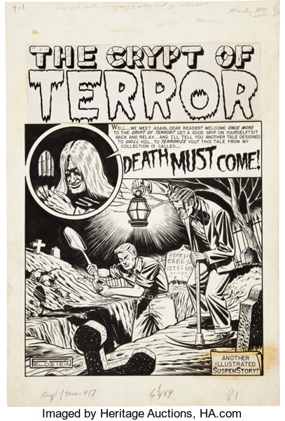
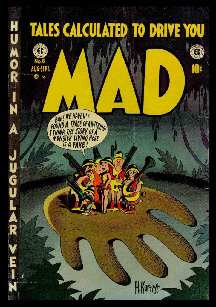
EC comics (First “Educational Comics” then later “Entertaining Comics”) was the biggest publisher of comics between 1950-1955. They published comics in genres like  horror, war, romance, fantasy, funny animal, and satire. Max Gaines, who was a co-publisher of All Star Comics in the 40s, founded EC comics in 1944 when that company merged with DC comics. After his death in 1947, his son, Bill Gaines took over. Bill transformed the company into a pioneer of horror, science fiction, and satire comics. While you may not have heard of “EC Comics”, you probably have heard of “Tales from the Crypt“, “Weird Science“, and “Mad Magazine“, for example.

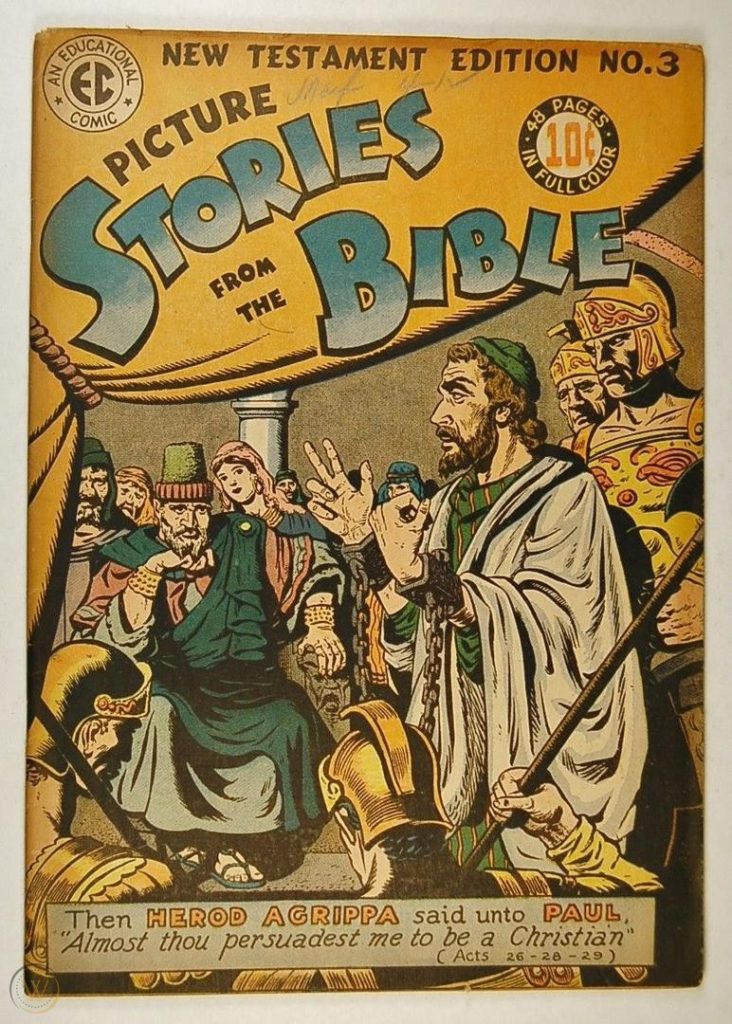
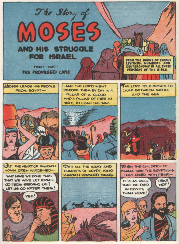
When Max started the company he began by producing a line of Picture Stories from the Bible.

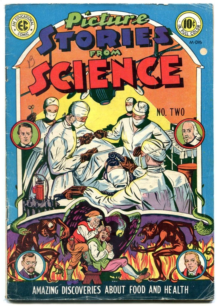
He also published Picture Stories from Science

…and Picture Stories from American History/

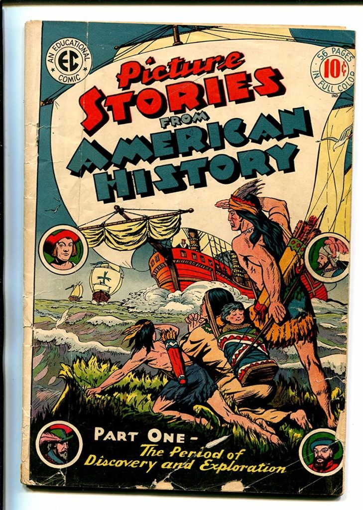
Which are all exactly what you think they are.

The company was approximately $100,000 in debt when he died in a boating accident.

His son, Bill Gaines, a chemistry student and aspiring teacher, was left in charge of the company.

Bill changed the name from Educational Comics to Entertaining Comics and decided to try and capitalize of the popular genres of the day. His first publications were character driven like the comics that preceded EC in the 40s. 

In 1950, Al Feldstein became the editor of the company. He and Gaines decided to take the books in a completely new direction.

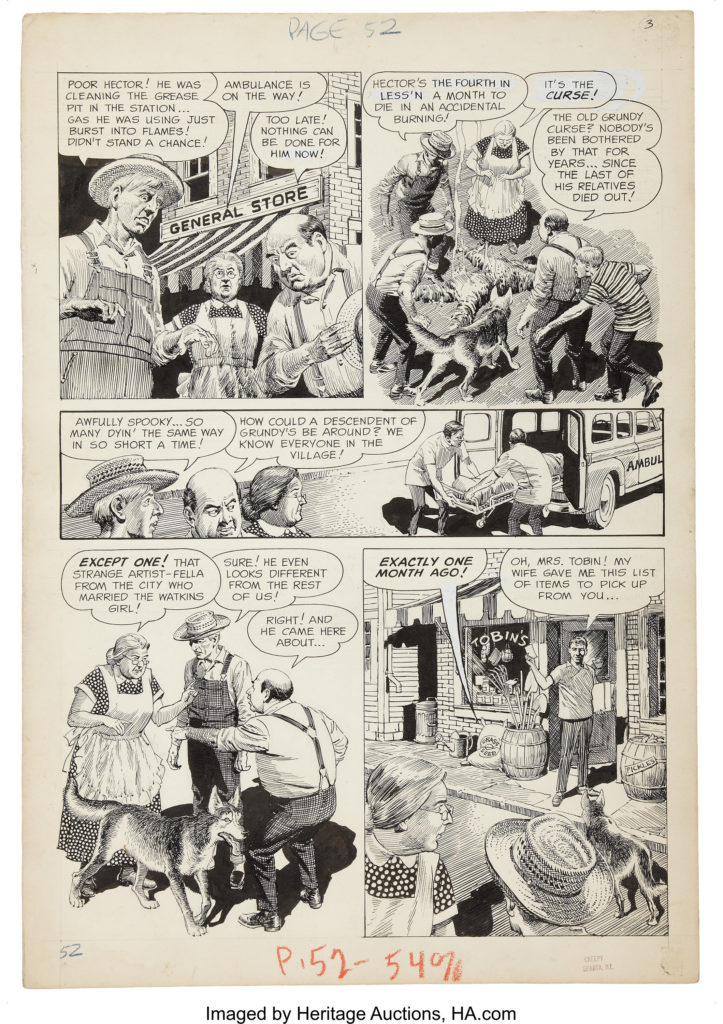
Most of their books were anthology comics, meaning, they did not feature a main character, but rather, sought to tell a variety of stories in the genre specified by each magazine’s genre. These stories would often be 4-8 pages long. The reason many comics are presented in 4 page units (you will often hear about 4 page, 8 page, 12, page, 16 page, 20 page, 24 page, etc comics is because when comic magazines are printed they are printed in 4 page signatures.

We will begin by discussing their main contributors:

Al Feldstein

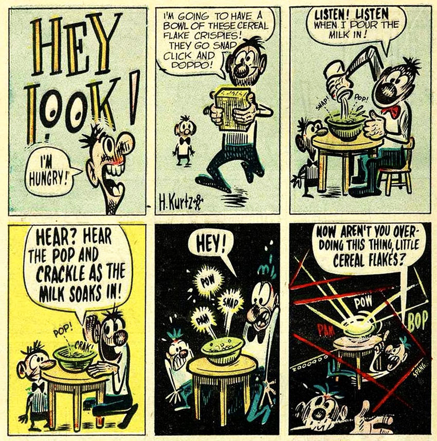
Al was an illustrator, but began writing comics at EC. He eventually stopped drawing interiors to focus on writing and cover art. He would often write a 4-8 page story for 7 magazines in the EC line every month.

Wally Wood

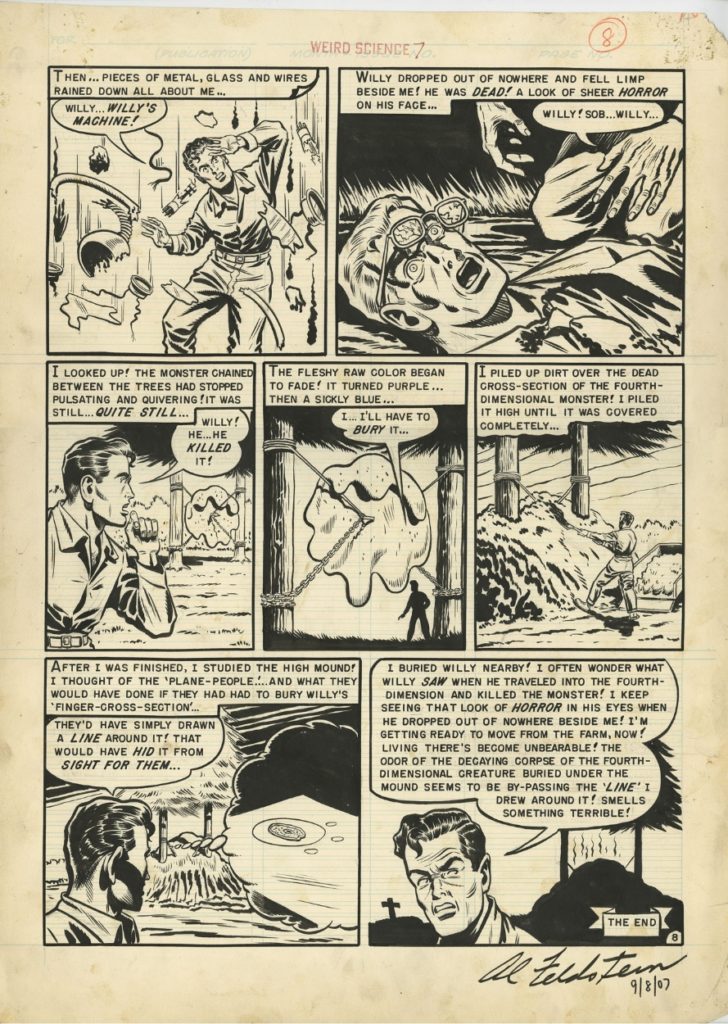
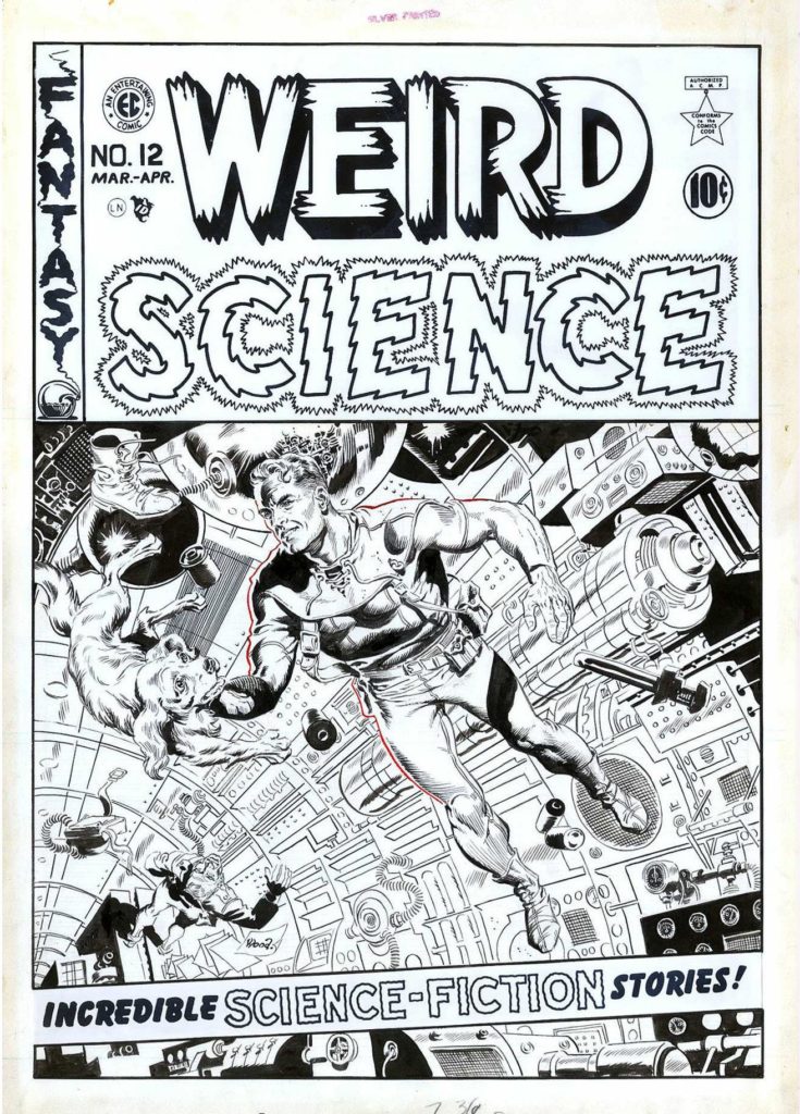
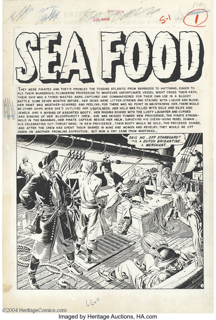
was the super star artist of the EC line. He became primarily known for his Sci-Fi comics, but the real secret behind the success for the EC line was the fact that he and Feldstein weren’t scared to get a little smutty with their depictions of romantic relationships.

Harvey Kurtzman

He wrote and edited theTwo-Fisted Tales and Frontline Combat  war comic books, where he also drew many of the carefully researched stories, before he created his most-remembered comic book, Mad, in 1952  which was a humor and satire book.

Al Williamson

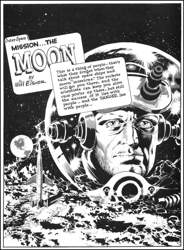
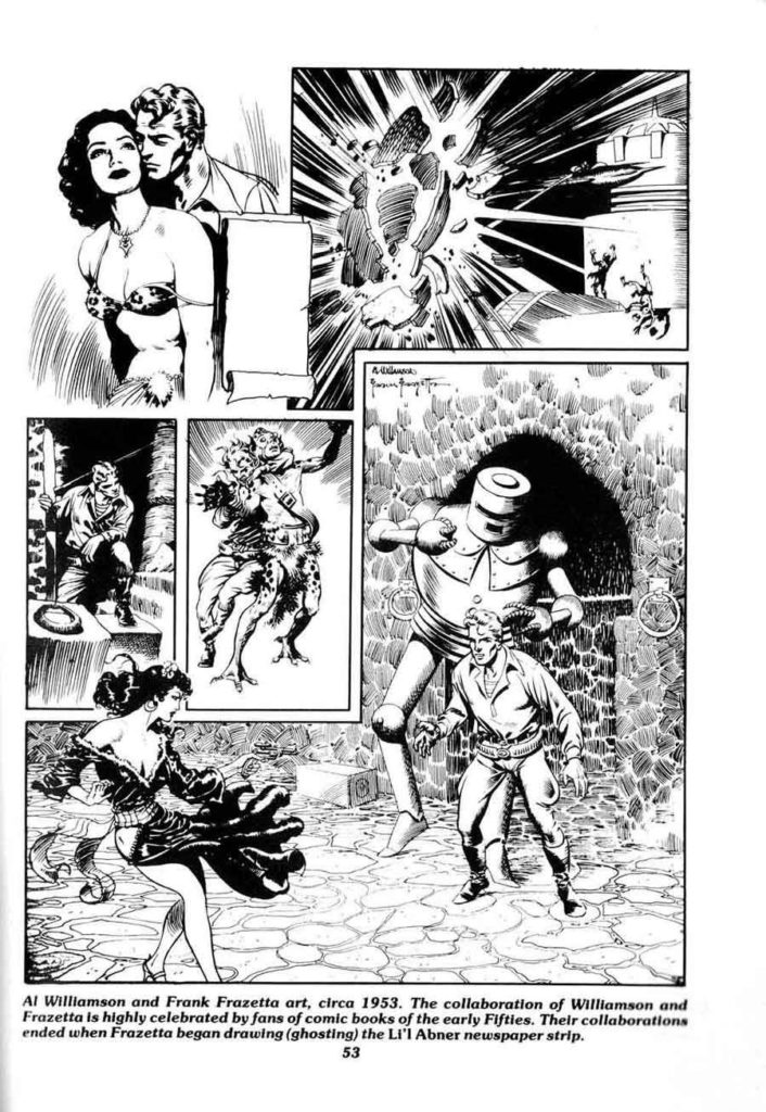
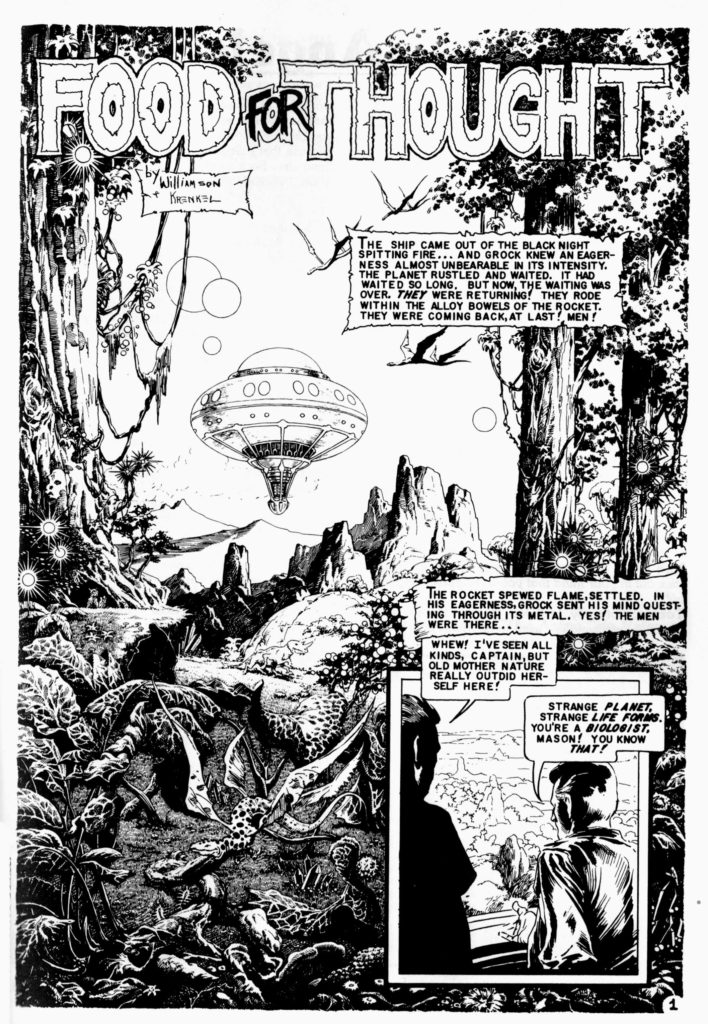
He took art classes at Burne Hogarth‘s Cartoonists and Illustrators School, there befriending future cartoonists Wally Wood and Roy Krenkel, who introduced him to the work of illustrators who had influenced adventure strips. Before long, he was working professionally in the comics industry. His most notable works include his science-fiction/heroic-fantasy art for EC Comics in the 1950s, on titles including Weird Science and Weird Fantasy.

Reed Crandall

Crandall drew for comic books from 1939 until 1973. His first work appears in comics from publisher Quality Comics, for which he drew stories starring such superheroes as the Ray (in Smash Comics, beginning in 1941 and initially under the playful pseudonym E. Lectron)[12] and Doll Man (first in Feature Comics in 1941, then in the character’s own solo title). His earliest confirmed cover art is for Fiction House‘s Fight Comics #12 (April 1941) at the Grand Comics Database.[13] Other early work includes inking the pencil art of future industry legend Jack Kirby on two of the earliest Captain America stories, “The Ageless Orientals That Wouldn’t Die”, in Captain America Comics #2 (April 1941),[14] and “The Queer Case of the Murdering Butterfly and the Ancient Mummies” in #3 (May 1941).[15]

With S.M. “Jerry” Iger credited as writer, Crandall co-created the superhero the Firebrand in Quality’s Police Comics #1 (Aug. 1941) and began his long run as artist of his signature series, the World War II aviator-team strip “Blackhawk“, in Military Comics #12-22 (Oct. 1942 – Sept. 1943) and, after his WWII service in the Army Air Force,[8] in Blackhawk and in Modern Comics. During this time he also drew the adventures of Captain Triumph in Quality’s Crack Comics. His final “Blackhawk” work was a seven-page story, plus the cover, for Blackhawk #67 (Aug. 1953).

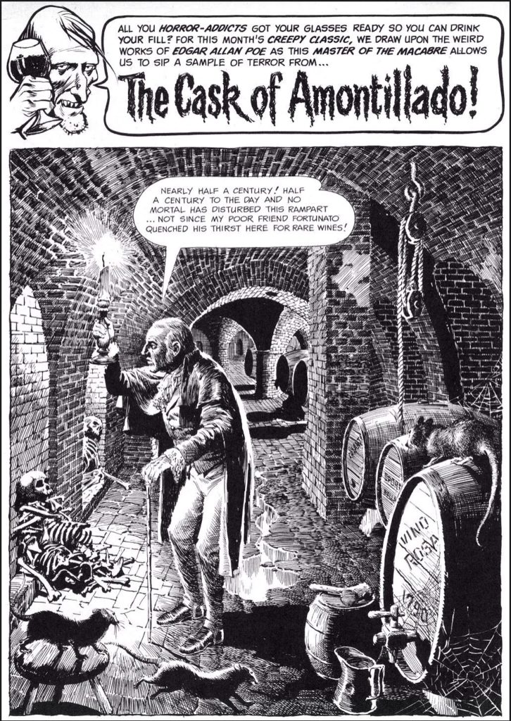
Crandall went on to become a mainstay of EC Comics, whose line of hit horror and science fiction titles would become as influential to future generations of comics creators as they were controversial in their own time due to their often graphic nature and mature themes. Joining a group that included artists Johnny Craig, Jack Davis, Will Elder, Frank Frazetta, Graham Ingels, Jack Kamen, Bernard Krigstein and Wally Wood, Crandall made his debut there with the six-page story “Bloody Sure”, written by Al Feldstein, in The Haunt of Fear #20 (August 1953).

He drew dozens of stories across a variety of genres for the EC anthologies Crime SuspenStories, Shock SuspenStories, Tales from the Crypt, Two-Fisted Tales, The Vault of Horror, Extra!, Impact, Piracy, and Weird Fantasy and its sequel series, Weird Science-Fantasy.

Marie Severin

Severin was working on Wall Streetwhen her brother John, then an artist for EC Comics, needed a colorist for his work there. Marie Severin’s earliest recorded comic-book work is coloring EC Comics’ A Moon, a Girl … Romance #9 (Oct. 1949). In a 2001 interview, she recalled she broke in as a colorist… for all the war books at EC with [Harvey] Kurtzman. I went on to color all their books, they were happy with it, and I learned a lot about production color and how everything worked. … I believe the color chart for the printed pages had a range of up to 48 colors. I had the full range; I would mix colors — golds, greens, blues, and so on — and you would intensify them so that the separators could see the difference. … What they liked is that I really studied which colors looked best and sharper next to one another, the subtleties of it. I would also proofread the colors.She would contribute coloring across the company’s line, including itswar comic and its celebrated but notoriously graphic horrorcomics, and also worked on the comics’ production end, as well as “doing little touch ups and stuff” on the art.